Nature Photographers Network
This is the preserved archive of the original Nature Photographers Network. The community continues at naturephotographers.network.
Emulating Anil
‹ PreviousLandscape GalleryNext ›

Emulating Anil

by Bill Fach

Gallery: LandscapePosted November 14, 2017264 views11 comments
Sony A77II
Sony 70-400G @ 250mm
ISO 200, 1/40 @ f8
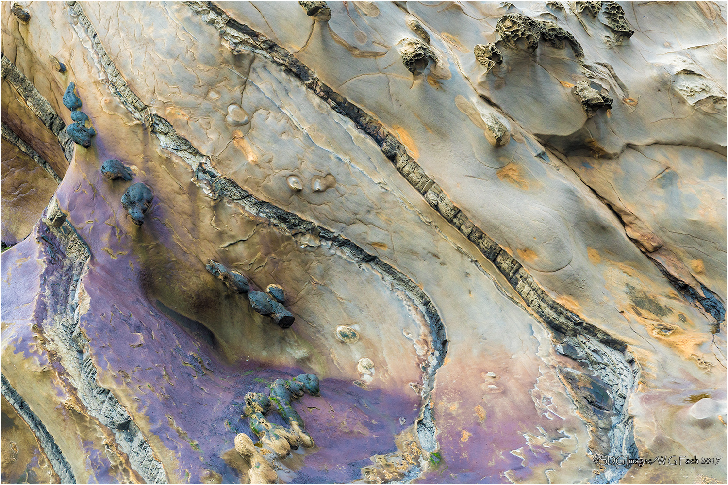
One of my favorite NPN artists is Anil Rao. I've always admired his vision, especially with his images of coastline rocks. My wife and I just got back from our annual anniversary celebration in Oregon and while there we went to one of our favorite sites; Shore Acres State Park. Last time we were treated to one of the most spectacular surf shows I've ever witnessed but this time things were relatively calm and at the lower tide levels many of the otherworldly rock forms and colors were visible. I had a blast extracting abstracts with my long lens and hope to post a few for your comments and suggestions. This was one of my top five. >=))>

Comments

11 comments
Comment posted by Michael Lowe on November 14, 2017 at 11:41 PM
Hey Bill, where's the flowers? Seriously, this is great. The only problem with it is it's not mine.laugh
Registered on February 11, 2004, 777 Posts, 5252 Comments
Comment posted by Balan Vinod on November 15, 2017 at 1:50 AM
Bill...I like the title of image. Tafoni images are great any day. Would a tad bit more contrast sent this to the moon ...Very well seen and love this as is.

Balan Vinod
Registered on March 20, 2006, 889 Posts, 2312 Comments
Comment posted by Harley Goldman on November 15, 2017 at 8:24 AM
Beautiful abstract! The colors and shapes are excellent. I like this a lot. 
Registered on November 19, 2003, 586 Posts, 11271 Comments
Comment posted by Ian Wolfenden on November 15, 2017 at 11:09 AM
Love the variations in depth as well as colour, Bill, making for a lovely abstract.  The rock seems almost alive !
Registered on May 18, 2007, 1108 Posts, 7647 Comments
Comment posted by Bill Chambers on November 15, 2017 at 1:27 PM
Well, you certainly picked a high target to emulate, but I would say you performed quite nicely.  I'm a rockscape freak so I love this.  Both the subtle and not-so-subtle coloration is just so appealing as is the wonderful texture.  This is one of those images I just like to sit back and explore and search out every detail.  Wonderful job, Bill.
Registered on April 10, 2005, 753 Posts, 21216 Comments
Comment posted by Preston Birdwell on November 15, 2017 at 2:33 PM
This is excellent, Bill. The details and textures are excellent. I do find the purple to be a little out of key with the other colors, so you might consider dialing it back a bit. Other than that minor item, this really lovely.
--P
Registered on November 1, 2003, 471 Posts, 5188 Comments
Comment posted by Lon Overacker on November 15, 2017 at 3:48 PM
Bill,

What a gorgeous image and appropriate tribute to Anil, also one of my favorite and inspiring NPN'ers!

Not only is this a fascinating geological study, it's downright artistically beautiful!.  I like the striations layering this intimate. The little patches of gold throughout with hints of blue just make the color palette wonderful.  Oh, the purple, didn't mention that... I wasn't there, was it really  purple?  Even to a degree one way or another, this really just tops off the color palette.

If I had any suggestion it would be some soft burning along the bottom, but mostly in the LR area.  If you follow the swath of purple, I think that's what I would burn down, just a bit.  Also the face of the purple along the left edge could be burned down a little as it draws the eye.

A far cry from the power of crashing waves, but this packs a beauty punch on it's own.  Well seen, captured and presented!

Lon
Registered on November 24, 2006, 521 Posts, 19147 Comments
Comment posted by gary phillips on November 15, 2017 at 8:45 PM
Beautiful abstract, Bill.  Love the details and the luminance of the rock is special.  I had my first visit to Shore Acres this summer...spectacular.  Very nice work.
Registered on October 24, 2013, 185 Posts, 4136 Comments
Comment posted by Harry Lichtman on November 16, 2017 at 4:45 PM
Dig this abstract and the colors and textures.  My eye is attracted to the strong colors on the left a bit more, so I think I prefer that side.  Might have created a vertical crop where 1/2 would be the purples and the top the tan tones.
Registered on September 17, 2010, 304 Posts, 3507 Comments
Comment posted by Doug Koepsel on November 17, 2017 at 10:51 AM
A lot to like in this image.  Only suggestion may be reducing the brightness in the upper left a little. Well done Bill.
Registered on April 1, 2010, 196 Posts, 1592 Comments
Comment posted by Anil Rao on November 24, 2017 at 9:26 PM
This is a beautiful image, Bill. I love the flow provided by your chosen composition and the lovely soothing colors. Very, very strong. I only wish I can produce something like this one day.

Thanks a bunch for the kind words regarding my photography. It is appreciated very much.

Best regards,
Anil
 
Registered on November 15, 2003, 234 Posts, 4923 Comments