Nature Photographers Network
This is the preserved archive of the original Nature Photographers Network. The community continues at naturephotographers.network.
Meeting of the Waters
‹ PreviousLandscape GalleryNext ›

Meeting of the Waters

by Jim Hansen

Gallery: LandscapePosted December 6, 20171,237 views8 comments
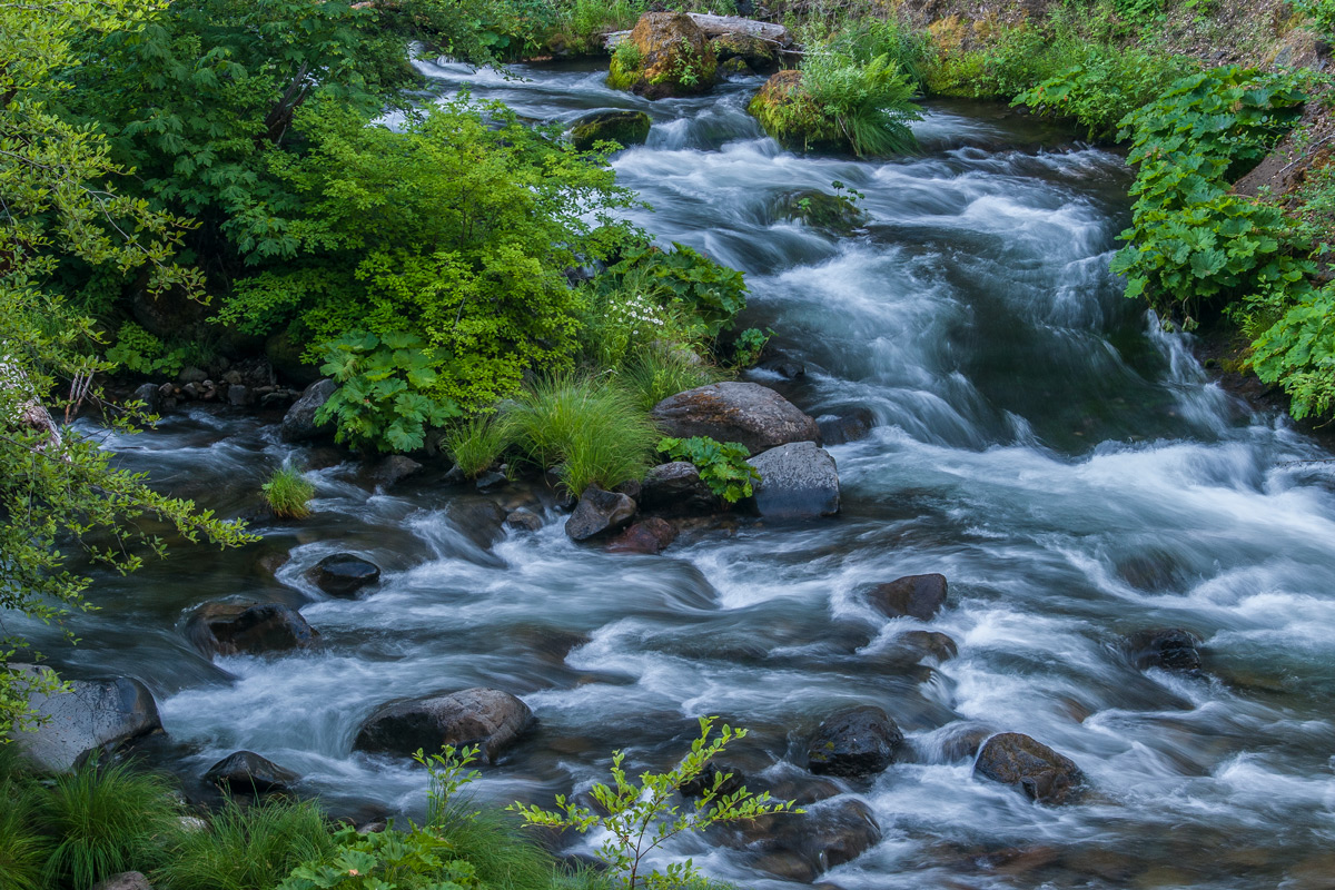
This was taken a few years ago and not processed until recently.  This is a local creek, and in spite of the title, the image represents water that had been divided from the main flow, returning to it.  D300, 28-70 @ 38, 0.6 sec., f18, ISO 200, CPL, tripod.  Always learning from your comments and suggestions.

Comments

8 comments
Comment posted by Igor Doncov on December 6, 2017 at 11:45 PM
Nice full rich colors and a good composition. Flyfishermen would call this 'pocket water'. Good shutter speed for this water flow. Larger versions look better. I like the branch popping up from the bottom. The rock up top could use a little more room perhaps
Registered on November 22, 2014, 189 Posts, 2733 Comments
Comment posted by gary phillips on December 7, 2017 at 2:55 AM
This is beautiful, Jim.  I like your thinking on the comp, it does have that coming together feeling.  I love the large, the colors and textures really come to life.  I would clone the orange spot in the foliage bottom left and there are a couple of white specs on the rocks that demand a bit too much attention bottom center.  Really nice work.
Registered on October 24, 2013, 185 Posts, 4136 Comments
Comment posted by Mark Seaver on December 7, 2017 at 8:15 AM
Jim, I really like your ss choice and how it shows flow even as it retains the textures.  I think your comp works very well also.  It's a very inviting, intimate scene.  This looks a bit blue/cool.  I'm wondering how a subtle warming would look.
Registered on January 23, 2011, 1103 Posts, 17270 Comments
Comment posted by Ed Lowe on December 7, 2017 at 9:44 AM
I am really enjoying the large version, Jim. The greens are so lush and inviting as is the rushing water as it winds its way through the scene. Great SS choice BTW. My only suggestion would be to clone that small orange leaf bottom edge towards the left as it catches my eye just a bit. This is beautifully done.

Ed
Registered on February 7, 2004, 414 Posts, 7115 Comments
Comment posted by Ed McGuirk on December 7, 2017 at 11:01 AM
Jim, nice use of diagonals here, this image has a very dynamic feel to it. As a nitpick I would crop a little off the left, to eliminate the bright log that is partially concealed by vegetation that is halfway down the frame. I think you can crop this away without losing anything important. I initially thought that the image would benefit from a slight warming of the blue cast in the white parts of the water, but the more I study the image, the more I like the cool tones of blue and green in the image, and would not change the color balance.
Registered on November 29, 2017, 19 Posts, 260 Comments
Comment posted by Lon Overacker on December 7, 2017 at 12:37 PM
This is gorgeous Jim!  The large view really jumps out at me.  The setup of the scene to start with is wonderful - the confluence of the two streams coming back together is framed perfectly.

The greens are vibrant, but not over the top.  The flow of the water among the rocks is beautiful and I like the hints of that glacial blue in the water as well.

This just makes me want to be there, smelling the lushness of the vegetation and being mesmerized by the constant roar of rushing water...

Lon
Registered on November 24, 2006, 521 Posts, 19147 Comments
Comment posted by Jim Hansen on December 7, 2017 at 1:12 PM
I have included a version here in which I have cloned out the orange spot at the bottom, the little white spots on the rocks, and the log on the left.  Igor, I felt that giving the rock more room at the top would have compromised the integrity of that area, so left it alone.  Mark, I tried warming it up, but felt it looked better as is.  Thanks everyone for your thoughtful suggestions.
Registered on May 5, 2011, 161 Posts, 908 Comments
Comment posted by Preston Birdwell on December 8, 2017 at 12:53 PM
The repost works nicely for me, Jim. I really like the cool color palette. Well done!
--P
Registered on November 1, 2003, 471 Posts, 5188 Comments