Nature Photographers Network
This is the preserved archive of the original Nature Photographers Network. The community continues at naturephotographers.network.
Yosemite Unseen
‹ PreviousLandscape GalleryNext ›

Yosemite Unseen

by Lon Overacker

Gallery: LandscapePosted December 10, 201710,837 views11 comments
Thanks for your comments on my previous post - Yeah, I figured it would come across as busy and more of a record shot, and that's ok - it was. ;-)

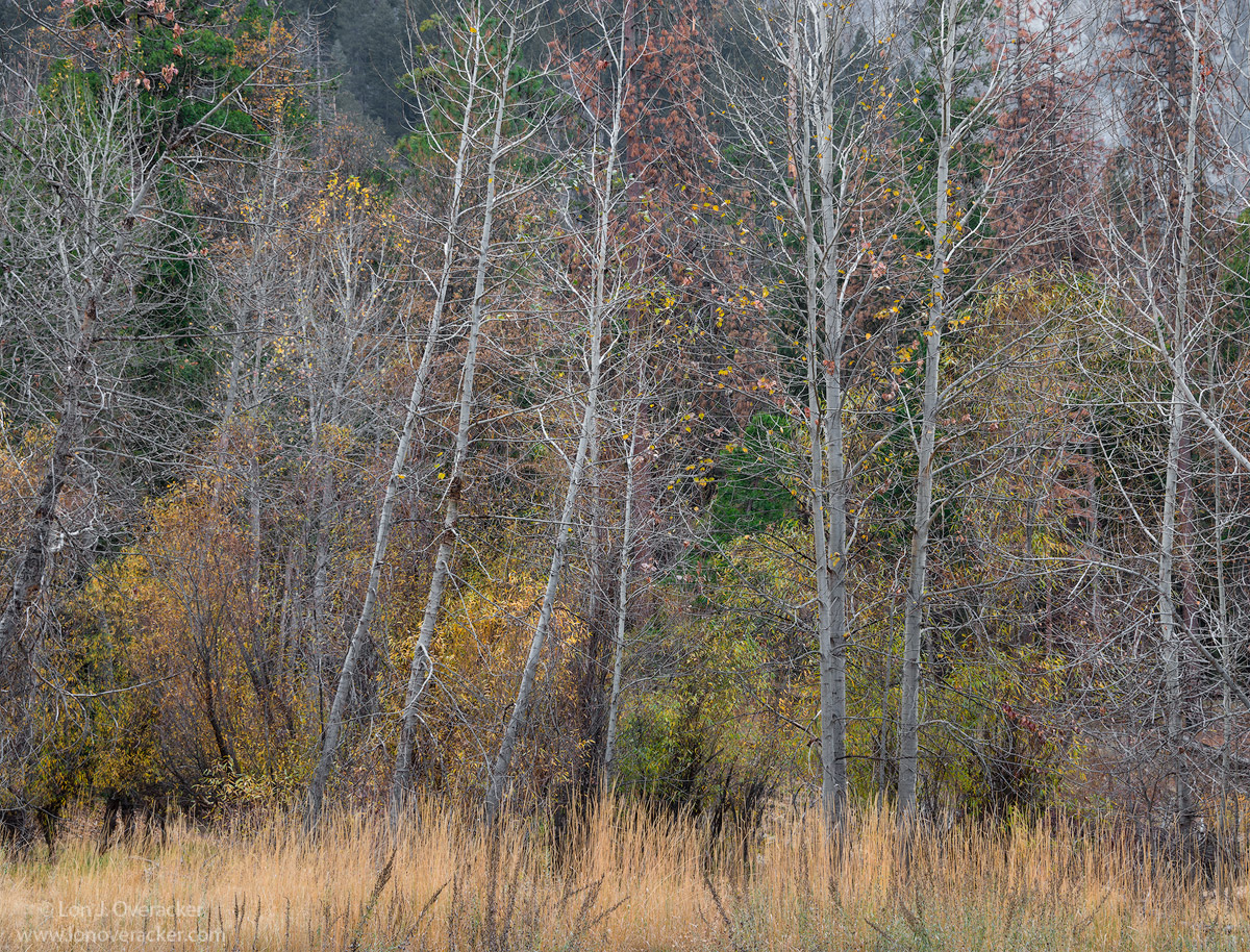
But now we'll see if this will help my confidence any... :-)  One of my running goals with Yosemite is to concentrate on the un-seen and avoiding the obvious and grand that Yosemite Valley clearly is.  But it's so much more than that - at least for me.  This scene, while not grand, is rather simple and typically goes unnoticed.

And because of the ordinary, and the diffused, flat light, I did try to bring some life to this in processing.  I hope not too much.  Would love your honest feedback and suggestions.

Another single frame at f/16.  We're still in the same sandy overflow area where I captured the previous image. El Cap looms large up and over my right shoulder.

Thanks!

Lon

Comments

11 comments
Comment posted by Kathy Barnhart on December 10, 2017 at 3:35 PM
Another lovely, subtle take away from the Valley. I appreciate so much how you look for the less iconic shots in the Valley and remind us of the beauty everywhere. The grasses in the foreground add a lot, and I love the subtle colors. My eyes do wander around looking for a center of interest and don't rest in any particular spot. I'm ambivalent about that...maybe that's what keeps my attention in an image, or maybe I need more help from the photographer to hone in on something. Not sure and will be interested in what others say.
Registered on November 11, 2011, 404 Posts, 1639 Comments
Comment posted by Preston Birdwell on December 10, 2017 at 4:14 PM
As you know, I love images like this. There is simplicity, but also a complexity that I find pleasing. I like the color palette here--warm and cool, and just the right amount of neutral tones. The gentle contrast really works.

In light of Cathy's remark about this not having a true, central, focal point, I think that would be less of an issue if the leaning tree on the left was cropped out. Doing so improves the balance and allows my eye to focus on the lovely grass, the stand of alder, and the vegetation behind them.

In terms of color, I think the grasses are too red. I think they should be more of a 'hay' color. You might also consider burning down the El Cap wall on the top right--the grey there catches my eye.

When the light is soft on the valley floor, that is the time to see the unseen, as you have done here. Nicely done, sir!
--P

 
Registered on November 1, 2003, 471 Posts, 5188 Comments
Comment posted by Nick Bristol on December 10, 2017 at 4:43 PM
Lon, This is really nice! It is easy to look at and just enjoy. My eyes drift around the images just enjoying things I like to see and for me that is the purpose for the image. The colors look great and look very natural to me. I just don't see any need for change here. I guess we usually can find something to suggest  for improvement in our opinion (kind of the point of NPN I guess) but once in awhile it is just nice to enjoy what you have here and that is what I'm doing with this one. cool

Nick Bristol
Lone Rock, WI.
Registered on February 1, 2004, 752 Posts, 14140 Comments
Comment posted by Igor Doncov on December 10, 2017 at 6:13 PM
I like this one very much. The grass is handled perfectly, which apparently is not an easy thing to do. It adds to the image without drawing attention to it. In sports parlance 'it's a team player'. The trees give it a nice rhythm and the leaning ones draw your interest.  But it's just the latticework of lines over a background of restrained yet not flat  colors that makes this for me. I would not crop from the left to remove that tree because it fulfills an important role im the comp. Nice work.
Registered on November 22, 2014, 189 Posts, 2733 Comments
Comment posted by Harley Goldman on December 11, 2017 at 12:24 PM
Real nice look at the unseen (and if seen, unnoticed) Yosemite. I might burn the back wall URC, but pretty minor stuff. Otherwise, looks real good to me. Nice take!
Registered on November 19, 2003, 586 Posts, 11271 Comments
Comment posted by Lon Overacker on December 11, 2017 at 4:38 PM
Thanks for the comments and suggestions folks.

Preston, I agree and have tweaked the red tint in the grasses - in fact I pulled red out globally as well and like the color balance better.  I've also burned down the granite in the UR.  I tried the crop, but it just didn't feel right and so agree with Igor's comments about that.

I can see and understand the notion of not having a focal point and the eye wandering around.  I think this could be an interesting topic.  I think sometimes an anchor, or a place for the eye to "rest" might not be a single object, but perhaps a group of them? Rather than one tree, maybe it's the Alders collectively.  Maybe it's that "anchors" and "a place to rest" are two different things? They could be the same, but maybe not always the same?  Anyway, just mumbling out loud.

Thanks!

oh, I did make some changes and I think the image is improved, but the changes are subtle and I don't think will show well enough here that I decided not to repost.  But the feedback was most certainly valuable and used!
Registered on November 24, 2006, 521 Posts, 19147 Comments
Comment posted by Dave Dillemuth on December 11, 2017 at 8:57 PM
Nicely seen, Lon. The soft light works wonderfully to bring out all the subtle colors and array of textures. Composition works well with the repeating trees anchored nicely in the golden grass. Only nit, which was already mentioned, is the URC. I might play around with burning down the brightness and/or doing a bit of cropping to minimize. 
Registered on December 10, 2015, 104 Posts, 1112 Comments
Comment posted by Ed Lowe on December 11, 2017 at 10:25 PM
Unseen by everyone but you and now we on NPN get to enjoy your vision, Lon. I am really liking the vertical lines of the tree trunks in the horizontal format here and the large version lets me wander and enjoy the multitude of textures and details. My only suggestion would be the already mentioned URC. Beautifully done.

Ed
Registered on February 7, 2004, 414 Posts, 7115 Comments
Comment posted by Anil Rao on December 12, 2017 at 10:53 AM
Lon, this had turned really well. What I like most is the complexity of the scene, which goes a long way in ensuring that the image has lasting effect. The muted colors depict the season perfectly.

Looking forward to more of your unique vision.
Registered on November 15, 2003, 234 Posts, 4923 Comments
Comment posted by Ed McGuirk on December 13, 2017 at 5:29 AM
Lon, you are the master of stick season, for sure. I really like how you left a hint of the granite cliffs in the upper right, and the grass below, they really help to break up the pattern, and give your eye a reason to wander around a bit. I don't think they are anchors in the sense you discussed, but rather they are elements that make your eye move around the scene, and add some variety beyond just the trees.
Registered on November 29, 2017, 19 Posts, 260 Comments
Comment posted by Mark Seaver on December 13, 2017 at 9:36 AM
Lon, the warmth of the grass at the bottom sets the stage very well for the mix of subtle colors and bare trees in the upper parts.  It's a fine late fall image.  The colors in the grasses and in the leaves left on the trees look spot on to me.  Our Montana yard is full of grasses like this and I love watching the colors change from golden glow to hay colored depending on the light's direction and intensity.  I don't see the lack of a focal point as a problem.  I see this as setting the somewhat nostalgic mood of a fine late autumn day.
Registered on January 23, 2011, 1103 Posts, 17270 Comments