Nature Photographers Network
This is the preserved archive of the original Nature Photographers Network. The community continues at naturephotographers.network.
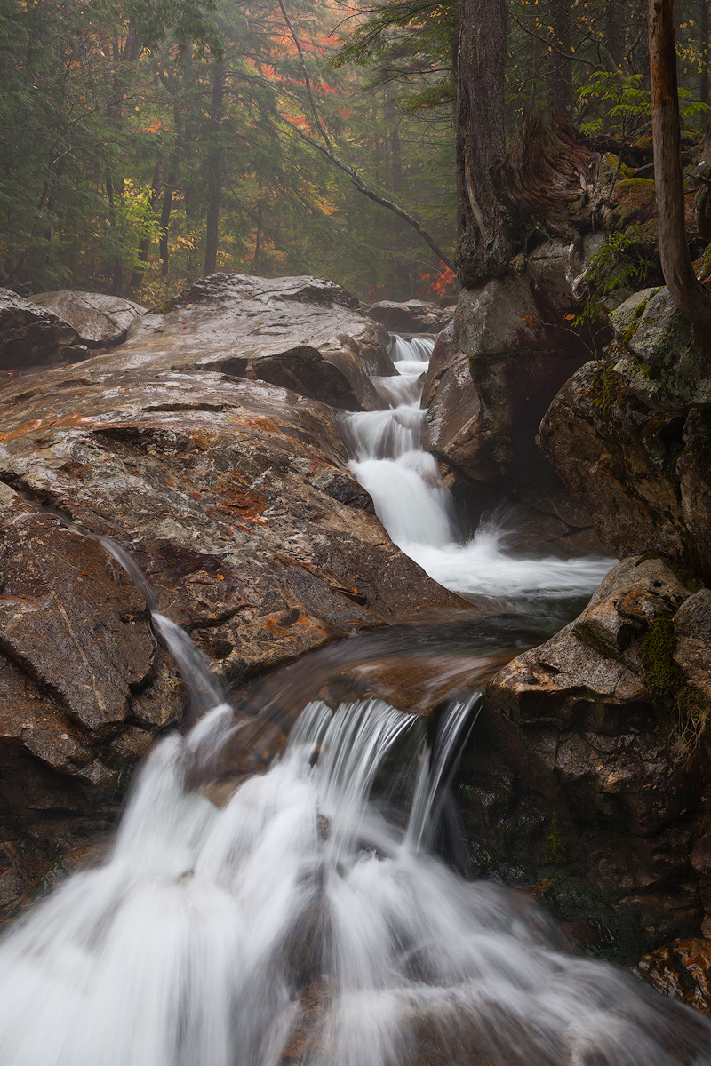
Pemi Falls 2
‹ PreviousLandscape GalleryNext ›

Pemi Falls 2

by Craig Moreau

Gallery: LandscapePosted December 19, 20173,760 views9 comments
I had posted another view from this same location a few weeks back, and I also processed this slightly wider view. I'm curious to hear what people think about these images compared, or just about this one on it's own. Here's the other version.

5d2, 24-105L @ 50mm
1/6s @ f/11, ISO800 with another exposure just for the foreground falls. The water in the base image had fanned out more, leaving much more rock showing through
TK luminosity masks, dodging and burning

Comments

9 comments
Comment posted by Igor Doncov on December 19, 2017 at 1:41 PM
I like this image but the previous comp was significantly better imo.
Registered on November 22, 2014, 189 Posts, 2733 Comments
Comment posted by Dan Kearl on December 19, 2017 at 2:21 PM
I think the richness of color is lacking a bit in this one compared to the first.
Maybe a bit off the bottom of this one and a bit more contrast on the top...
Registered on September 2, 2013, 209 Posts, 1514 Comments
Comment posted by Michael Lowe on December 19, 2017 at 2:35 PM
I really like both images, but I guess I'm always a contrarian, cause I much prefer this one. Having been to this location numerous times, I feel the previous comp is a little too tight. I like the inclusion of the lower falls. No nits from me.devil
Registered on February 11, 2004, 777 Posts, 5252 Comments
Comment posted by Ed Lowe on December 19, 2017 at 4:21 PM
Definitely this one for me, Craig. My brother and I have been here several times and the wider view works better for me. The prior version feels a bit cut off without the lower section of the falls. The light fog is another wonderful element to the scene as is the splash of fall color in the BG. Beautiful work.

Ed
Registered on February 7, 2004, 414 Posts, 7115 Comments
Comment posted by gary phillips on December 19, 2017 at 11:27 PM
I think I like this one, Craig.  I can see that the impact of the heavy left side is a concern, but somehow this works for me.  As an experiment, I might play with some selective color adjustments in the red channel.  I think if you make them pop a bit more it might add to the impact of the color and lessen the impact of the stone. Just a thought.
Registered on October 24, 2013, 185 Posts, 4136 Comments
Comment posted by Ed McGuirk on December 20, 2017 at 10:27 AM
Craig, I like this version much better than the prior one. The placement of the trees and the falls is much stronger compositionally than before. Your processing here is excellent, the understated saturation works great for this scene. I also like how the waterfall itself is very sharp, but then the scene fades away to the soft, misty background. Really nice work on this image. I think it would make an interesting B&W image as well, might be worth a try.
Registered on November 29, 2017, 19 Posts, 260 Comments
Comment posted by Preston Birdwell on December 20, 2017 at 12:16 PM
I prefer the wider view, Craig. The way the water is channeled here gives a nice compositional balance and a nice lead through the image, tying everything together. The color and tonality look great to me.
--P
Registered on November 1, 2003, 471 Posts, 5188 Comments
Comment posted by Lon Overacker on December 21, 2017 at 5:05 PM
Craig,

I liked the color and contrast of the previous image, but I think I prefer the overall composition, the extra flow and texture of the water.  I also like the slightly more diminished presence of the tree trunks. Now they seem more balanced with the rest of the scene.  My only wish would be the contrast/pop was a little more like the previous one. It looks though like the mist was a little heavier in this exposure.

Overall, a very nicely balanced vertical.  I quite like this.

Lon
Registered on November 24, 2006, 521 Posts, 19147 Comments