Nature Photographers Network
This is the preserved archive of the original Nature Photographers Network. The community continues at naturephotographers.network.
Sycamore Details + RW
‹ PreviousLandscape GalleryNext ›

Sycamore Details + RW

by Preston Birdwell

Gallery: LandscapePosted December 30, 201710,754 views9 comments
Thank you for your comments n my recent images, and a Happy New Year to all!

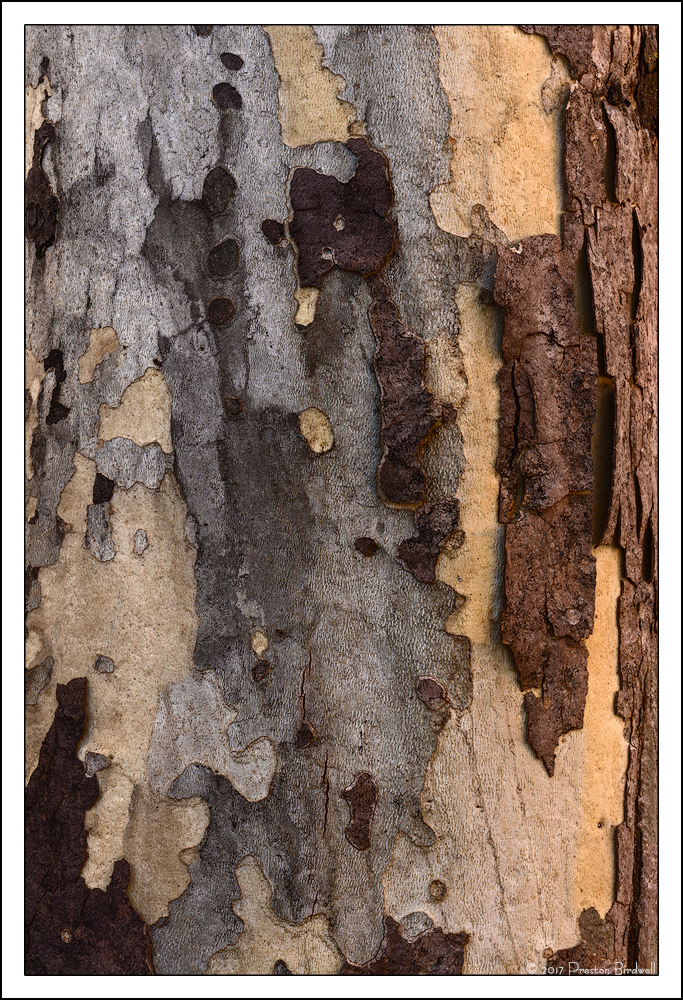
This is a section of the same tree I posted an image previously.

Nikon D-7100
Nikkor 70-200 @ 105mm
F-16 @ 1/6, ISO 100
Single Exposure, full frame
TK's masks.

Please see the large version. Thanks!

Your thoughts are always appreciated.cool
--P

Comments

9 comments
Comment posted by Harley Goldman on December 31, 2017 at 6:29 AM
Nice little abstract. I might consider either a crop or clone to remove the little dark half circles along the bottom and top edges, but real minor. I am enjoying the patterns and colors.  
Registered on November 19, 2003, 586 Posts, 11271 Comments
Comment posted by Peter Richter on December 31, 2017 at 4:12 PM
Preston, I especially appreciate the transition from the cooler shades at the left to the warmer ones at the right. There is a lot of delightful tangible details that keep my attention.

To my eye, the composition is a bit weighted to the right caused by the luminosity of this part. Maybe enhancing contrast in the left half might compensate for this. Only a minor suggestion.

A Happy New Year!

Peter
Registered on November 10, 2010, 218 Posts, 2723 Comments
Comment posted by Harry Lichtman on December 31, 2017 at 5:22 PM
This feels like interconnecting pieces of a puzzle.  Always difficult to decide how tight or wide to compose, I like what you did here.  No suggestions, really enjoy exploring this one.
Registered on September 17, 2010, 304 Posts, 3507 Comments
Comment posted by Lon Overacker on January 1, 2018 at 12:43 PM
Preston,

Happy New Year!  Bark studies are always fun, and this is a good one.  My thinking lately, especially with tree bark and other intimates like Jim's recent ice image, is that "less is more."   Like Harry commented, it's always difficult deciding initially where and how much to frame, and then in processing, where and/or how much to crop.

Purely personal choices... but if it were mine I might consider about a 25% crop off the right and bottom, just for the purposes of tightening the view. Although I'm also less excited about the strip of brown bark along the right edge. Harley's comment is a good fine tune suggestion. Otherwise, really enjoying the colors and I think the contrast and processing are right on.

Just had a thought.  Every sycamore tree I've seen has these similar patterns.  They vary in degree of course, but it makes me wonder if this is some sort of "shedding" or some other natural feature of this particular species of tree.  A natural barrier against disease, insects?  If anyone would know, I'm guessing it would be you Mr. PB! ;-)

Good eye on this tree!

Lon

 
Registered on November 24, 2006, 521 Posts, 19147 Comments
Comment posted by Igor Doncov on January 1, 2018 at 1:36 PM
A lot of good suggestions have been provided already. If you do decide to crop I would try to keep that circle from ending up in the center. If it were mine I would build the comp with that circle in mind. Cooling down the yellow and browns on the right seems like a good idea for an abstract. 
Registered on November 22, 2014, 189 Posts, 2733 Comments
Comment posted by Preston Birdwell on January 1, 2018 at 3:52 PM
Thank you all for your comments, and great suggestions!

Here is what I did...

Cropped some from the right side and bottom
Selected the dark left side beginning with the greys and then increased the brightness and tweaked the contrast there a bit
Selected the dark area in the lower left corner and brought up more detail there
Increased the saturation of the yellows on the left side
Cloned out a couple of distracting spots.

Please let me know what you think.

Thanks, and Happy New Year!
--P
Registered on November 1, 2003, 471 Posts, 5188 Comments
Comment posted by Jim Hansen on January 1, 2018 at 4:50 PM
Preston, this is a very nice sycamore abstract.  I like the second version quite a bit more than the first.  Unlike others, my primary issue with the first one was that large dark area in the lower left.  The repost takes care of that and makes several other improvements that make this a pleasure to view.
Registered on May 5, 2011, 161 Posts, 908 Comments
Comment posted by Lon Overacker on January 2, 2018 at 6:57 PM
Terrific job on the rework Preston!   I like this one quite a bit more!  You're making good use out of the excellent feedback!

Lon
Registered on November 24, 2006, 521 Posts, 19147 Comments
Comment posted by Silvia Richter on January 9, 2018 at 1:52 PM
Preston, the second version is spot on to my eye and certainly worth all the effort! I especially appreciate the tangible details beneath the fine balance in your composition. Great work in my opinion.

Silvia
Registered on February 27, 2011, 18 Posts, 167 Comments