Nature Photographers Network
This is the preserved archive of the original Nature Photographers Network. The community continues at naturephotographers.network.
Decision 2018
‹ PreviousLandscape GalleryNext ›

Decision 2018

by Lon Overacker

Gallery: LandscapePosted January 1, 20188,719 views15 comments
Greetings and Happy New Year!  Do I really get to be the first to post in Landscape in 2018?  devil

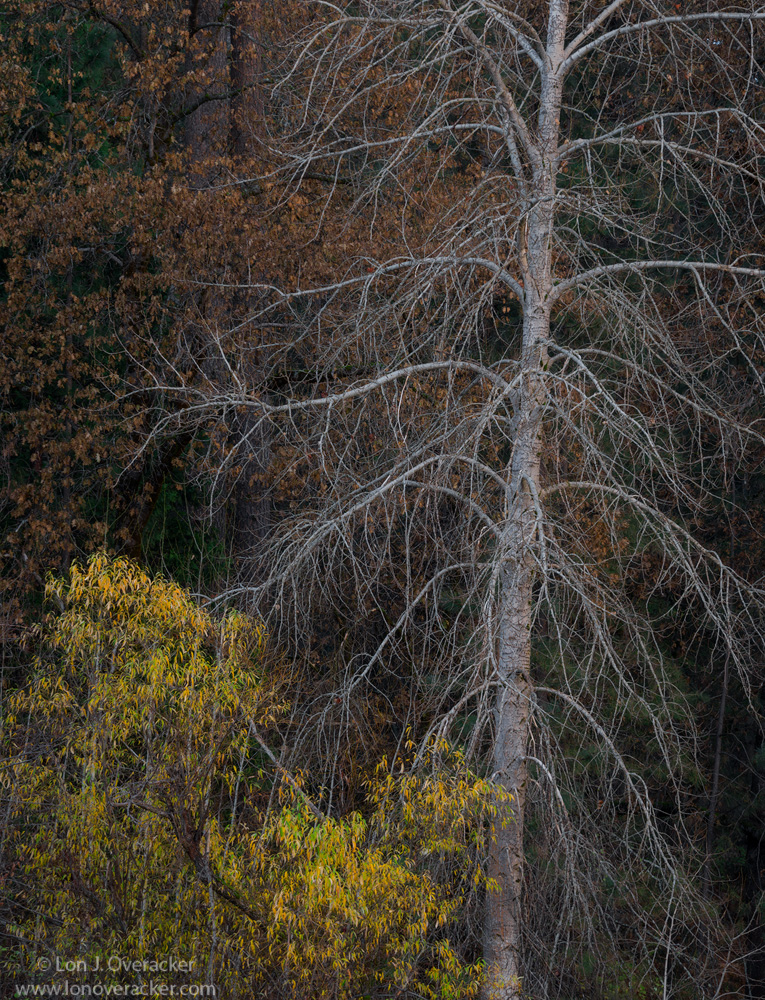
Lacking a good title, it's called Decision because I'm undecided about which of these two versions I prefer.  I guess I'm leaning towards this one since I had to already make a decision as to which to make the original post.

In the second version, I like the addition of the green from the cedar, but am torn on the inclusion of the bare verticals in the LL.

Still going chronologically and this was the same morning as the previous image, although we had now moved on to El Capitan Meadow.  This is a large meadow and often I find myself walking all the way to the Merced. This is captured overlooking the Merced to a little grouping on the far bank.  I hadn't thought of this before, but this image contains many of the primary trees in the valley; Alder, Black Oak, Cedar, Willow (not sure if this is a tree or not.)  The missing exception would be the Big Leaf Maple.

Would love to hear your comments and suggestions and especially which image you may prefer, and why.

Thanks and Happy 2018!

Lon

Comments

15 comments
Comment posted by Lon Overacker on January 1, 2018 at 1:38 PM
Second rendition
Registered on November 24, 2006, 521 Posts, 19147 Comments
Comment posted by Jim Zablotny on January 1, 2018 at 1:54 PM
Hi Lon,

Your first image is the one I prefer.  The single vertical trunk on the right solidifies the comp...................Jim
Registered on January 17, 2004, 705 Posts, 3594 Comments
Comment posted by scott lanz on January 1, 2018 at 2:03 PM
I also prefer the original, Lon. It contains three basic elements, with the tree as a strong focal point. I wonder about a ccw rotation to straighten the gray tree? I realize that the tree is leaning right, and that the trees behind it are straight, but my inclination is to straighten the main tree so it is not leaning out of the frame.

Happy New Year to you as well, Lon. crying 
Registered on November 14, 2003, 840 Posts, 12902 Comments
Comment posted by Harley Goldman on January 1, 2018 at 2:33 PM
Second one and I would agree about the rotation. Not critical, but would be interesting to see the different. I like the second because it seems to have a bit more breathing room and the bare branches balance out the empty space bottom right. Nice
Registered on November 19, 2003, 586 Posts, 11271 Comments
Comment posted by Igor Doncov on January 1, 2018 at 2:59 PM
What a marvelous tree image. The first image is so well constructed in the color scheme, the arrangement of shapes, and the lines. The second image seems awkward due to the large space in upper left. However, awkward is sometimes good. Regarding straightening the tree: the second image needs it, the first is just fine. Don't know what to suggest. You could raise the luminosity of the dark greens on th right half a bit so that they're more noticeable. 
Registered on November 22, 2014, 189 Posts, 2733 Comments
Comment posted by Bill Fach on January 1, 2018 at 3:46 PM
Lon: I do lean enlightened to the first but both are well seen and superbly captured. 2 thumbs up! >=))>
Registered on November 1, 2003, 1805 Posts, 26981 Comments
Comment posted by Peter Richter on January 1, 2018 at 4:26 PM
Lon, after taking several looks at both images, I decided to vote for the first one. It was not easy to decide, as there is also a difference in processing between the images.

The bare tree with its delicate structure is a haunting beauty to my eye. In the first image there are greens in the depth at both sides of the tree, what makes the composition especially appealing to me. In order to match them even better, I would suggest to reduce the saturation of the greens at the left a bit. This is only my personal preference of course. The darker vertical trunks in the background anchor the image aptly and therefore no rotation is necessary in my opinion. 

Peter
Registered on November 10, 2010, 218 Posts, 2723 Comments
Comment posted by Preston Birdwell on January 1, 2018 at 4:29 PM
The color and tonality on both images is spot-on. I do prefer the original because the vertical sticks on the lower left are distracting to me. The lean of the snag does not bother me. You might try bringing up the lights in the snag just a wee bit, but that is minor. This is very well seen, and nicely done.

Happy New RYear, Lon!
--P
Registered on November 1, 2003, 471 Posts, 5188 Comments
Comment posted by Harry Lichtman on January 1, 2018 at 7:04 PM
This selection of trees doesn't seem as strong an image as some of your earlier tree portraits.  The yellow (willow?  they call it a big weed our way - not sure how big a weed needs to be to become a treesad) tree and leaves seem to compete with the stark branches of the tree next to it.  The luminosity of the larger view does help equalize the two though.  The background doesn't compete with these trees, but doesn't add to it for me either.  If the tree were leaning into the frame rather than out, might have a different reaction to it.  Processing looks fine, just not resonating to me like some of your other tree shots.  I might be in the minority, so keep them coming!
Registered on September 17, 2010, 304 Posts, 3507 Comments
Comment posted by Gary Minish on January 1, 2018 at 8:59 PM
I like the contrasts and composition of this scene, Lon!  The starkness and sharply define lines of the large bare tree are quite a contrast with the leaved trees below and behind it. There are 3 separate color palettes here also.  The gray of the bare tree, the green/yellow of the trees below and left plust the dark orange/brown of the background leaves.  It all works nicely together for me.  As to my preference between the two versions; I like the tighter crop when viewing the small sizes because of the graphical balance and less complicated composition but when I view the large sizes I prefer the wider crop despite the verticals in the lower left because it seems to have much more presence. 
Registered on February 4, 2006, 625 Posts, 3583 Comments
Comment posted by Dan Kearl on January 2, 2018 at 12:17 AM
Not sure about this one...I prefer the OP to the repost, it has a more painterly feel.
I agree with Harry that the trees are not strong enough.
Registered on September 2, 2013, 209 Posts, 1514 Comments
Comment posted by Bill Chambers on January 3, 2018 at 11:18 AM
I definitely prefer the original post better as it's less busy.  The naked branches on the far left of the report are a strong eye magnet to me.  Honestly, I'm not in love with this.  I love the bare branches of winter; I think they are graceful and artistic, but the addition of the leaved tree distracts for me.  I know I'm a little weird in that perspective probably as most people probably enjoy trees full of greenery more than bare branches, but bare branches are just so expressive to me.  Actually, I think the top part of the image is far more attractive than the bottom as the dead leaves in the BG don't pull my eyes away from the main subject.
Registered on April 10, 2005, 753 Posts, 21216 Comments
Comment posted by Nick Bristol on January 3, 2018 at 1:21 PM
Lon, I like the composition of the original post here the best. I think you did an excellent job with that and it is especially nice in the larger detailed version. Happy 2018 to you as well!  Nick
Registered on February 1, 2004, 752 Posts, 14140 Comments
Comment posted by Jim Gavin on January 3, 2018 at 2:10 PM
#1. Prefer seeing the background tree trunks and limbs. Seems more balanced.
Registered on August 14, 2008, 293 Posts, 1250 Comments
Comment posted by Ed Lowe on January 3, 2018 at 3:23 PM
The original post for me, Lon. I really like the subdued tones in the first one. I think the green along the RS in the second version upsets that balance a little bit. I would leave the first one as is because the star of the show for me is the dead evergreen. I would have to disagree with those that think this is not as compelling as some of your other tree images. Sometimes the less than perfect aspects of nature can stand on their own and are just as beautiful.

Ed
Registered on February 7, 2004, 414 Posts, 7115 Comments