Nature Photographers Network
This is the preserved archive of the original Nature Photographers Network. The community continues at naturephotographers.network.
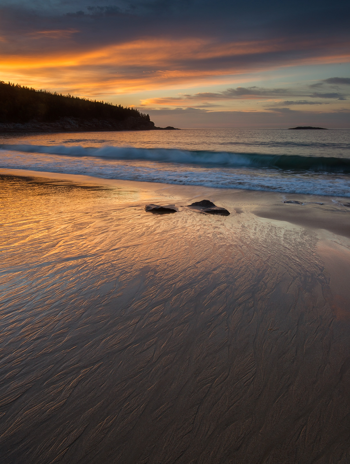
Sand Beach Sunrise + repost
‹ PreviousLandscape GalleryNext ›

Sand Beach Sunrise + repost

by Ed Lowe

Gallery: LandscapePosted January 17, 20185,474 views19 comments
Nikon D 800
Nikon 17-35 @ 24 mm
f18 @ 0.4 sec.
ISO 200
tripod & cable release
Acadia NP

I was attracted to the rivulets in the sand and liked the way the warm light from sunrise was falling across them. I do not know why I did not think of it at the time, but I wish I had taken a few shots of the water as it receded to create some nice effects in the water. Oh well, maybe next time. angel

Ed

Comments

19 comments
Comment posted by Bill Fach on January 17, 2018 at 8:17 PM
Ed: Marvelous light and color in the reflections especially. The large version really shows up the sand texture. Most excellent.>=))>
Registered on November 1, 2003, 1805 Posts, 26981 Comments
Comment posted by Dan Kearl on January 17, 2018 at 10:43 PM
Nice warm beautiful light..
The SS is just right, I like the wave.
Registered on September 2, 2013, 209 Posts, 1514 Comments
Comment posted by Ed McGuirk on January 18, 2018 at 8:15 AM
Ed, a beautiful shot from one of the not-so-obvious sunrise locations in Acadia. I think the processing here is great, you've nailed the colors and saturation without going over the top. Really like the wave motion that you captured here as well. As presented I like this image a lot and wouldn't make any changes. When I went to view the larger version, it was too large to fit on my monitor, and had to scroll down. When the large version first came up it only showed the top half of the image, and did that really pop. I think this would also work as a horizontal, cropping away the bottom half. In that cropped version, the golden light on the sand is really emphasized and makes for a very different, but very nice shot. I like it as a vertical with the rivulets, but also like it this other way too.
Registered on November 29, 2017, 19 Posts, 260 Comments
Comment posted by Harley Goldman on January 18, 2018 at 8:24 AM
Beautiful, Ed. Funny, I read Ed's comments and I was thinking the opposite. To me, the bottom lines are great and I might crop out about half the dark area of the sky (to just below that lighter blue area top left). To my eye, that pops the sand lines and detail just a bit more. But minor stuff, looks beautiful as is. 
Registered on November 19, 2003, 586 Posts, 11271 Comments
Comment posted by Paul Breitkreuz on January 18, 2018 at 9:36 AM
Ed, what a dramatic change from your previous images with the ice. This is quite a contrast with an almost Hawaiian beach warmth to it. I especially like the composition on this one for the feel of being pulled in toward the distant land mass main point there. Has that wondering what is out there feel at least to me.......nice work.
Registered on February 25, 2006, 525 Posts, 8448 Comments
Comment posted by Mattia Oliviero on January 18, 2018 at 10:32 AM
Excellent foreground, Ed. Unfortunately, I do not live by the sea but those rivulets really fascinate me. For the next time it would be a terrific abstract IMO. Very peaceful and well composed scene with great colors.
Registered on August 24, 2016, 43 Posts, 254 Comments
Comment posted by scott lanz on January 18, 2018 at 10:39 AM
Fine image, Ed. No nits. I like it just as presented. Well done.
Registered on November 14, 2003, 840 Posts, 12902 Comments
Comment posted by Dave Dillemuth on January 18, 2018 at 11:55 AM
Beautiful, Ed. Very well composed and processed image. This crop works for me, and as mentioned, I think the level of saturation is spot-on. I could see experimenting with adding a bit of clarity and/or slightly dodging the bottom right to make those rivulets standout a tad bit more.
Registered on December 10, 2015, 104 Posts, 1112 Comments
Comment posted by Preston Birdwell on January 18, 2018 at 12:14 PM
This works for me, Ed. I do agree with Harley's suggestion regarding the crop from the top, and Dave's idea to bring up the lower right corner a bit. Fine image-nicely processed.
--P
Registered on November 1, 2003, 471 Posts, 5188 Comments
Comment posted by Chris Chamberlain on January 18, 2018 at 9:06 PM
A lovely and relaxing image! That foreground sand and it's patterns with the reflected light would have had me though. Beautiful!
Registered on March 13, 2007, 500 Posts, 8365 Comments
Comment posted by Nick Bristol on January 19, 2018 at 9:27 AM
Ed, This is beautiful. The light and colors are wonderful and what a fantastic mood it has. Great just as it is but it is pretty cool that it works really nice with either of the crop suggestions made by Ed and Harley as well. That can't happen with very many images. Excellent work on this beautiful image. Just love the quiet and peaceful feel this has. Nice work!

Nick Bristol
Lone Rock, WI.
Registered on February 1, 2004, 752 Posts, 14140 Comments
Comment posted by Michael Lowe on January 19, 2018 at 11:33 AM
Ed. I liked this the first time you showed it to me on your camera. Has it all, great light, comp, subject matter. The FG is just fantastic as it draws you into the scene. Nice SS on the waves and the sky is the topping on the cake.
Registered on February 11, 2004, 777 Posts, 5252 Comments
Comment posted by Kathy Barnhart on January 19, 2018 at 1:17 PM
Wonderful light and colors, and the rivulets make a great texture in the foreground. The 3 rocks make a good mid ground and I like its placement between the point and the little island. I might consider a crop off the bottom, or at least try lightening the shadows a little so a bit more is visible. But even without that, this is a marvelous image.
Registered on November 11, 2011, 404 Posts, 1639 Comments
Comment posted by Ed Lowe on January 19, 2018 at 1:38 PM
Here is a repost with Ed's suggestion of a horizontal comp. Thanks for your thoughts.

Ed
Registered on February 7, 2004, 414 Posts, 7115 Comments
Comment posted by Igor Doncov on January 19, 2018 at 2:00 PM
I like the first (horizontal) repost the most. I think the original would have superior had you waited a few seconds more for the sun to  highlight those streaks a bit more in the lower right area. Not so that the area becomes bright but just the outline is strongly lit by the sun, like the lower left.  
Registered on November 22, 2014, 189 Posts, 2733 Comments
Comment posted by Ed Lowe on January 19, 2018 at 4:52 PM
One more repost with Harley and Preston's crop suggestion along with Dave's suggestion of a little dodging and clarity to the LRC. As always thanks for your thoughts.

Ed
Registered on February 7, 2004, 414 Posts, 7115 Comments
Comment posted by Ed McGuirk on January 19, 2018 at 5:48 PM
Ed I like both of your re-posts. The re-work you did on the vertical takes what was a great shot up even another notch. The horizontal has a very different feel. The vertical feels very moody/dramatic, and the horizontal has a warmer, softer feel to it. I think they both work pretty well, but the vertical is definitely more dramatic.
Registered on November 29, 2017, 19 Posts, 260 Comments
Comment posted by Mark Seaver on January 20, 2018 at 1:53 PM
Ed, this is a lovely beach scene  The colors in the sky and their reflections look great.  I like the long lead in of the textured sand.  I was going to comment about bringing up the bright tones in the lower half, but you've done that in your second repost.  Looks like a wall hanger to me.  The horizontal crop looses the invitation and the drama.
Registered on January 23, 2011, 1103 Posts, 17270 Comments
Comment posted by Lon Overacker on January 21, 2018 at 1:17 PM
Ed,

Late in commenting here, but wanted to jump in and say the horizontal frame is a much more "comfortable" view and pleasing composition.  In the original, the spit of land is a bit out of balance in the overall scene, where as it's more complimentary in horizontal view.  Love the colors in the beach, the waveline and of course the sky.

Lon
Registered on November 24, 2006, 521 Posts, 19147 Comments