Nature Photographers Network
This is the preserved archive of the original Nature Photographers Network. The community continues at naturephotographers.network.
Perspective
‹ PreviousLandscape GalleryNext ›

Perspective

by Balan Vinod

Gallery: LandscapePosted February 4, 20181,772 views5 comments
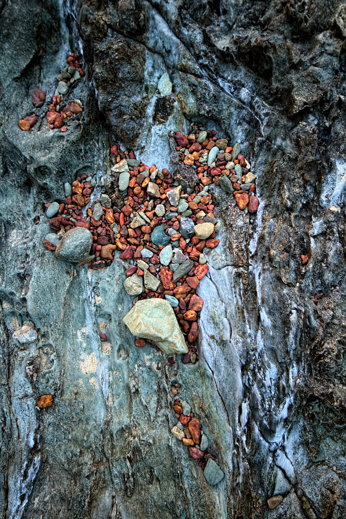
When the tides recede the heavy material stays back in the shallow parts of the rocky beach. This place is like a large bowl in the rock surface which had collected some stones, which got moved around during the wave action. I wanted to give this a feel, that the stones are going to fall off a vertical plane. Made this from right above, or parallel to the surface. The white marks are the calcium/salt deposits from the sea water. 
Light - Post sunset twilight, and a strong presence of moonlight. 

7D, 10 20 Sigma, ISO 400, F7.1, 1/40, EV-0.3, Tonal Contrast on Nik Color, Topaz Detail.
C&C Welcome
Balan Vinod

Comments

5 comments
Comment posted by Jim Zablotny on February 4, 2018 at 12:43 PM
Hi Balan,

I like this one as is except for one minor nit.  I would crop a little off the rh side to remove the bright patch that is hugging the right side of the image.  Other than that, I like the colors and the arrangement of the small rocks is especially nice.  Well done....................Jim
Registered on January 17, 2004, 705 Posts, 3594 Comments
Comment posted by Peter Richter on February 4, 2018 at 1:20 PM
A very appealing abstract to me, Balan. I especially like the kind of flow in your composition as well as the color balance. There is an interesting foreboding feel to the image for me.

I just think of darkening the brighter area at the right edge, but that is only a minor matter to me.

Peter
Registered on November 10, 2010, 218 Posts, 2723 Comments
Comment posted by Preston Birdwell on February 4, 2018 at 7:46 PM
Interesting rock study, Balan. The composition works. I agree with doing something with that bright patch on the right edge. You might also consider backing off on the cyan just a bit. The red stones are very cool.
--P
Registered on November 1, 2003, 471 Posts, 5188 Comments
Comment posted by Harry Lichtman on February 5, 2018 at 6:30 PM
Like all of the textures, and the colorful stones separate them nicely from the surrounding rock.  My only suggestion might be to tighten up the comp, but not sure that would really improve other than give more emphasis to the colorful rocks.  Looks like Africa and the Middle East.  A slight crop off the top, right and bottom might eliminate the bright right edge but still keep th original ratio.
Registered on September 17, 2010, 304 Posts, 3507 Comments
Comment posted by Igor Doncov on February 5, 2018 at 9:47 PM
This has a nice combination of warm and cool colors. I might crop some to get a composition where the 2 color casts are less clustered. 
Registered on November 22, 2014, 189 Posts, 2733 Comments