Nature Photographers Network
This is the preserved archive of the original Nature Photographers Network. The community continues at naturephotographers.network.
Flowing to the Sea&edit
‹ PreviousLandscape GalleryNext ›

Flowing to the Sea&edit

by Kathy Barnhart

Gallery: LandscapePosted February 20, 20183,701 views15 comments
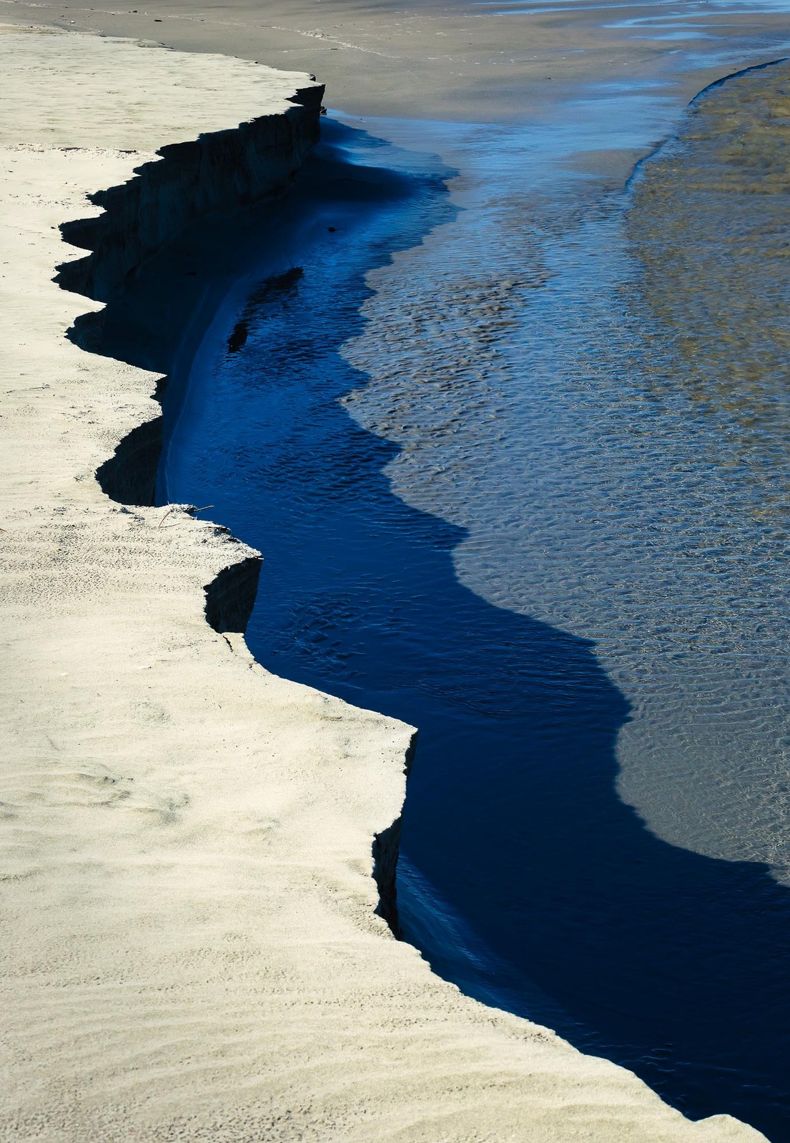
I was intrigued at the Oregon coast with a little river entering the sea that carved a scalloped edge and cast a similar shadow. As an abstract, I let the shadows go black. I would be happy for any comments, critiques, and feedback.

Canon 5dM3, ISO800, 81 mm, f/16, 1/160 sec.

Comments

15 comments
Comment posted by David Schoen on February 20, 2018 at 5:56 PM
I think this is a terrific abstract image.  Really nice textures and colors.  The leading lines and diagonal shapes make this work very well.
Registered on November 6, 2006, 1213 Posts, 4587 Comments
Comment posted by Nick Bristol on February 20, 2018 at 6:07 PM
Kathy, Nice job setting up the comp to make this an abstract shot. The contrast with the deep shadows really bring out that scalloped edge and I like that look along with the other colors and textures. Nice work! 

Nick Bristol
Lone Rock, WI.
Registered on February 1, 2004, 752 Posts, 14140 Comments
Comment posted by Genny K. on February 20, 2018 at 7:58 PM
Yep, I like the abstractness of this.  The colors work really well, and that scalloped edge makes the whole image.  A really cool graphic image.
Registered on June 5, 2006, 132 Posts, 2001 Comments
Comment posted by Ronald Murphy on February 21, 2018 at 8:48 AM
Great image! A crop down from the top to eliminate the upper 15% might work too.
Registered on March 13, 2012, 279 Posts, 975 Comments
Comment posted by Daniel Rappaport on February 21, 2018 at 11:25 AM
Works very well as an abstract.  I agree that a slight crop from the top where it opens up would remove some reference to location. 
Registered on September 9, 2009, 294 Posts, 2006 Comments
Comment posted by Dave Dillemuth on February 21, 2018 at 7:24 PM
Nicely seen, Kathy. Great lines and mix of cool and warm colors. Personally, I think the composition becomes stronger with the top cropped to the end of the scalloped edge.
Registered on December 10, 2015, 104 Posts, 1112 Comments
Comment posted by Aaron Feinberg on February 21, 2018 at 7:35 PM
Pretty intriguing.  I'd crop just a bit off the top so the corner of the jagged edge hit the ulc.  Like these kinds of graphic shots.  Could prob work as an interesting bw too.
Registered on October 26, 2009, 399 Posts, 2789 Comments
Comment posted by Kathy Barnhart on February 22, 2018 at 12:06 AM
Here is the cropped version. I think it is stronger. Thanks for the suggestions.
Registered on November 11, 2011, 404 Posts, 1639 Comments
Comment posted by Anil Rao on February 22, 2018 at 1:11 PM
A bold and beautiful image Kathy. I love the strong colors and there is just the right amount of contrast to make this sing. The composition is delicate and offers good flow throughout the frame.

I actually prefer the original version. The cropped version seems very predictable, especially in today's Internet era.
Registered on November 15, 2003, 234 Posts, 4923 Comments
Comment posted by Harry Lichtman on February 22, 2018 at 1:12 PM
Great job seeing this, and presented well.  Might have cropped the top area so as not to disrupt the curve of the sand.  The gold and blues do work well here.  Shadows come to life in the larger view.
Registered on September 17, 2010, 304 Posts, 3507 Comments
Comment posted by Preston Birdwell on February 24, 2018 at 12:59 PM
Very dramatic, and a fine abstract. I agree with the crop suggestion. The intense blue works really well here.
--P
Registered on November 1, 2003, 471 Posts, 5188 Comments
Comment posted by Mattia Oliviero on February 25, 2018 at 4:13 PM
Really like this image, Kathy. The lines and the different colors work really well. I slightly prefer the repost.
Registered on August 24, 2016, 43 Posts, 254 Comments
Comment posted by Marylynne Diggs on February 25, 2018 at 5:18 PM
Hi Kathy,
I keep coming back to this one.  I just love the colors here and the way the shadow looks alongside the midnight blue water.  I like the more abstract composition, and I would even maybe go a tish further.  Broadening out to the beach makes it less abstract, and if that's the intention (something twixt and tween), that's great.  However, if you crop down from the top to where the sand changes color on the left side (cropping to eliminate all but the lighter color sand) the composition feels more mysterious and interesting to me. 

Great eye to see and get this, and I really appreciate the light hand in processing here.
ML
Registered on December 14, 2010, 122 Posts, 1034 Comments
Comment posted by Bill Chambers on February 27, 2018 at 2:02 PM
Beautiful composition and colors here, Kathy.  This is one of those images that, to me anyway, look far more intriguing from a distance than up close.  Up close, the texture and detail seem to take away the abstract nature of it and, to me again, the abstract nature is what this is all about.  Beautiful work.
Registered on April 10, 2005, 753 Posts, 21216 Comments
Comment posted by Kah Kit Yoong on February 27, 2018 at 5:56 PM
Very creative use of those edges. The crop is an improvement IMO
Registered on September 27, 2006, 636 Posts, 10682 Comments