Nature Photographers Network
This is the preserved archive of the original Nature Photographers Network. The community continues at naturephotographers.network.
Evolution
‹ PreviousLandscape GalleryNext ›

Evolution

by Chris Chamberlain

Gallery: LandscapePosted March 10, 20181,340 views16 comments
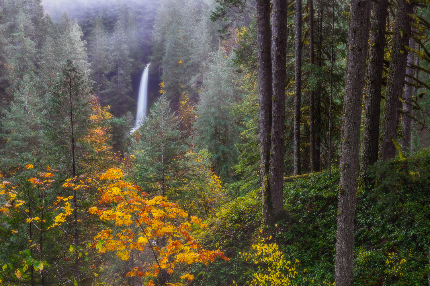
This is the last image of a re-shoot I wanted to improve upon from back in 2007. I shot this a couple years ago. I posted a different frame that I like very much. But it had a little softness issues on the edges . I processed and cropped this frame a few days ago. I am quite happy with this one. Slightly different editing and sharpening. And a crop. The original was ruined with water on the lens that I failed to wipe off. And was in not processed with the same tools I have today. I loved the scene, and always wanted to get back for another chance at it. The original is posted below in the comments. Thanks for looking.

Original,
D200
18-70mm,
laptop and CS2

current version,
D800
24-70mm,
30inch Dell Ultrasharp and Adobe CC

Comments

16 comments
Comment posted by Chris Chamberlain on March 10, 2018 at 2:54 PM
The first shot from 2007.
Registered on March 13, 2007, 500 Posts, 8365 Comments
Comment posted by Harry Lichtman on March 10, 2018 at 5:20 PM
Well the new version is quite an improvement I think.  A dreamy quality to the image, especially the left half.  The right tree trunks seem too bright maybe, almost as if pasted on top of the background.  Maybe they lack contrast?  I'm wondering if the image would be stronger without the far right 4 trees.  They take a bit of emphasis away from the falls.  A square crop was not probably in your plans.  The fall color looks great in the image.
Registered on September 17, 2010, 304 Posts, 3507 Comments
Comment posted by Igor Doncov on March 10, 2018 at 5:50 PM
Boy this is a hard choice. I really like the original, particularly the forested area on the right. Even though it's the same subject the images are so different it's hard to compare. There's a bit of magenta in the tree trunks but I like it.
Registered on November 22, 2014, 189 Posts, 2733 Comments
Comment posted by Dave Dillemuth on March 10, 2018 at 6:56 PM
This is a beauty. Definitely prefer the re-shoot version. I find the wider array of colors add more visual impact. Not sure if you used some Orton around the falls (or it just natural mist?) but I might dial it back slightly.
Registered on December 10, 2015, 104 Posts, 1112 Comments
Comment posted by Preston Birdwell on March 10, 2018 at 7:08 PM
The new version works for me, Chris. I do find the trunks on the right to be a bit too dominant in that create a this-or-that conflict between them and the waterfall. I think that if to toned them down a bit this would work much better. The color and saturation look very nice.
--P
Registered on November 1, 2003, 471 Posts, 5188 Comments
Comment posted by Aaron Feinberg on March 10, 2018 at 8:57 PM
This is pretty rad.  Great comp.  Could see a bit more contrast but personal taste.  :)  Assume OR somehwere?
Registered on October 26, 2009, 399 Posts, 2789 Comments
Comment posted by Ian Cameron on March 11, 2018 at 7:42 AM
Oddly I prefer the array of greens of the original shot and the procession of trees out towards the waterfall.  Nothing much wrong with the recent addition but I prefer the slightly less cluttered look of the spring/summer version and if I'm honest I see less clarity on the new shot than the original, maybe an effect has been added Orton or other which is too strong for my tastes..
Registered on August 6, 2004, 1125 Posts, 3318 Comments
Comment posted by Chris Chamberlain on March 11, 2018 at 11:22 AM
Thanks guys!
I really have no issues with the original capture. My processing was pretty limited then, only using selections and dodge/burn. 
There are some smudged areas from water that ran down the lens. So while it might look ok for a web presentation, I could never make a nice print. Maybe I will return again for a new spring themed version too, I appreciate all the feedback. The fall color, and dreamy approach(not true orton) suit my personal taste well. I might see what burning down the forested area on the right looks like. Nothing was done in post to alter the captured luminance to that area. My exposure or luminosity adjustments were applied to the frame as a whole. Accept for the falls themselves that I dodged slightly.

Yes, there were no clarity sliders in ACR then and I didn’t know how to apply any kind of dreamy like effects. So the original would have just had contrast and curves applied to it.
Registered on March 13, 2007, 500 Posts, 8365 Comments
Comment posted by Harry Lichtman on March 11, 2018 at 11:41 AM
Chris - after looking more at the first shot in 2007 that is more green, it seemed overly green.  Maybe introducing a more magenta bias in the shadow and mid tones using the color balance sliders would help separate the elements better and reduce the overall green cast.  
Registered on September 17, 2010, 304 Posts, 3507 Comments
Comment posted by Chris Chamberlain on March 11, 2018 at 1:23 PM
Yes, Harry! The almost green cast over everything is kind of a characteristic of my earlier processing. I will give this older file a fresh start with my 2018 workflow. But the water smudges will still probably keep this from being a viable file for print.
Registered on March 13, 2007, 500 Posts, 8365 Comments
Comment posted by Ed Lowe on March 11, 2018 at 3:54 PM
Hard to pick which version I like best as they portray different moods, Chris. The fall version is a bit more edgy with the autumn color while the greens in the spring version are a little more soothing IMO. I could also see this working as a vertical with the trees on the right cropped off. Did you happen to get any verticals while you were there?

Ed
Registered on February 7, 2004, 414 Posts, 7115 Comments
Comment posted by Chris Chamberlain on March 11, 2018 at 3:59 PM
Thanks, Ed!

no verticals. I see the world in horizontal view! I was so focused on this comp that I didn’t even consider anything else. Should I return, I will surely do a series of verticals for stitching. And probably some longer focal length shots of the falls without the area on the right. This particular comp really resonates with me, for some reason.
Registered on March 13, 2007, 500 Posts, 8365 Comments
Comment posted by Brian Schrayer on March 11, 2018 at 5:36 PM
This is an interesting scene, Chris.  The trees on the right tend to pull my eyes a bit and seem to compete with the waterfall for my attention.  Yet they add context to the scene as a whole so maybe it's a good kind of visual tension.  There is an orton like effect around the fall - I'm not sure if it's from water on the lens or from your processing.  For my tastes it is a tad too strong. If it is from processing I would consider dialing it back a little, but again that is a matter of preference. 
Registered on May 28, 2004, 114 Posts, 2890 Comments
Comment posted by Ed McGuirk on March 11, 2018 at 6:13 PM
Chris, I really like the sense of depth you have created with this scene, your eye really gets pulled in the image. The color pallette in this image is also processed nicely. Others have already touched on what I would suggest, which is crop away some of the trees on the right, and dial down the orton effect it's a little too strong for my taste. I think an orton (or negative dehaze) effect works in the immediate area of the falls, but is too strong in the rest of the scene. I would maybe add a little contrast in the pine trees around the falls as well, it could take it without losing the soft glow in that area.
Registered on November 29, 2017, 19 Posts, 260 Comments
Comment posted by Mark Seaver on March 13, 2018 at 11:41 AM
The differences here speak loudly to the combination of knowing a location and timing.  I find your right-left balance of the trees and falls intriguing/challenging and the fall colors are lovely.  Yes, cropping from the right to 4x5 would make a fine, conventional view.  The green view also looks great, creating a totally different mood.
Registered on January 23, 2011, 1103 Posts, 17270 Comments
Comment posted by Youssef Ismail on March 22, 2018 at 1:00 AM
Wonderful composition Chris. The splash of color in the bottom left really makes this image sing.
Registered on November 1, 2003, 474 Posts, 5555 Comments