Nature Photographers Network
This is the preserved archive of the original Nature Photographers Network. The community continues at naturephotographers.network.
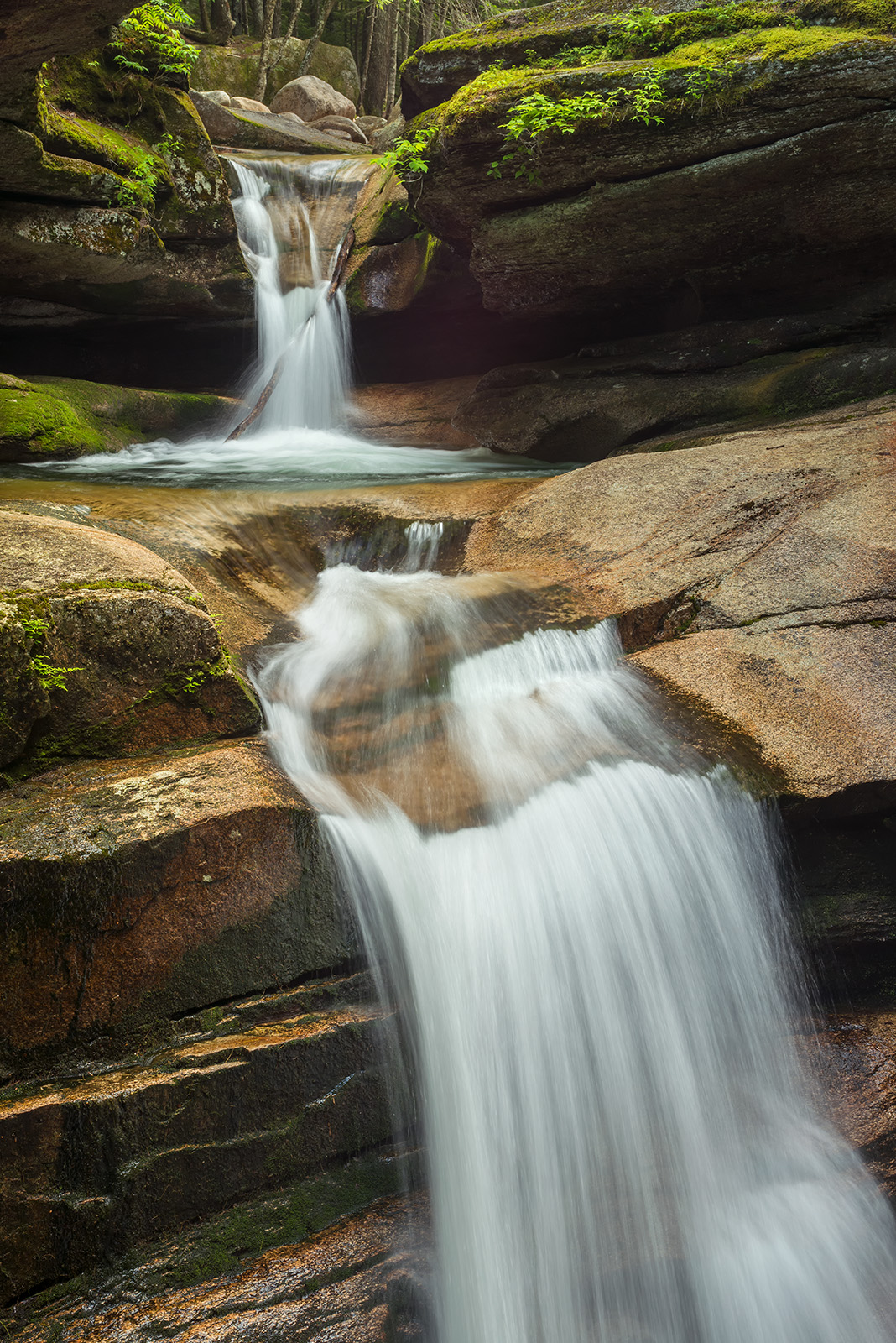
Sabbaday Falls # 2
‹ PreviousLandscape GalleryNext ›

Sabbaday Falls # 2

by Ed Lowe

Gallery: LandscapePosted March 15, 20185,690 views11 comments
Nikon D 800
Nikon 35-70  @ 62 mm
f 20 @ 0.3 sec.
ISO 400
cable release & tripod
White Mountains, NH

This is a slightly different composition than the last post. I switched lenses and framed the falls a bit tighter while moving a little to the left. Just curious if you prefer one over the other.

As always thanks for taking a look and leaving a comment or suggestion.

Ed

 

Comments

11 comments
Comment posted by Michael Lowe on March 15, 2018 at 5:39 PM
Ed, I think I like this one a little better than the first. I prefer how the upper section of falls plays a more prominent part and to me the image has a slightly better flow. No nits frm me. I expect a sort of 50/50 response from others since they're both great.
Registered on February 11, 2004, 777 Posts, 5252 Comments
Comment posted by Preston Birdwell on March 15, 2018 at 7:20 PM
I prefer this one, too, Ed. The textures in rock, and especially the water, are more prominent. One minor nit: There is a spot of green at the top edge on the tree trunk that grabs my eye. The color looks great, and I like the hints of green at the top. This would make a nice print. Well done!
--P
Registered on November 1, 2003, 471 Posts, 5188 Comments
Comment posted by Brian Schrayer on March 15, 2018 at 10:33 PM
Both versions are very nice, Ed.  I'm having a hard time picking a favorite between the two.  On one hand I like the original because of the trees and vegetation above the falls.  On the other hand, I like the framing of the falls a little better here especially with a little more room for the bottom cascade.  I saw the wide version you posted so I know the limitations that you were facing in terms of composition. 
Registered on May 28, 2004, 114 Posts, 2890 Comments
Comment posted by Ed McGuirk on March 16, 2018 at 7:21 AM
Ed, I prefer this view to the original one. More of the back waterfall is visible, and I also like the more diagonal orientation of the foreground waterfall. Overall the processing looks good, I like the warmer white balance here. I actually like the log being in the second waterfall, it helps make the image more unique. Nice work !!!
Registered on November 29, 2017, 19 Posts, 260 Comments
Comment posted by Craig Moreau on March 16, 2018 at 9:02 AM
Ed, I really like this one. Having the upper falls in full view here is very nice, and the composition appears better balanced to my eye. A great capture of a very cool (and difficult to shoot) waterfall.

My only critique was the green up top that Preston already mentioned.
Registered on April 21, 2015, 64 Posts, 584 Comments
Comment posted by Nick Bristol on March 16, 2018 at 11:39 AM
Ed, I think this one is my favorite and it has been nice seeing the different takes you came away with. This one really makes me enjoy the upper falls even more. The detail and texture in the foreground rock is really nice as well.  Very nice work!

Nick Bristol
Lone Rock, WI.
Registered on February 1, 2004, 752 Posts, 14140 Comments
Comment posted by Ed Lowe on March 16, 2018 at 1:56 PM
Thanks for your thoughts folks; always appreciated.

Preston and Craig: Good catch. I am going to have to be aa little more observant as I missed some greenery on the bottom of my last post. cool

Ed
Registered on February 7, 2004, 414 Posts, 7115 Comments
Comment posted by Mark Seaver on March 16, 2018 at 2:17 PM
This is my favorite of the three, Ed.  The two steps look great.  Having the top step surrounded with green and the bottom step with stone makes for excellent texture and color contrast.  Removing that little spot at the top makes a great view even better.
Registered on January 23, 2011, 1103 Posts, 17270 Comments
Comment posted by Genny K. on March 17, 2018 at 3:05 AM
An absolutely great comp, and combined with the great job on the flowing water, this just keeps my attention.  Love the greens in there, and you got the vegetation in the right places.  
Now I have to go find the other version!! angel
Registered on June 5, 2006, 132 Posts, 2001 Comments
Comment posted by Genny K. on March 17, 2018 at 3:08 AM
OK, I went back and looked at the other one.  I like them both.  Very different feel to each one. This one is much more intimate, and the falls look much smaller.  I was really surprised when I looked at the other image, at how big the falls were.  Well done on both of them.
Registered on June 5, 2006, 132 Posts, 2001 Comments
Comment posted by Harley Goldman on March 17, 2018 at 10:04 AM
I much prefer this one (given the other is quite nice). I really like this comp, nice transition from top to bottom. As an experiment, I might desaturate the water  some in the near falls and see how it looks more on the white side. Hard to say if it would be an improvement though. This is a really nice image. 
Registered on November 19, 2003, 586 Posts, 11271 Comments