Nature Photographers Network
This is the preserved archive of the original Nature Photographers Network. The community continues at naturephotographers.network.
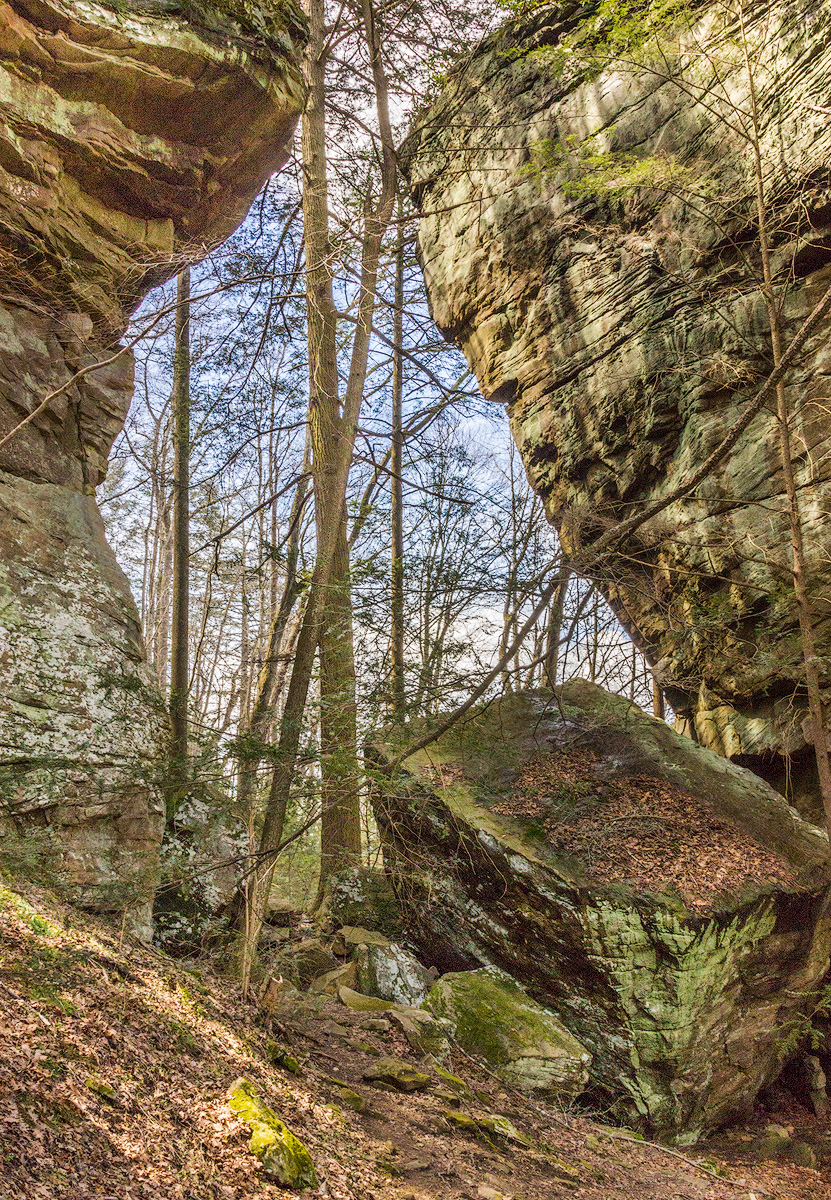
Sunlit dappled monoliths
‹ PreviousLandscape GalleryNext ›

Sunlit dappled monoliths

by Stephanie Murphy

Gallery: LandscapePosted March 31, 2018648 views9 comments
The geology of the Breaks is fascinating. Immense sandstone canyon walls exposed by the  steady scouring forces of the Russell Forks River over millions of years. Truly awe inspiring place! Yellow poplars 7 ft in diameter, chestnut and oaks were  predominant until the 1930s. 

Canon T3i, 1/125 s, f/16, ISO 800, Sigma 18-200 mm f/3.5 @ 24 mm, HH. 
Raw file processed in LRCC. TK resize/sharpening for web.

Seeking any and all advice and comments. Thanks in advance. 

Please view the large image! 

 

Comments

9 comments
Comment posted by John Williams on April 1, 2018 at 8:21 PM
Well that's a great job of framing cool. The tree growing between is nice. I think this could handle slightly more saturation.
Registered on September 6, 2007, 221 Posts, 5985 Comments
Comment posted by Stephanie Murphy on April 1, 2018 at 11:37 PM
Thank you for your suggestion, John. I find it helpful. 
Registered on October 18, 2017, 24 Posts, 56 Comments
Comment posted by Ed McGuirk on April 2, 2018 at 9:57 AM
Stephanie, this is a pretty unique subject, and I love the textures and colors in the rocks. nice bit of seeing here ot create this composition. It almost looks like you are looking through a doorway here, it's pretty neat. In terms of suggestions for improvement, I have three. The boulder in the lower right corner is a key element in your composition, and the right side of it is cropped away, I would prefer to have seen all of it included. In terms of processing, I think this could also take some more darkening in the shadow areas, it would add more definition and textures in the rocks. I also think darkening the edges here with a vignette would place more emphasis on all the neat stuff going on in the center of the image. The lower left and upper right corners in particular are very bright.
Registered on November 29, 2017, 19 Posts, 260 Comments
Comment posted by Nick Bristol on April 2, 2018 at 12:09 PM
Stephanie, What a cool shot of a very interesting location. Ed's suggestion of adding some vignette (dark) I think is a great idea for this picture. He is also right on the money about including all of the big boulder if you could so that the one corner is not cut off and darkening the shadows a bit. It is a nice image and worth just a little more work. I like looking at this and it really reminds me of a place about 40 miles from my home that I have not shot for quite some time. Now I think I have to make a little trip there. cool

Nick Bristol
Lone Rock, WI.
Registered on February 1, 2004, 752 Posts, 14140 Comments
Comment posted by Stephanie Murphy on April 2, 2018 at 6:31 PM
Ed, John, and Nick,  Thanks so much for your excellent suggestions. I went back to the original photo and added some vignette, increased the contrast, and increased the saturation. The biggest problem of the cropped boulder couldn't be corrected because sadly I didn't include the entire boulder in the frame. 
Registered on October 18, 2017, 24 Posts, 56 Comments
Comment posted by Nick Bristol on April 2, 2018 at 6:44 PM
Stephanie, This looks much better to me now. Nothing you can do about the boulder now but with the darker vignette it looks much better. A very nice image of a great looking place. Nice job on the redo!..cool

Nick Bristol
Lone Rock, WI.
Registered on February 1, 2004, 752 Posts, 14140 Comments
Comment posted by Doug Koepsel on April 2, 2018 at 9:57 PM
The larger rocks create a nice "window" to look out.  For suggestions, maybe add come contrast and mid-tone contrast, and reduce the yellow saturation just a little.
edit to add that your repost has addressed the contrast suggestions.
Registered on April 1, 2010, 196 Posts, 1592 Comments
Comment posted by Ed Lowe on April 3, 2018 at 3:12 PM
The repost looks great, Stephanie. The increase in saturation and contrast has added some pop to the scene. To bad about the boulder. If this is close by it is certainly worth a reshoot.

Ed
Registered on February 7, 2004, 414 Posts, 7115 Comments
Comment posted by Neale Dyster on April 3, 2018 at 11:53 PM
Hi Stephanie,
Nice capture, good framing, though it would have been better to include the whole boulder. Some great advice there and well followed and executed in your repost. 
Registered on February 19, 2008, 94 Posts, 738 Comments