Gallery: LandscapePosted April 9, 2018301 views5 comments
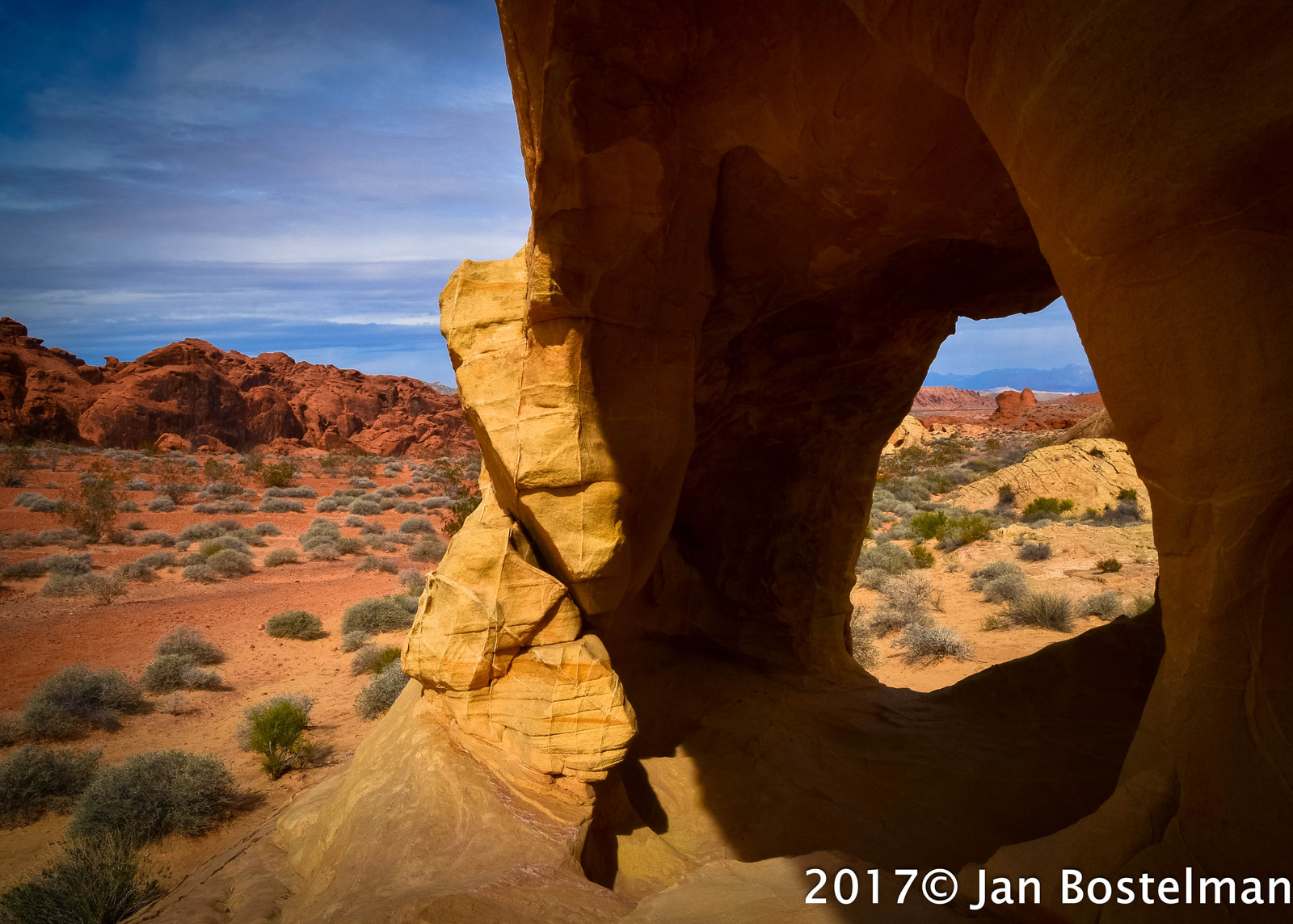
Location - Valley of Fire Nevada February 2017
Equipment - Nikon D800, Lens Nikon 18mm
Settings - 1/ 250th sec. f18, ISO 100
Comments
5 comments
Comment posted by Igor Doncov on April 9, 2018 at 9:07 PM
I really like the colors in this image. They are a bit exaggerated but in a positive way. They make the viewer appreciate them more by making them more aware of them. I find the composition a bit awkward in that we look through the hole and then to the left desert and back to the hole. Back and forth. Perhaps raising the shadows and adding contrast there would make their texture more prominent. There is some wonderful reddish glow in some of the shadows. Would not want to lose that.
Registered on November 22, 2014, 189 Posts, 2733 Comments
Comment posted by Bill Fach on April 10, 2018 at 12:14 AM
Jan: I lived in Las Vegas many years ago and got out to the valley a couple of times but that was in my pre-photography life. I'm sorry I missed the opportunity. You've done well here. I'm OK with the comp but I do think bringing the shadows up would be a worthwhile improvement. Overall still fine work.>=))>
Registered on November 1, 2003, 1805 Posts, 26981 Comments
Comment posted by Mark Seaver on April 10, 2018 at 9:20 AM
Jan, the larger version of this is quite dramatic. Yes, it's a challenging comp., that I think works well as my eyes pop back and forth across the frame.
Registered on January 23, 2011, 1103 Posts, 17270 Comments
Comment posted by Craig Moreau on April 11, 2018 at 12:27 PM
Jan, my first response to this was that the composition was unbalanced with the heavy dark area to the right. As I looked at it more, I started to see an interesting figure/ground study that I really like. I don't know what effect lightening up the shadows would have on this, but it could certainly be worth looking at.
Registered on April 21, 2015, 64 Posts, 584 Comments
Comment posted by Brian Schrayer on April 15, 2018 at 4:56 PM
This is a bit of an unconventional composition that at first glance feels a bit heavy on the right hand side. But the more I look at it I think it works. I think that the color looks appropriate on my monitor.
Registered on May 28, 2004, 114 Posts, 2890 Comments

Comments
5 comments