Precarious
by Gary Minish
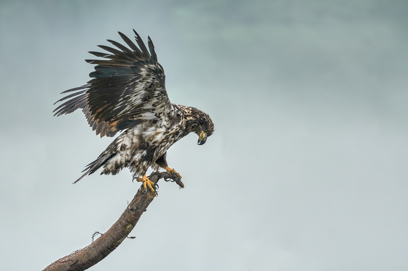
An immature Bald Eagle balancing on a driftwood branch. It lost its balance when it was turning around and I was shooting at the time so I caught it with its wings unfolded (always an impressive sight). The background is heavy ground fog with a hint of the green Mountainside in the distance.
Sony a6500, SEL100400GM @ 333mm, ISO-320, f/5.6, 1/800, hand held.

Comments
11 commentsI like the dynamic pose of the Eagle. Wonderful to see those talons.
I think the image is presented too dark. I know we've mentioned this on prior posts and maybe it's an issue with calibration. I'd look at bringing all the exposure up and then some on just the midtones.
a) I very much dislike blown highlights because I see so much texture and detail in real life and I don't want to lose that in my images. I usually push the smallest highlights to the limit and then bring up the lower part of the luminance curve to compensate for the overall brightness. The problem is that I don't like the results when I bring up the shadows too much because the contrast is lost and the 3D effect is lost with it. Personally, I would rather have a darker 3D image than a bright flat image. I try to make a happy compromise but when I reach the limit the image is still, overall, darker than what most people might post.
b) I work on my images and display them at home against a dark background because it brings out much more color and detail in the images. The same image that looks great against the dark background always looks dark when displayed against the bright white of this site's pages. I have long wished that Naturephotographers.net would change the background to a classy, dark gray or something. Everyone's photos would look much more dynamic and colorful if they did.
c) My computer room is fairly dark and my monitor has been, probably, too bright . That results in my reaching the limits on the highlight exposure too quickly and makes my images look darker when viewed by others. I turned down the brightness and contrast of my monitor significantly and reprocessed this image. I'm hoping that will help somewhat. I processed to the same point as always except that I have to raise the brightness about 20 - 30 % more to reach the same level according to my eyes.
I anyone reads this, please let me know what you think. Thank you, everyone for the constructive and honest criticism. That's what I really like about the members of this site!
I pulled the larger version from the original post and the repost and just compared the histograms. Clearly the reprocessed versions histogram represents the scene more accurately. Consequently, I think it looks better. I understand the issues with contrast, but not taking full advantage of the tonal spectrum is a surefire way to have images that just aren't optimal. I'm attaching a comparison of the 2 histograms I saw.
You said you turned down the brightness and contrast on your monitor? I calibrate my primary monitor to a luminance level of 110 cd/m2. Your statement lead me to believe you changed your monitors controls manually?
White background: Agreed. One way to see an image on a darker background here is to just click on the image (not the little icon to get the largest available version). The background for that is a darker tone gray. I've suggested many changes to the interface here, but nothing has been done to work on those suggestions.
Just saw this . What a great capture of this immature eagle!
I tend to process my photos too dark in many instances. Usually in my case, its due to using the monitor on my Apple laptop, which is decidedly brighter than it should be due I think to the technology. If I use my external, I am pretty ok, but since that is not always possible, I try to look more at the histogram- when I remember. I also run prints - when I am near a printer. I know what you mean about detail in the whites. Its something that bugs me too. With flowers and an all white bird, you can put a radial filter on the main subject and reduce the highlights a bit while keeping the rest of the pic ok histogram wise. With a subject like this eagle, that is pretty hard to do.
I like both versions and my eyes would not have picked up darkness but for the comments here.
My solution - sometimes - is to do a couple light swipes of the "dodge" tool on the dark areas of images I post here.
I leave the image alone for printing, or for other sites.
seems to work - I don't believe anyone has commented adversely.
not ideal, for sure - but, in my experience, web pressentations on any site are not very accurate.
This is an excellent capture, and you should post it exactly as you think it should be. In this instance, like Kathy, I really don't see a difference between the two. images
Sandy