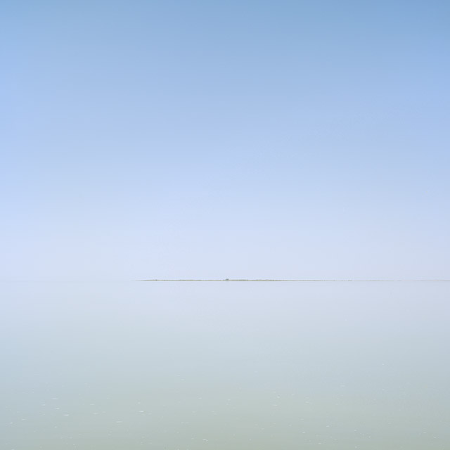
Old Wives Lake, Saskatchewan
by Eric Fredine
Capture: 4x5 field camera, 150mm, Astia 100F
The wind almost always blows in Saskatchewan, so it was slightly surreal to see this lake absolutely calm in the middle of the day. I watched the wind arrive - it first appeared as a dark slick on the horizon and eventually arrived at my end of the lake. It actually grew in to quite a strong wind by the end of the day.
This may only work at larger print sizes (if it works at all).
Cheers,
Eric

Comments
34 commentsWell, that was pretty much what I saw that inspired me to take the photograph - kind of surreal but certainly an exercise in minimalism. There is a subtle colour differences between top and bottom and a few flecks of foam in the water :).
Guy
I guess I am the complete opposite of Guy in this instance---this is the kind of image that I would stop to contemplate. I would be utterly compelled by it in a gallery, especially if it stood alone in a crowd of more traditional nature images...this would be the one I would zoom across the room to see. No doubt this requires a bit of a leap on the viewers part because at first gazing I didn't notice the detail on the bottom half...the little white patches of texture. Whether they are wind spots or just foam I don't know but there is definitely a difference between the top and bottom of this image. There is that ever-so-subtle gradient of blue. And that little point on the land that my eye is eventually drawn to. And how I feel surrounded by sky and water.....to me there is LOTS to look at and feel. So I think it works here and the print will most likely be magnificent. It has a very calming and peaceful feel to it also.
added: As I re-read your second comment I see that the white patches are foam.
I like it for that very reason. I would hope that the print shows off the tonal range. It would have to for it to work for me I think.
So I couldn't resist.....I converted it to B&W with some toning. It really pulled out the little "flecks" in front. Of course at this resolution the pixel mess up the gradient. A little burning on the horizon pulled out some more detail (I think). Doing this made me realize the print probably shows all that off!
Guy asked - "I'm not sure why it would be much different at a larger size..."
There is just something more immersive about looking at a larger print - it becomes apparent that you are looking at a photograph of a landscape and the small details, though there aren't many, give it depth. The vastness and scale become clear. The stillness perhaps becomes more pressing.
In general, I've found that I often prefer my simplest, most graphic images printed larger - they truly become landscapes rather than exercises in graphic design. I wouldn't necessarily have expected this - since the simple, graphic content is readily apparent even at small sizes. But it turns out the details are important after the original structure is taken in I think.
Of course, this image is a bit of a different beast - more minimal with very little graphic content.
Cheers,
Eric
B.
Interesting range of comments....
For me - I'll take the largest print you care to make, thank you very much. I am enjoying your highway series very much, but I also dearly love the lakes/sloughs and I'm glad to see the last couple you've posted. I think this one is just lovely.....well done as usual.
CJ
I too am with Mary on this image. I zoomed right in on it even in the thumbnails.
Will
Edmonton, Alberta
- Dan.
I personally like making images like this, exploring just how minimalist a scene can get and still be impactful. This works for me!
I know next to nothing about photography in general, and even less about landscape photography, so don't set much store by my comments.
That said, I must say that this image really doesn't "float my boat". Personally, I like an image to convey SOMETHING to me, and if all this shows is either the strip in the middle, or searching for various splashes at the bottom, then I'm sorry, I cannot rate it at all.
I'm sure that it is probably my ignorance that cannot see the real beauty of this image, but at least I may have inspired some debate!!
Absolutely no offence meant,
Best wishes
Phil
Scott - I can imagine this working well in B&W. In fact, I sort of envisioned it as an almost monochromatic blue image.
Phil - I'm sure you're not alone in your thinking on this one! No offense taken at all - photography is a broad and democractic discipline allowing for a wide range of differing tastes and objectives. I was being a bit flippant in my comments about the foam and thin strip of land (though I didn't intend any malice or disrespect - I was really poking fun at myself and my minimalist tendencies). Of course, this photograph isn't about those things for me. Instead, it is probably more about space, emptiness and quiet calm. Which is probably more or less the same thing I'm attempting to communicate every time with this (ongoing) series of photographs. And I must say that Saskatchewan is a fantastic location to explore these themes - it has vast open spaces where I often drive (let alone walk) for hours without encountering other people.
Cheers,
Eric
The intrinsic mystery of this image keeps me locked into it. It has an almost vaporous quality that I find most intriguing. The web presentation does not show the very subtle texturing and color that a large print would show, I'm sure.
I have always enjoyed your lake and slough images, and this one is right at the top in terms of creativity.
So to me the central placement, the square format all work well to relate that sense of transfixation ( is that a word? )
I'm really amazed how these images of a great Canadian prarie region can look so much like a Maritime scene.
You are the minimalist master. Are you studing Zen? Crongrats on the EP.
Bob
I've been meaning to ask; since you shoot 4x5 and crop square, do you capture the 'gist' of the image while in the field and then make cropping decisions later, or do you make firm decisions in the field? Do you crop most often from one side? Both L and R? Or sometimes all sides? Just curious about your methodology...
to my photographic way of thinking (on the subject of photographic art as opposed to photogaphic decoration). it is photographs such as this that separate the thinking/feeling observers/photographers from the viual-adrenaline-junky crowd (obsevers and photographers).
whatever purely visual attributes this photograph has, and it has many, i think it also acts as a photography aptitude ink-blot test - those observer/photographers who are genuinely in touch with their inner self )in photography and in life), in all probably, see and feel much in this photograph jsut as i'm sure that you did in creating it.
it is its very simplicity and ambiguity that opens the doors to so many possibilities of thought, emotion, and feeling. you have, as always, resisted the temptation to visually "lecture" the observer on what is or isn't important/meaningful/beautiful. each observer is allowed to address and react to this photograph on their own tems and in their own way
where so many photographers use their technical skills to create visual vehicles that are on a single rail with a single destination, visually, intellectually, and emotionally, you have photographically opened the door to a vast vista (literally and figuratively) in which the observer may negotiate in a vehicle (to keep the metaphor going) of their own making.
...and it takes a real (hu)man to cobble together their own personal vehicle as opposed to simply acquiring a cultural ready-made.
very good stuff, indeed
This is incredible! I am lost looking at this. I feel the expansiveness of the open water and sky, yet oppressivness of the fog. It almost terrifies me even as it leaves me breathless with wonder. So many things go through me that I can't even describe. This is minimilism extraordinaire! Congrats on the EP! It's good to see you here again.
this is a fantastic photograph.
Not much to add.
I feel a disappearence in this...leaving only hints(almost);
hints of lines/geometry, hints of matter/ground air/emptyness.
Very good work
Salut
Re: the maritime feeling noted by several people. I think that 'feeling' is part of what attracted me to the scene. And I think the similarity is due to flatness - you can see all the way to the horizon. And FWIW there is no fog here - just afternoon haze on a hot sunny day at around noon.
Re: composing and cropping. I compose it square in the field. I've marked the GG on my 1Ds and use the grid lines to guide composition on the Ebony (though sadly the existing grid lines don't properly frame a square). I usually crop from both sides (ie. I centre the image in the frame). I'm not particularly religious about whether I shoot horizontally or vertically. Every so often I see a slightly better crop after the fact than the one I composed :), so sometimes its nice to have the extra real estate.
I do sometimes see and compose non-square shots (and even make an exposure sometimes:)) but I don't seem to stray far from square.
In this case, this scene is pretty much as seen and composed in the field (I cropped in a little - mostly because I was struggling with correcting a small amount of vignetting) - shot vertically and cropped from both top and bottom.
Cheers,
Eric
superb image, and I would most certainly zoom across a gallery to check it out.
Simon
Very good job!!
Fernando Brito