Hi Robert,
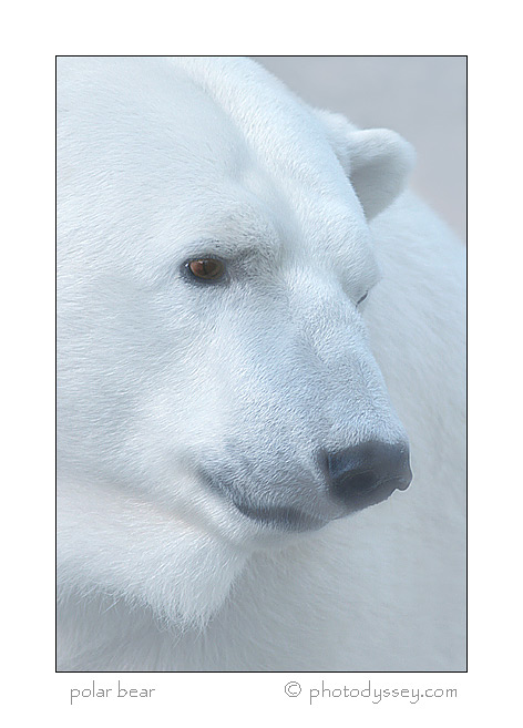
I'd increase a little the contrast, otherwise a splendid portait!
Registered on November 1, 2003, 374 Posts, 10466 Comments
Comment posted by Jasper Doest on July 5, 2006 at 5:49 PM
Nice portrait, I agree about the contrast and I also see a slight colorcast. Could you provide some more information on the place where this was taken and your technical specs?
Registered on November 1, 2003, 371 Posts, 2101 Comments
Comment posted by Jill E. Snyder on July 5, 2006 at 7:30 PM
Beautiful! I'd also like to know the technical details, especially how close you were.
Registered on June 28, 2006, 26 Posts, 182 Comments
Comment posted by James Pawlowski on July 5, 2006 at 7:44 PM
Very nice, I think the lack of contrast works well for this image.
Registered on May 3, 2005, 66 Posts, 291 Comments
Comment posted by Christine Adams on July 5, 2006 at 10:44 PM
Holy Sh-t!!! Or holy shot!!! Wow, is this nice!! I'm figuring that this is a captive(?) bear but anyway what a nice portrait!!
Registered on January 24, 2006, 119 Posts, 1871 Comments
Comment posted by Dave Courtenay on July 6, 2006 at 9:35 AM
A very white bear-all the ones i saw in Churchill were yellowish-nice portrait all the same
Registered on July 18, 2005, 56 Posts, 462 Comments
Comment posted by Richard Ennis on July 6, 2006 at 10:22 AM
Very nice portrait. I like the contrast as it is. I don't really mind the slight blue cast either. It makes the image a bit cooler, which I associate with polar bears!
Registered on November 1, 2003, 118 Posts, 422 Comments
Comment posted by David Weber on July 6, 2006 at 11:24 AM
Very pleasing to me as is, Robert.
Registered on February 7, 2005, 296 Posts, 2737 Comments
Comment posted by Dan Walters on July 8, 2006 at 4:47 PM
Nice shot. I would not increase the contrast. Some of the hot spots might really blow out.
Plus, the lack of contrast has a more subtle feel, in my opion.
Registered on October 30, 2005, 405 Posts, 3693 Comments
Comment posted by renae sandberg on July 8, 2006 at 7:58 PM
Great portrait, i love the detail as seen thru the softness overlaying. is this filtered, shooting thru a barrier (glass or plexiglass) , ps work or one of those very cool soft focus lenses? Great shot.
Registered on December 29, 2004, 313 Posts, 2476 Comments
Comment posted by Ganesh H Shankar on July 8, 2006 at 10:48 PM
Constrast I think is perfect. Increasing it further in my view will affect the overall mood. To me what holds the attention is the eye. I think not including the trace of the left eye would have helped this image further.
Registered on March 1, 2004, 324 Posts, 1867 Comments
Comment posted by Ned Fenimore on July 10, 2006 at 12:29 PM
Outstanding!
Registered on November 1, 2003, 467 Posts, 2803 Comments
Comment posted by Doug Benner on July 13, 2006 at 6:44 AM
Unique presentation - very powerful image.
Registered on December 8, 2003, 482 Posts, 1868 Comments
Comment posted by Paul Wrobel on July 15, 2006 at 1:54 PM
I wouldn't change the contrast or the color cast unless you planon this being a fine art piece. They both help add emotion and this will definitely work as a stock image. The composition is beautiful.
Paul Wrobel
Registered on March 27, 2004, 6 Posts, 15 Comments

Comments
14 commentsI'd increase a little the contrast, otherwise a splendid portait!
Plus, the lack of contrast has a more subtle feel, in my opion.
Paul Wrobel