Nature Photographers Network
This is the preserved archive of the original Nature Photographers Network. The community continues at naturephotographers.network.
Fall Meander (Orton)
‹ PreviousPhoto Art GalleryNext ›

Fall Meander (Orton)

by Chuck Beatty

Gallery: Photo ArtPosted September 19, 20062,950 views13 comments
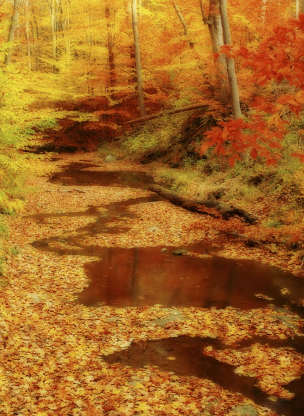
This is another try at the Orton technique. This was shot last fall at the edge of Cuyahoga Valley National Park. The resulting colors are very intense--in fact I lowered the saturation a bit in PS. Is it too much? What do you think overall?

All comments are appreciated.

D-70, 18-70 @ 31mm, 1 sec @ f/22, tripod, polarizer, adjustments in PS, Orton technique

Comments

13 comments
Comment posted by Bernie Kasper on September 19, 2006 at 11:06 PM
Looks great to me, I wouldn't tone it down at all.
Registered on June 5, 2005, 251 Posts, 3734 Comments
Comment posted by Jim Salge on September 19, 2006 at 11:10 PM
SOOOOO MUUUUCHHH COLOR!

And I love it...just a solid comp to begin with and the effect makes a dreamy fall image to die for! :toast:
Registered on February 23, 2006, 269 Posts, 2210 Comments
Comment posted by Mike Dawson on September 20, 2006 at 1:06 PM
I like it, great color and comp
Registered on February 4, 2006, 364 Posts, 8872 Comments
Comment posted by Pete D on September 20, 2006 at 6:42 PM
Hi Chuck,

Beautiful composition. I'd try different degrees of the Orton game. I think this is a little too much. No more color or saturation is needed, for sure.

regards, Pete D.
Registered on November 1, 2003, 590 Posts, 1794 Comments
Comment posted by Dennis Patrick Lor on September 20, 2006 at 9:37 PM
Beautiful job Chuck! I think a small black frame would work nicely here. (Of course I always think black frames look good around any shot :smile: )
Registered on January 15, 2006, 91 Posts, 2052 Comments
Comment posted by David Weber on September 20, 2006 at 10:19 PM
Very nice color, Chuck; a very dreamy scene. Perfect for ortonization! :cool:
Registered on February 7, 2005, 296 Posts, 2737 Comments
Comment posted by Bill Chambers on September 22, 2006 at 9:42 AM
Very pretty Chuck. It doesn't seem too intense at all IMO. I might suggest a bit more contrast, but am unsure of that because I'm on my work monitor. Beautiful scene.
Registered on April 10, 2005, 753 Posts, 21216 Comments
Comment posted by James Milligan on September 22, 2006 at 1:15 PM
Chuck, this works for me. The color is intense but this is part of the wow factor inherent with this technique .Check out Andre Gallant and his book Dreamscapes.

Jim
Registered on November 1, 2003, 39 Posts, 109 Comments
Comment posted by bill meikle on September 23, 2006 at 10:57 AM
I love it Chuck, and could look at it for a long time.

Bill
Registered on May 21, 2006, 173 Posts, 663 Comments
Comment posted by Christine Adams on September 26, 2006 at 8:15 AM
Hi Chuck!! I like this effect alot. Congrats on the EP!! :toast: :toast:
Registered on January 24, 2006, 119 Posts, 1871 Comments
Comment posted by Becky Wolfe on September 26, 2006 at 9:09 AM
Very beautiful! Fantastic colors!
Registered on March 15, 2006, 26 Posts, 397 Comments
Comment posted by Catherine Reilly on September 27, 2006 at 2:43 AM
Brilliant color! and nice composition. The orange really screams, so the contrast with the softer greens and yellows and the orton technique lends a nice softening effect. Congrats on the EP. :wavey:
Registered on August 16, 2006, 603 Posts, 9192 Comments
Comment posted by SandyRichardsBrown on October 2, 2006 at 12:24 AM
I agree that it looks terrific as is! Sandy
Registered on November 24, 2003, 3937 Posts, 12909 Comments