Gallery: LandscapePosted April 23, 20072,685 views21 comments
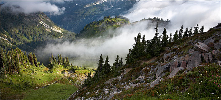
One from last summers trip to Rainier. As this fog bank moved in, John Lehmkuhl and I photographed this valley from different spots.
Comments
21 comments
Comment posted by Zack Schnepf on April 23, 2007 at 5:06 PM
Here is the original for comparison, I like both for different reasons, but prefer the crop overall.
Registered on November 1, 2003, 403 Posts, 2528 Comments
Comment posted by Joseph Kayne on April 23, 2007 at 5:08 PM
Zack, Real nice work. I prefer the uncropped version.
Thanks.
Joe.
Registered on November 1, 2003, 573 Posts, 2619 Comments
Comment posted by Marc Adamus on April 23, 2007 at 5:09 PM
I'll take the original crop here, but both are nice. Great depth to this as a result of amazing light and atmosphere. Nice layers in this too. Lots to look at everywhere.
Registered on September 17, 2005, 780 Posts, 8091 Comments
Comment posted by Ashutosh Rajekar on April 23, 2007 at 5:16 PM
Zack I like the original version. The peaks and clouds add additional drama.
Registered on June 8, 2006, 51 Posts, 910 Comments
Comment posted by Lincoln Castricone on April 23, 2007 at 6:33 PM
What's not to like? Level after level of light. Thanks.
Registered on February 10, 2007, 86 Posts, 167 Comments
Comment posted by Laurent Baig on April 23, 2007 at 7:13 PM
Cool clouds. Love the spot light down low and the dots of flowers on the side. I like the cropped version.
Registered on January 12, 2005, 206 Posts, 6784 Comments
Comment posted by Jody Grigg on April 23, 2007 at 7:24 PM
Zack the original images gets my vote here but both are very nice.
Registered on February 7, 2004, 165 Posts, 1227 Comments
Comment posted by Steve Bunn on April 23, 2007 at 7:33 PM
Zack, both are great, but I have to say I like the cropped version just a bit better. I think it lends a bit of mystery to what isn't seen and really focuses attention on the ridge and the enveloping clouds. Both versions are keepers.
Registered on February 5, 2007, 34 Posts, 320 Comments
Comment posted by Kent Mearig on April 23, 2007 at 7:51 PM
I like the way the perspective emphasizes descending, but even though that feeling is more accentuated through the panoramic crop, I actually much prefer the full frame version. This inspires me to spend more effort to get up my hometown mountains if the snow ever melts .
Registered on September 4, 2006, 237 Posts, 4748 Comments
Comment posted by John Zinn on April 23, 2007 at 9:54 PM
Zack, I like the more predominate flowers in the full version and the slice of blue sky looks great too. Great stuff!!
John
Registered on November 1, 2003, 41 Posts, 1743 Comments
Comment posted by Darren White on April 23, 2007 at 9:55 PM
Most excellent use of light....Good to see ya back here posting Zack.....
I love the light and dark areas and how they work together to pull the image into itself!
Registered on May 29, 2006, 193 Posts, 855 Comments
Comment posted by Guy Tal on April 23, 2007 at 10:34 PM
I love those low clouds and the beautiful plays of light and shadow.
Guy
Registered on November 1, 2003, 566 Posts, 15507 Comments
Comment posted by Mike Veltri on April 23, 2007 at 11:33 PM
Two very nice images Zack. I prefer the original for the more wide open view and the clouds are great.
Registered on February 3, 2007, 51 Posts, 1077 Comments
Comment posted by John Lehmkuhl on April 23, 2007 at 11:44 PM
Great shot, Zack. This was such an amazing moment when the fog was fighting to take over the valley. I personally prefer the full frame with the inclusion of the sky and the red flowers in the bottom center of the frame. Seems like I can breathe better with the added space, but both are very nice.
That was a great outing and I'm still sorry about that Thursday sunrise !!
Registered on May 22, 2005, 165 Posts, 2008 Comments
Comment posted by Eric Good on April 24, 2007 at 5:03 AM
Strangely, I think I'm going to have to give the edge to the cropped version. Both are nice as you say in their own respects, but there is something powerful about that cropped version that I don't get in the original. The balance between light and shape feels just perfect. Great shot(s)!
Registered on March 17, 2007, 116 Posts, 4764 Comments
Comment posted by Verena & Georg Pop on April 24, 2007 at 2:03 PM
yeah that is a good idea: spread those MR images over the whole year instead of overflowing this place with them in August...
Now I can enjoy them! Nice one.
Georg
Registered on July 5, 2006, 272 Posts, 2823 Comments
Comment posted by Bill Fach on April 30, 2007 at 12:05 PM
Zack: Sustained WW meter spike for me on this one. Congrats on the EP. What a gorgeous and awesome scene spectacularly captured. >=))>
Registered on November 1, 2003, 1805 Posts, 26981 Comments
Comment posted by Lance B Isackson on May 1, 2007 at 1:14 AM
It is hard choice ...but to sell it or hang it... the cropped one is one that will sell...very well done
Registered on March 25, 2007, 52 Posts, 51 Comments
Comment posted by Carol Hyman on May 4, 2007 at 10:37 AM
Zack,
You so aptly named this image. The bank of fog rolling in, the silhouettes of the trees on the right and that beautiful light all combine to give me a sense of "I want to be there."
Nice work,
Carol
BTW, just saw the original and I like the cropped version better because it forces the eye to focus on the light,
Registered on January 18, 2007, 597 Posts, 8062 Comments
Comment posted by Cory O'Neill on October 8, 2008 at 12:50 AM
Beautiful capture, Zack! I like the "space" in the uncropped version...makes me wish I was walking through that very spot right now!
Registered on October 4, 2008, 28 Posts, 273 Comments
Comment posted by Mark Metternich on January 15, 2010 at 4:37 PM
Excellent scene. Wish I was there and not here!
Mark
Registered on June 19, 2009, 276 Posts, 6240 Comments

Comments
21 commentsThanks.
Joe.
John
I love the light and dark areas and how they work together to pull the image into itself!
Guy
That was a great outing and I'm still sorry about that Thursday sunrise !!
Now I can enjoy them! Nice one.
Georg
You so aptly named this image. The bank of fog rolling in, the silhouettes of the trees on the right and that beautiful light all combine to give me a sense of "I want to be there."
Nice work,
Carol
BTW, just saw the original and I like the cropped version better because it forces the eye to focus on the light,
Mark