|
First installment in this series - Monochromatic Color Harmony
Second installment in this series - Complementary Color Harmony
Third installment in this series - Analogous and Triadic Color Harmonies
Fourth installment in this series - Cool and Warm Color Dominance
Fifth installment in this series - Split Complementary, Tetradic and Square Color Harmonies
1 - Split Complementary Color Harmony (also called Compound Harmony)
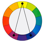
In a Split Complementary color harmony we use two colors plus the color that is opposite to them on the color wheel. For example blue and purple with yellow.
This harmony has a strong visual contrast, similar to the complimentary color harmony (number 2 above), but with less tension because three colors are used instead of two.
This is an easy harmony to use and therefore it is appropriate for study and practice.
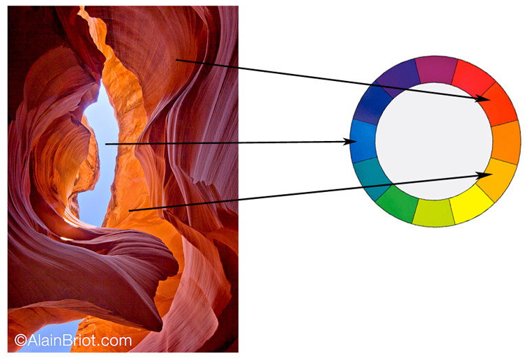
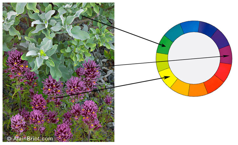
2 - Notes
- Comparable to Tetradic harmony except colors are not evenly spread.
- Actually between Tetradic and Analogous.
- Comparable to analogous harmony except there are 2 opposite colors spaced 1 color apart
- Very visually pleasing and artistic harmony.
- Common in nature
3 - Exercises
Create a photograph that features a split complementary color harmony.
4 - Tetradic Color Harmony (rectangle)
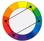
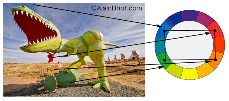
In a Tetradic color harmony we use a combination of four colors that consist of two sets of complementary colors. For example: purple and blue green plus yellow green and red.
These colors form a rectangle on the color wheel. The colors on the short side of the Rectangle are spaced one color apart.
This is a rich color harmony that offers many opportunities for variations. To be most effective it is best to let one of the 4 colors dominate. It is also important to pay attention to the relationship between the warm and the cool colors used in this harmony.
5 - Notes
- Very colorful harmony
- Tends to be ‘in your face’
- Works well with ‘flashy’ subjects
- Easily gets ‘crude’ if overused
- Works when you want to call attention in a dramatic manner
- Similar to square harmony except that colors are one apart on the short side
6 - Exercises
Create a photograph that features a Tetradic Color Harmony.
7 - Square Color Harmony
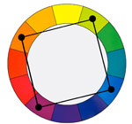
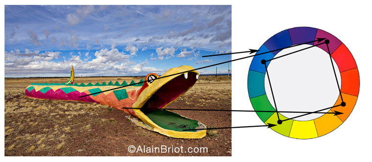
In a Square color harmony we use a combination of four colors equally spaced around the color wheel. For example: orange, yellow-green, blue and violet.
These colors form a square on the color wheel, with each color being spaced two colors apart from the the other colors.
This harmony is comparable to the Tetradic harmony but with the four colors spaced evenly around the color wheel. This harmony works best if one color dominates. Just like the Tetradic harmony, you need to keep track of the relationship between the cool and the warm colors.
8 - Notes
- Very colorful harmony
- Tends to be ‘in your face’
- Works well with ‘flashy’ subjects
- Can easily give a ‘crude’ effect if overused
- Secret is to use small amounts of three colors and a larger amount of 1 color. For example here lots of blue is used and only small amount of green, violet and red are used. This prevents the effect from being overly flashy.
- Works when you want to call attention in a dramatic manner
- Similar to Tetradic harmony except that colors are two apart on the short side
9 - Exercises
Create a photograph that features a Square Color Harmony.
10 - Continuing Your Studies
Color harmonies are one of the most important aspects of a personal style. If you are working on developing your style take a look at my just-released Personal Style Master Class Workshop on DVD. A FREE 21 pages ebook table of content is available. All you need to do is email me at alain@beautiful-landscape.com with the words ‘Master Class’ in the subject line and you will receive the link to the free eBook immediately.
This is the final essay in the Color Harmonies Series. My next series of essays will focus on Vision, one, if not the, most important aspect of creating photographs that are unique to you. The first essay of this new series will be published on this site in February 2013. Stay tuned!
Alain Briot - NPN 2054
|
 Alain Briot creates fine art photographs, teaches workshops and offers DVD tutorials on composition, conversion, optimization, printing and marketing photographs. Alain is also the author of Mastering Landscape Photography. Mastering Photographic Composition, Creativity and Personal Style and Marketing Fine Art Photography. All 3 books are available from Amazon and other bookstores as well from Alain’s website.
You can find more information about Alain's work, writings and tutorials as well as subscribe to Alain’s Free Monthly Newsletter on his website at http://www.beautiful-landscape.com To subscribe simply go to http://www.beautiful-landscape.com and click on the Subscribe link at the top of the page. You will have access to over 40 free essays by Alain, in PDF format, immediately after subscribing.
Alain welcomes your comments on this essay as well as on his other essays. You can reach Alain directly by emailing him at alain@beautiful-landscape.com.