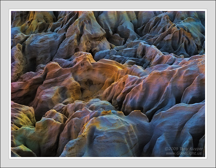
It's a little hard to know what to say about this image. It's an unusual place known as "the brain" because of the deeply carved channels that are reminiscent of the sulci and fissures in the human brain. And it is sandstone, which is a favorite subject, so it was relatively easy to compose into a simple textural form. At the same time, however, I realize that it's nearly impossible to look at the light and color here and think it's real. And this is where I'm not sure what to say.
I can say that these are the colors I found in the RAW file. I decreased brightness, increased contrast, and pushed Vibrance to 30% before conversion. A duller version of this image emerged, and it was obvious that this was the direction the image would go. Once in Photoshop I used my standard methods to improve contrast and saturation, and this is the result. The only color alteration applied in PS was a 12% warming filter.
This image exemplifies what often happens as I try to develop an image, and that is that it (the image) somehow determines its final form. I know it would be easy to say that the image is a victim of my Photoshopping, but at the same time I feel very much at the mercy of the light. I did not make this light, but merely followed where it was leading. Each image is its own creation and to a very large degree determines its own course. I rarely can predict where it will end up, although I usually do enjoy the ride. This one, however, really took me by surprise. Once it came out of RAW, there was no way I was going to try and stop where it was going . . . and this is where it eventually took me. If I'm going to honestly trust the light, then I need to accept that it knew what it was doing.
Your thoughts and suggestions, if you have any for this image, would be sincerely appreciated.
BTW, this image is my first attempt at using the sharpening discussed in
this post on Fred Miranda. It's got a lot of Marc Adamus' technique with some smart sharpen at the end. I've tried it with a few other images and it seems promising.
Canon G9

Comments
65 commentsNice catch on that one Floris!
I think Ben meant to include a 'never' :P
your images truly are one of a kind. i really love how its such a colourful brain, sort of symbolic. is that what yours looks like??
i just finished up your sat. mask tutorial, what a difference. i am relizing that while I thought myself pretty handy in PS, I really had no idea what I was doing. i was getting quite frustrated with the lack in quality my images had for the amount of effort I was putting in out in the field, so its nice to see some improvements. your tutorials have helped considerably. just wanted to say thanks a ton, and sorry I couldnt donate more than $5
Fantastic.
Your point of view that is the light within the image that leads the way through PS is very interesting. Thanks for adding it.
gio
too make it perfect for me, you could make it "glow" a bit more like some of your "other stuff". (I mean the "other mind-boggling-good stuff"...
georg
Kim
Your development of this image is both subtle and vivid at the same time.
That in itself is quite a feat, and you pulled it off masterfully here. The intro. you posted was quite helpful with involving the viewer into your thought process.
The end result is a feast for the eye, and I really like this a lot!
Paolo
I don't know what to say other than you are the master! This is super fantastic, I can't stop looking at it. I really like sandstone abstracts and have tried some, but they don't look anything like yours!
Are you still fiddling with rock images......just kidding!
I don't have any suggestions as I think the image speaks for itself, another Kuyper classic.
All the best
Fernando Brito
The real kicker for me, however, is that the changes I have tried to put into place recently were almost completely inspired by your images. While I'll never be able to match your incredible compositions, I was trying to improve the light in my pictures based on what I saw in yours: darker, not quite so much contrast, saturation in check. And while I do think the light in my images has improved, it's also clearer now that there is something more fundamental that they are lacking. This is good to know and will give me much to think on. I appreciate your taking the time to share these thoughts.
Fantastic range of colors here. It is a bit abstract, but I like it. Hard to know exactly how to frame such an image, but you've handled it nicely. Best Regards.
You need to do what pleases you first and foremost. The way you work on color isn't remotely like anything I've ever seen, though I definitely see some similarities in the way you develop tonal values and contrasts to my own imagery.
I'm inspired by a lot of what you do as well. I've directed countless people to your website and mentioned your name on almost every workshop I've ever lead.
With that said though, I've just never been able to get into this type of rainbow-color sandstone treatment. You're the only one I've seen do it like this and I feel like I'm missing some natural quality I can relate to. There's been some of your sandstone stuff lately where I've noticed the effort towards more natural color, but not the last two as much. I'm not saying you shouldn't stop doing what you're doing though. Again, this is really all about your art.
I do want to point out that I'm not the only one anymore doing the "rainbow sandstone treatment." Jimmy Gekas, Rick Lundh, and Adam Kavalunas, for example, have all posted images here that I think might qualify as "rainbow treatment." However, they look very natural to me because sandstone in the shadows takes on these hues and it's relatively easy to bring them out in PS. In the image I posted above, I did not do any rainbow treatment in PS. These were the colors that were there and in the places that they are in in the photograph. It wasn't hard to spot them on the RAW file, and PS just facilitated making them more visible. And I do want to be clear that I'm not trying to a defend Photoshopping or rainbow treatment of images. No, that's not it. I'm defending sandstone. It really, truly, absolutely is this beautiful. I, and (I'm hoping/guessing) the other photographers too, are merely trying to show this in our photographs.
Thanks also for expressing your honest opinion. It really does help us here to better understand what we're trying to communicate in our photographs.
It's relatively easy for me to bring out just about any color that existed in anything, and that includes just about every color in every part of every image. I understand the color is there, but I'm just going to draw a different line when "developing" them than you are. Nothing wrong with that. You have an eye-catching and unique style.
There's actually something very right with that, Marc. Not so long ago we were debating on NPN whether or not we should even have the liberty of establishing a personal "line," so to speak. And in some regards, our exchanges here have maybe been an extension of that debate, but on a very different level, namely, can a photographer push too far instead of should a photographer push at all. The entire forum has become increasingly tolerant of photographers pushing where to draw their lines IMO, and this acceptance has resulted in some incredibly beautiful photographs being posted along with the development some defining personal styles . . . like yours. It certainly continues to inspire me.
I read the exchange between you and Marc with great interest. I am not normally a super heavy saturation fan (although I do shoot Velvia), but I happen to really like the work you do with sandstone and your particular style. The colors you present often look over the top to me compared to what I have seen with the naked eye in nature, but the images "work" and look stunning and beautiful.
The saturation look works for me with your sandstone images. When you posted your subway image and had a bit of a heavy hand with the saturation, it was not really to my taste. The difference to me? The sandstone is a abstract and as such, can handle pushing the envelope further out. The subway image was a more traditional landscape image and the I did not find the heavy saturation as pleasing. It was a distortion of the reality I am used to seeing and as such, did not work for me. An abstract is, well, abstract. By definition I don't expect it to represent any realistic scene.
My $0.02 on it.
Chris
this is an amazing rendition of sandstone indeed.
FWIW, agree 100% on your thoughts: I know it happened to me with my attempts at Antelope Canyon too.
Giovanni.
Best,
Jose
Thank for sharing this stimulating photo.