Thanks very much for all the comments on the previous image - very much appreciated.
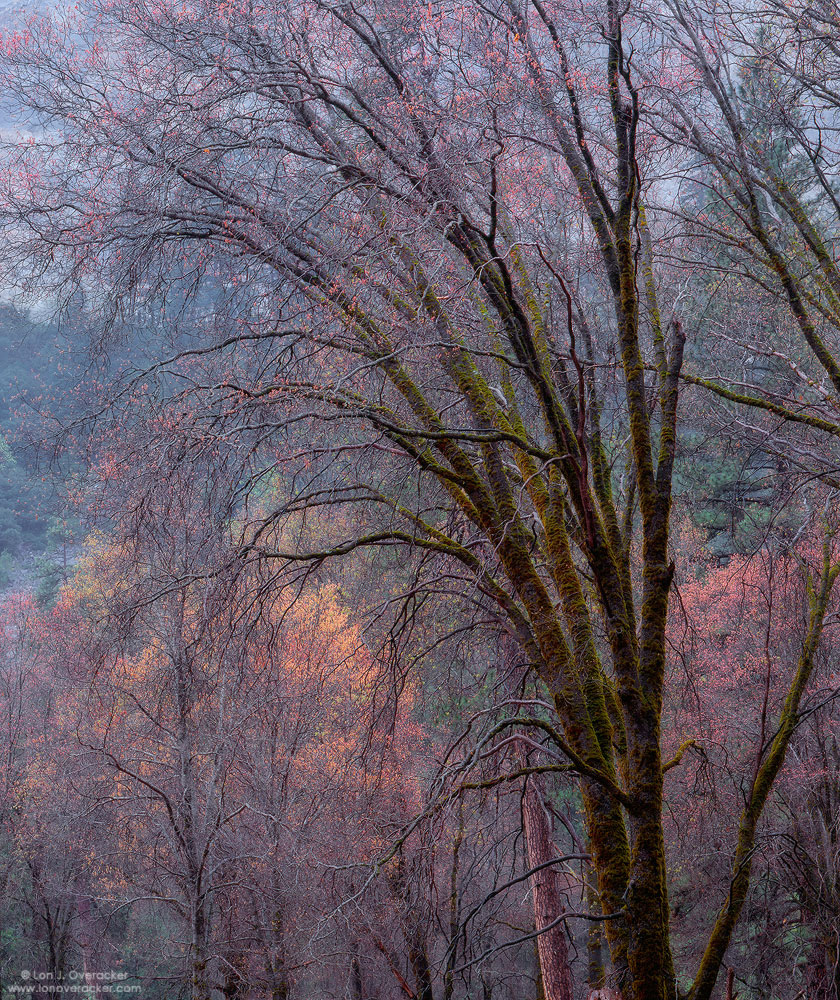
This is one of my favorites from the Yosemite trip now over a month gone by. I was attracted to the amazing variety of "emerging" spring colors found throughout the valley. It was still quite early for the black oaks as they were just beginning to sprout their leaves. But it's at this very time that these magnificent trees show their best color - I think even better than autumn. The baby oaks leaves go through an amazing color transition from red to orange and finally to green and catching them in the transition is wonderful.
I used Tony's saturation masks, selective masking and painting to get the final look and I would love to know if this looks good or overdone? Also, I added a faint Orton layer near the end which more than anything just bumped the contrast a little.
Would love to hear your thoughts and critiques. Honesty welcome. :-)
Chamonix 4x5, Nikkor 300mm, V100f, f/32 @ 1/2s.
Thanks!
Lon
Larger version saved at quality 5...


Comments
53 commentsChris
Chris
I understand Chris why he wants a print...;-)
Chris - PayPal address is ljrack@.....
Mike - yeah, I was going to title this something like "Spring or Fall?" as I had the same feeling about this.
Dietrich - not sure about your reference to the "pole." Was that from one of my previous images? I think I remember, so no it's not the same area. But it's interesting that you mentioned that tree. I had to selectively paint the saturation of that tree down, reducing the red to try and minimize it's presence.
Oh, and I wanted to ask about a crop. I thought about cropping from the right to get back the 4x5 ratio, but I didn't want to lose any of those reds in the trees. Anyone think this should be cropped?
Thanks,
Lon
If the larger version saved at quality 5x, I can't even image what the original looks like! I love everything in this image and think the background green sets off the color of the sprouting leaves nicely. If I really have to pick something, I'd be interested to see if there's any chance to de-saturate the "pole" even more. Regarding the crop I really like the current version and wouldn't change it. All in all, this is a "wow/damn/dang..." type of image.
it doesn't look overdone to me.
Indeed it is a very good capture.
Giovanni
I'd like to thank you as well for your elaborate comments on my images. They are always very inspiring for me.
Guy
Wayne
Good Photography!!
Joe.
Love it - the flowing lines of the trees, all of the emerging colors, and of course the granite in the background (just the right amount) to speak "Yosemite". I think it is just right.
"#39018SV Yosemite Winter Luminance". Someone commented on the "telephon-pole"...
Great gads of detail.
As far as this particular image I would have to classify it as possibly your best, among many extremely fine captures from past posts here at NPN. I would also think the only thing to make it better is to see it in a large print.
For me, it is the subtle range of light on display throughout the colorful leaves and various limbs. A truly gorgeous scene overall.
take it. I had no idea that you could get those colors in the spring.
I'd swear this was an autumn image based on the color. It is absolutely captivating! Your work truly humbles me as a photographer.