Nature Photographers Network
This is the preserved archive of the original Nature Photographers Network. The community continues at naturephotographers.network.
Soft Susan
‹ PreviousFlora GalleryNext ›

Soft Susan

by John Kerr

Gallery: FloraPosted November 3, 200977 views11 comments
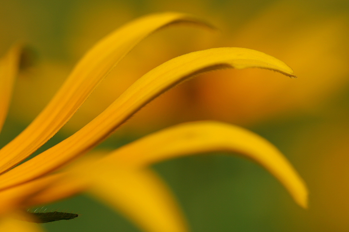
I hope I dont ruin my reputation with only my second flora post but here goes. This past summer I was photographing a patch of Wild Black-Eyed Susans and while I like a number of different images, this one really interests me everytime I look through my photo's. I would be interested in other opinions, good or bad, Is it too simple? Too soft? These are the two things I like about it, but others I show (friends &family)dont care for it. So now I turn to fellow photographer lovers for their thoughts.
Canon XT, harsh afternoon sun, 1/1000 sec, F4, ISO 100, 100mm macro, RAW, WB st at daylight.
Again, C&C welcomed and Thanks.

Comments

11 comments
Comment posted by Morris McClung on November 3, 2009 at 12:05 PM
Excellent lines and comp. I also really like the color, background, and the dof.
Registered on May 7, 2007, 670 Posts, 19650 Comments
Comment posted by Debashis Bandyopad on November 3, 2009 at 12:50 PM
John, a truly delightful feel in this picture. But I guess it does look a tad soft to me - could be just me... Wonderful anyway :toast:
Registered on June 24, 2007, 130 Posts, 1309 Comments
Comment posted by Pat Sampson on November 3, 2009 at 7:03 PM
John,

I think the comp and color in this really make the image. My only suggestion would be to clone out the black sepal? at the bottom left of the image. I think it disrupts your colors and composition. Well seen.

Pat

Registered on May 19, 2007, 953 Posts, 15989 Comments
Comment posted by Miro Susta on November 3, 2009 at 8:36 PM
Nice compo John. IMO I'd not do any changes. It is nice as it is. Well done. :smile:
Registered on August 18, 2006, 719 Posts, 3736 Comments
Comment posted by Ned Fenimore on November 3, 2009 at 9:55 PM
I like this a lot, and could go either way on the dark lower left element.. DOF choice is wonderful..
Registered on November 1, 2003, 467 Posts, 2803 Comments
Comment posted by Tomas Turecek on November 4, 2009 at 4:19 AM
I like the DOF choice here, colours and lightning. I have also couple of tips for improvements: I think that it would be better if the middle petal would be in focus, now it seems that the third from viewer is in focus but only partially. Second thing is composition. I like the skewed petals and their rake-like shape but it's the dark part in the left down corner that drags my attention still, perhaps also because it's in focus. As I said I like the composition but maybe I would tryo to have also the centre fo the flower in the image, having it in the bottom left corner with petals rising horizontally to the top left corner. But that's only my opinion.
Registered on August 14, 2009, 17 Posts, 200 Comments
Comment posted by Howard Cheek on November 4, 2009 at 6:22 AM
The overall softness works, but that center petal should be more in focus John.
Some would argue that the nearest petal should actually be your point of focus as well.
The nearest OOF petal blurbs FG should not be there, they distract somewhat also..
That said, the three primary curved petals arching through make for a pleasing comp IMHO :wavey:
Registered on July 24, 2008, 1201 Posts, 10758 Comments
Comment posted by Bob&Charly Nelson on November 4, 2009 at 8:04 AM
This is very well done John. Wonderful capture and presentation. :toast:
Bob
Registered on October 27, 2005, 289 Posts, 4202 Comments
Comment posted by Bill Fach on November 4, 2009 at 3:37 PM
John: There is a lot to like here. This is what we call a SOA shot and a good one. My only significant nit is the LLC dark element. When I scroll the picture to crop that away I like it much better. POF is always an interesting choice with these shots and I rather like yours. I think you handled the light very well and the colors look spot on. Well done. :toast: >=))>
Registered on November 1, 2003, 1805 Posts, 26981 Comments
Comment posted by Albert Darmo on November 4, 2009 at 9:24 PM
Hi John :wavey: Splendid color and composition, agree with howard about the oof yellow petal blurb. :smile:
Albert Darmo Canada
Registered on November 25, 2008, 1386 Posts, 11978 Comments
Comment posted by Elisabeth Czwikla on November 7, 2009 at 12:12 PM
I like your soft susan. The pedals make nice lines. The black sepal is a bit distracting for me too. But not too soft!
Registered on December 9, 2007, 145 Posts, 852 Comments