Nature Photographers Network
This is the preserved archive of the original Nature Photographers Network. The community continues at naturephotographers.network.
(c) Primal
‹ PreviousWildlife GalleryNext ›

(c) Primal

by Jorne de Bruin

Gallery: WildlifePosted November 11, 2009213 views13 comments
Hi all,


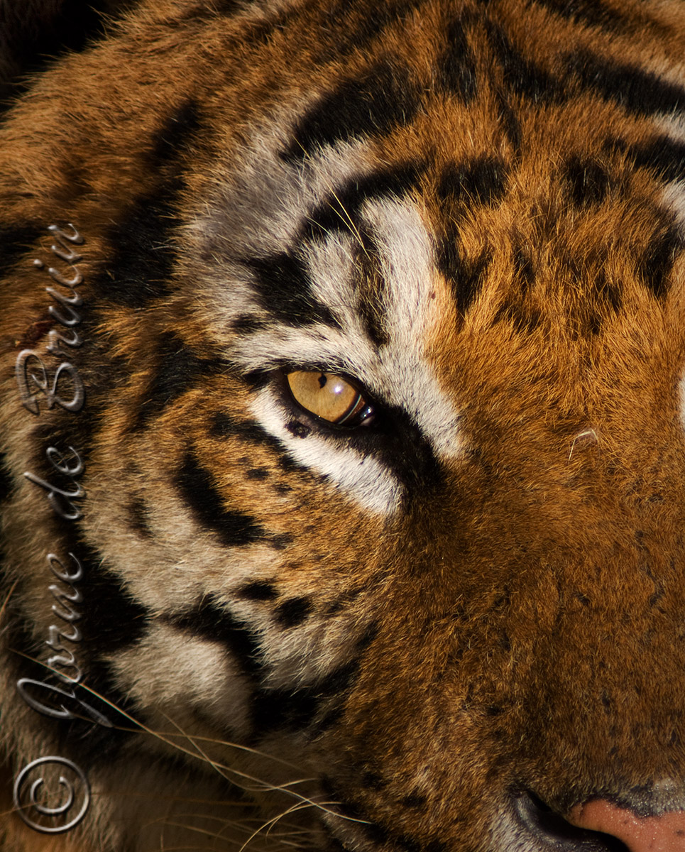
This is an image I've been wanting to post since I got back and finished it, but I had such a hard time finding a title for it I kept delaying it. I finally decided on Primal because for me this covered the emotional content in the best way. I especially loved the light of the early morning sun on the head, and decided to make it my focus in this image.

The image was taken in Spain, and altough this might look like a typical zoo shot I do urge you to take a look at the tech before you think it :wink:

I'd especially like to hear some opinions on the composition, and my 'choice' to leave certrain parts of the head out. ( I really had no choice if I wanted just the tigers face in the image, I was hanging over a 5 meter high wall with hungry tigers at the bottom when shooting this, so I did not have a lot of compositional freedom here :wink: )

Thank you for looking!


Cheers!

Tech: Sony a700 with Minolta 300mm f2.8 & 2.0 Teleconverter @ f/5.6, iso 400 & 1/1000, 60% crop.

Comments

13 comments
Comment posted by Neil Rossmiller on November 11, 2009 at 7:56 AM
Hello Jorne,
I'm a real fan of eyes and frequently try to isolate them as the main point of interest in an image. Success, for me, is fleeting. Big Cats have piercing gazes that seem to reach the soul. I like the crispness of this image. If it were mine, I would have fixed the errant hair on the bridge of the nose, my eye continues to go to it, and perhaps worked on the eye goober in the white area just under the eye.
Nice shot!
Neil
Registered on October 30, 2009, 156 Posts, 749 Comments
Comment posted by Marsel van Oosten on November 11, 2009 at 9:31 AM
That eye and the light here are awesome, that's for sure. Composition not so much, in my very humble opinion of course. :wink:

For me the eye is the subject here, and as it is presented, it is smack in the middle. Also, I think there are quite a few elements in the shot that I would rather not see, or see more of. For instance, the little black triangle in the ulc doesn't add to the shot at all, and I think it shouldn't be there. Same goes for that sliver of white in the middle of the right edge of the frame. And then there's the nose and the whiskers - I'd prefer to see either more or nothing at all.

If this were mine, I'd try a different crop; a vertical one with the eye near the ulc and half of the nose near the lrc. It may not work, but this doesn't either (I know you appreciate me being brutally honest :wink: )
Registered on March 9, 2004, 285 Posts, 2277 Comments
Comment posted by Jorne de Bruin on November 11, 2009 at 10:01 AM
Thanks for the input guys!

Neil: I was not sure if I should remove the hair+goober, probably will try a version of it.

Marsel: you know I appreciate your honesty :wink: While I completely agree with you about the composition I've litteraly tried everything, and this works best (for me) Only improvement I can get without getting a 3 mp file is to remove the white sliver (which indeed has to go).

The image does not really work for me like this, but I have not found an other composition that works better either... I should have shot a vertical, but sadly I didn't :wink:
Registered on June 26, 2008, 178 Posts, 2136 Comments
Comment posted by John Tobias on November 11, 2009 at 10:01 AM
I like this photo. I believe it would be just as effective if it was cropped tighter. Good color and detail of the tigers fur. I would like to know more about the shooting environment. Was the cat in an open area or did you have to shoot through glass, wire or bars? If you did you have done a great job of eliminating them.
Registered on September 12, 2009, 2120 Posts, 6455 Comments
Comment posted by Jorne de Bruin on November 11, 2009 at 10:10 AM
Slight rework: removed the hair+eye thingy and cropped the white sliver off.

John: For the shooting conditions I'd like to refer you to my previous post:

http://www.naturephotographers.net/imagecritique/ic.cgi?a=vp&pr=134013&CGISESSID=2e72ef3603e5e6fe6f2b13808d835237&u=27593

Basicly it's a large open enclosure, much much larger then any zoo (thats why its a wildlife park
:wink: )
Registered on June 26, 2008, 178 Posts, 2136 Comments
Comment posted by Vincent Grafhorst on November 11, 2009 at 12:59 PM
Wow, even the thumbnail alone is a real attention grabber Jorne and the image is of course even more! The great detail, awesome light and the intensity of the eye are fantastic. I quite like your unusual crop decision, it focusses all the attention on that intense and very sharp eye. That said, whether it is the best option from your original file I cannot tell and depends on what sides you have more room. Avoiding a dead centre placement is something I would experiment with as well as exlcuding the nose. However, I know these crop choices can be extremely hard and like you said you have tried several already... :toast:
Registered on February 24, 2006, 504 Posts, 7203 Comments
Comment posted by Jorne de Bruin on November 11, 2009 at 1:25 PM
Thanks Vincent! I think I'll keep the crop as it is now, still not optimal but like I said I don;t have a lot of choice in the matter if I want to keep a workable file :wink:
Registered on June 26, 2008, 178 Posts, 2136 Comments
Comment posted by kiran khanzode on November 11, 2009 at 2:34 PM
A very nice shot,Jorne, I like the eye contact and the catchlight. A little crop off the top(black bg) and right(to remove the white area) can make this even better, imo. :toast:
Registered on February 21, 2009, 83 Posts, 428 Comments
Comment posted by Sally King on November 11, 2009 at 5:13 PM
I love that eye. I do appreciate the repost more with the black gunk below the eye cloned out. I actually like the bit of pink nose in the corner.
Registered on December 2, 2008, 416 Posts, 4450 Comments
Comment posted by Scott Fricke on November 11, 2009 at 9:22 PM
As far as an alternate composition I might suggest cropping out the nose and whiskers so you isolate the eye and the patterns of the fur. Also crop some off the right so the eye isn't centered. But I do like it as posted.
Registered on January 19, 2007, 133 Posts, 1448 Comments
Comment posted by Mike Bonar on November 11, 2009 at 10:25 PM
I really like the shot. I think the composition is just right. The inclusion of the nose and whiskers give it a feeling of depth that might be lost if they were cropped out.

Great Job!
Registered on November 11, 2009, 25 Posts, 50 Comments
Comment posted by Brad Hill on November 12, 2009 at 9:50 AM
Hi Jorne,

Sorry that I'm jumping into this one late in the game...

The eye is certainly compelling, but I'm going the brutally honest route here and agree completely with Marsel's comments. While it's always tough to suggest "the best" crop ("the best" being completely subjective) in this this case without seeing the full frame image I find it extremely difficult. Personally (and if you have the pixels, image sharpness, and DOF to support it) I would go more "abstract" here and work as much as possible with the eye alone. So...I would crop closer and work with the diagonal formed by the eye and black line below it - I'd lose the distracting elements from the main subject (nose, whiskers, and that upper left black triangle) and fill the frame edge-to-edge with that beautiful black, orange and white fur. You have beautiful texture, colour and pattern - plus the awesome eye - to work with here...but you have to simplify it a lot more to make it work maximally. Hopefully you have enough pixels to work with...

Cheers...from...the "other" brutally honest guy...:wink:

Brad
Registered on May 29, 2007, 431 Posts, 6061 Comments
Comment posted by Rick Gomez on November 13, 2009 at 11:46 AM
Great shot! I think the lighting is what really makes this an amazing image. :toast: :jump:
Registered on March 3, 2007, 206 Posts, 1853 Comments