Nature Photographers Network
This is the preserved archive of the original Nature Photographers Network. The community continues at naturephotographers.network.
Green Heron
‹ PreviousAvian GalleryNext ›

Green Heron

by Richard Ditch

Gallery: AvianPosted December 27, 2009157 views18 comments
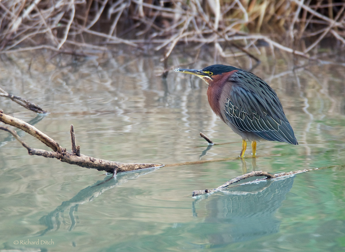
Green Heron (Butorides virescens)

Place: Gilbert Water Ranch, AZ, USA
Date: December 21, 2009
Equipment: Nikon D200, Nikkor AF-S 300/2.8, TC20E (2x), G1325, RRS BH-55, Sidekick
Exposure: Aperture priority matrix metered, ISO 400, 1/40th sec @ f/5.6
Raw, PS CS3 on G4 Mac, moderate crop

Taken on an overcast day with low light conditions. As is typical for my bird photos this shot is as much about the setting and habitat is it is about the heron.

Honest critiques requested; all comments appreciated. I hope you will view the larger imager for maximum impact.

Comments

18 comments
Comment posted by Raymond Klassen on December 27, 2009 at 5:01 PM
Nice lighting, perch and water color. Although I don't love the bg reeds, I think the higher angle is better, as it keeps the head from being lost in the clutter. Good choice of comp.
Registered on November 30, 2008, 114 Posts, 790 Comments
Comment posted by Nick Saunders on December 27, 2009 at 5:21 PM
I like the choice of comp and the aqua-marine water Rich. It looks like the head could use a touch more USM though . The details on the plumage is very nice.
Registered on February 6, 2008, 321 Posts, 3035 Comments
Comment posted by Ron Pullen on December 27, 2009 at 5:31 PM
I really like the feather detail that you've captured and the coloring in the water is nice too. :toast: :toast: Ron
Registered on December 18, 2005, 74 Posts, 1413 Comments
Comment posted by Luke Ormand on December 27, 2009 at 5:38 PM
Love the reflection and the colors of the water.

I like the habitat a lot however, I do find compositionally that my eye is being pulled in many directions. The upper 1/3 of the photo has my eyes moving from left to right following all of the intricate weavings of the vegetation. The heron pulls my eye to the right of the photo, and the parallel branches in the water grab my eye and move it toward the LLC. Certainly this is just my opinion, and the only real "solution" to this would have been getting it from a different angle which may have been impossible to do - or perhaps a head turn toward the camera would keep my attention a bit better. That said, I like this better than a Heron on a Stick shot :wink:

- Luke
Registered on February 4, 2009, 1093 Posts, 7035 Comments
Comment posted by Ravee Wattanatanak on December 27, 2009 at 5:49 PM
Nice shot. I like the water color too.
Registered on December 12, 2008, 105 Posts, 786 Comments
Comment posted by Scott Day on December 27, 2009 at 6:19 PM
I like habitat shots like this too. You have captured the beautiful colors and feather details of these herons well.
Registered on August 5, 2008, 25 Posts, 173 Comments
Comment posted by Dennis Plank on December 27, 2009 at 6:53 PM
Excellent, Richard. Good detail and pose in the bird and very nice environment. The water colors are particularly appealing. :toast:
Registered on January 28, 2008, 1767 Posts, 23192 Comments
Comment posted by Rob Drummond on December 27, 2009 at 7:15 PM
Like this Richard, particularly the way the blues in the foreground complement the bird's plumage.

cheers
Rob
Registered on November 8, 2003, 617 Posts, 8267 Comments
Comment posted by Chris Ross on December 27, 2009 at 7:40 PM
Very nice Richard, the tones in the ater make the shot for me. I'dbe inclined to take a touch off the top so it doesn't draw your eye quite as much.
Registered on November 1, 2003, 403 Posts, 2729 Comments
Comment posted by Ron Dudley on December 27, 2009 at 8:11 PM
Another classic BIH image from you Rich. The bird and water are great but those branch reflections (and whatever else is going on underneath them) are simply amazing I think. A higher angle might have minimized the tangle up top but it would also have meant a higher angle on the bird. The setting, tangle and all, is what makes this shot for me.
Registered on March 30, 2007, 437 Posts, 10915 Comments
Comment posted by Richard Ditch on December 27, 2009 at 8:52 PM
First, thanks to everyone who has commented so far. I appreciate the feedback and I'm pleased that most of you like the image.

Secondly, I don't want anyone to think I'm being defensive but I want to address some of the specifics in the comments. Please don't stop giving your honest responses on this or any other of my images!

I didn't expect much at all when I took this, and I'm surprised by how it looks finished and how much I like it. It was dark by AZ light standards, and it was unusual for me to be at the Water Ranch on an afternoon instead of my usual dawn visits. This was taken at 4:35 pm, about an hour before sunset. I only took about 45 shots over the 2-3 hours I was there, and I only kept about 20 after my edit. But I ended up with three shots (of three species) that I'm pleased with from these 20 frames.

...Although I don't love the bg reeds, I think the higher angle is better...


I too would prefer less texture showing in the background bushes at the top of the frame, but there was no other option at the time of shooting. This is a narrow "channel" between a small island of dense brush and the edge of the pond, and there is only one spot where there's a place to view the channel. Its a steep bank down from the main path, so that's why my angle is what it is here. This was taken with the lens/converter wide open at f/5.6 so I couldn't get less DOF to blur the background.

It looks like the head could use a touch more USM though


I don't think I had enough DOF to get the face/bill as sharp as the rest of the bird. I decided to apply no sharpening of any kind to this before posting (Usually I do selective smart sharpening to the main subject) as I didn't like what I saw when I tried it. One of the aspects that appeals to me the most with this image is the painterly feel it has, and I think part of that comes from overall soft look from the very soft light and the water. Sharpening seemed to destroy that for me so I left it as is.

I do find compositionally that my eye is being pulled in many directions. The upper 1/3 of the photo has my eyes moving from left to right following all of the intricate weavings of the vegetation. The heron pulls my eye to the right of the photo, and the parallel branches in the water grab my eye and move it toward the LLC.


I agree that there's a lot going on here, but personally I don't see that as a negative for the image. I like complicated settings and images, and I don't believe that an image needs to "pop" or have an instant "grab" for it to be a good image. Those factors might be important for contests or other venues where you need to make a strong immediate impression on the viewer, but that's seldom my style of photography. I'm more the contemplative type. My wife compares this to Robert Bateman's style of painting, by the way.

...perhaps a head turn toward the camera would keep my attention a bit better.


Perhaps, but that's something else I don't find necessary for a successful image, and I sometimes show my subject looking into the setting.

I'dbe inclined to take a touch off the top so it doesn't draw your eye quite as much.


This is about the limit of how much I am comfortable in a crop - this is 65% of the full frame and taking off any more would be limiting what I could do with the image.

but I also think that taking some off the top would unbalance the composition and would destroy some of the depth of the image, so I decided that I'd live with the distractions at the top.

The setting, tangle and all, is what makes this shot for me.


Yes!

Again, I'm using the comments as an excuse to talk more about this image, and I'd enjoy any additional dialog on any of these points anyone cares to pursue.
Registered on November 1, 2003, 1031 Posts, 12705 Comments
Comment posted by Mia McPherson on December 27, 2009 at 9:18 PM
Rich,

I like that the bird's head is turned slightly away from you, it indicates that this heron was comfortable in your presence and was content to do what ever it felt like. At this angle I can see the eye, the nice details in the bill and head.

The water color is gorgeous and compliments the color of the bird very nicely.

I find the setting here quietly appealing, it is a wonderful example of the type of habitat this species would be found in. I don't mind the tangled vegetation in the background it is OOF enough that I don't find it distracting and the complexity of the background seems to accentuate the simplicity of the foreground.

I love the fluffed up pose and find the image very peaceful and relaxing to view and that the included habitat simply adds to that feeling.
Registered on June 25, 2007, 491 Posts, 12566 Comments
Comment posted by Cheryl Molennor on December 27, 2009 at 9:24 PM
I love little greens and have yet to get a good one. I love the reflection and environment surrounding him
Registered on June 30, 2009, 300 Posts, 5051 Comments
Comment posted by Jimmie Fata on December 27, 2009 at 9:28 PM
I like the contrast of the bird against the colors of the water. You don't get too many aquamarine water sites where I am so I find it very attractive.
Registered on December 27, 2009, 14 Posts, 55 Comments
Comment posted by Gary Gulash on December 28, 2009 at 1:28 AM
I really don't have any quibbles about the photo, I understand your explanation and agree with it. It's a fine bird in habitat image. I don't have ready access to this type of habitat and would be a happy guy to have this subject to work with and have taken this photo. :toast:
Registered on January 28, 2005, 879 Posts, 12098 Comments
Comment posted by Brian Gatlin on December 28, 2009 at 8:12 AM
Rich, I like this shot a lot. Like you say, there is a lot going on, but I think that's what makes it such an interesting image. I like the colors and textures and reflections in the water. The pose works very well for me--the eye is fully visible, and the bird is looking into the engaging habitat you've included. Really nicely done.
Registered on March 21, 2009, 202 Posts, 4187 Comments
Comment posted by Sally King on December 28, 2009 at 10:49 AM
I love these birds and have only been lucky enough to see them a couple times so far. I love how the light let you show off the birds gorgeous colors and feather details. I don't mind the direction the bird is looking. He is intent on finding food. I also love the turquoise water. It is simply beautiful and works well with the birds colors.
Registered on December 2, 2008, 416 Posts, 4450 Comments
Comment posted by David Williams on December 28, 2009 at 6:27 PM
Really interesting water color here, Richard. I think the color helps bring out the true back and wing color of the bird. A also like how he is hunkered down a bit, and habitat never bothers me at all.....I prefer it. Well done.
:toast:
Registered on March 8, 2005, 315 Posts, 2291 Comments