This image was among the best "gifts" I received over the holiday season of 2009. During the holidays I was browsing through my RAW images taken during a trip to the Canadian tundra in 2004 when I found this image sitting in my collection in RAW, unprocessed form! Bonus! I'm not sure how I missed it the first 20 times I went through the image collection, but I was very pleased to find it. Surprisingly, when I re-discovered this image I immediately recalled all the details of the very memorable situation under which I captured it (which makes me wonder even more about why I had forgotten about the image!).
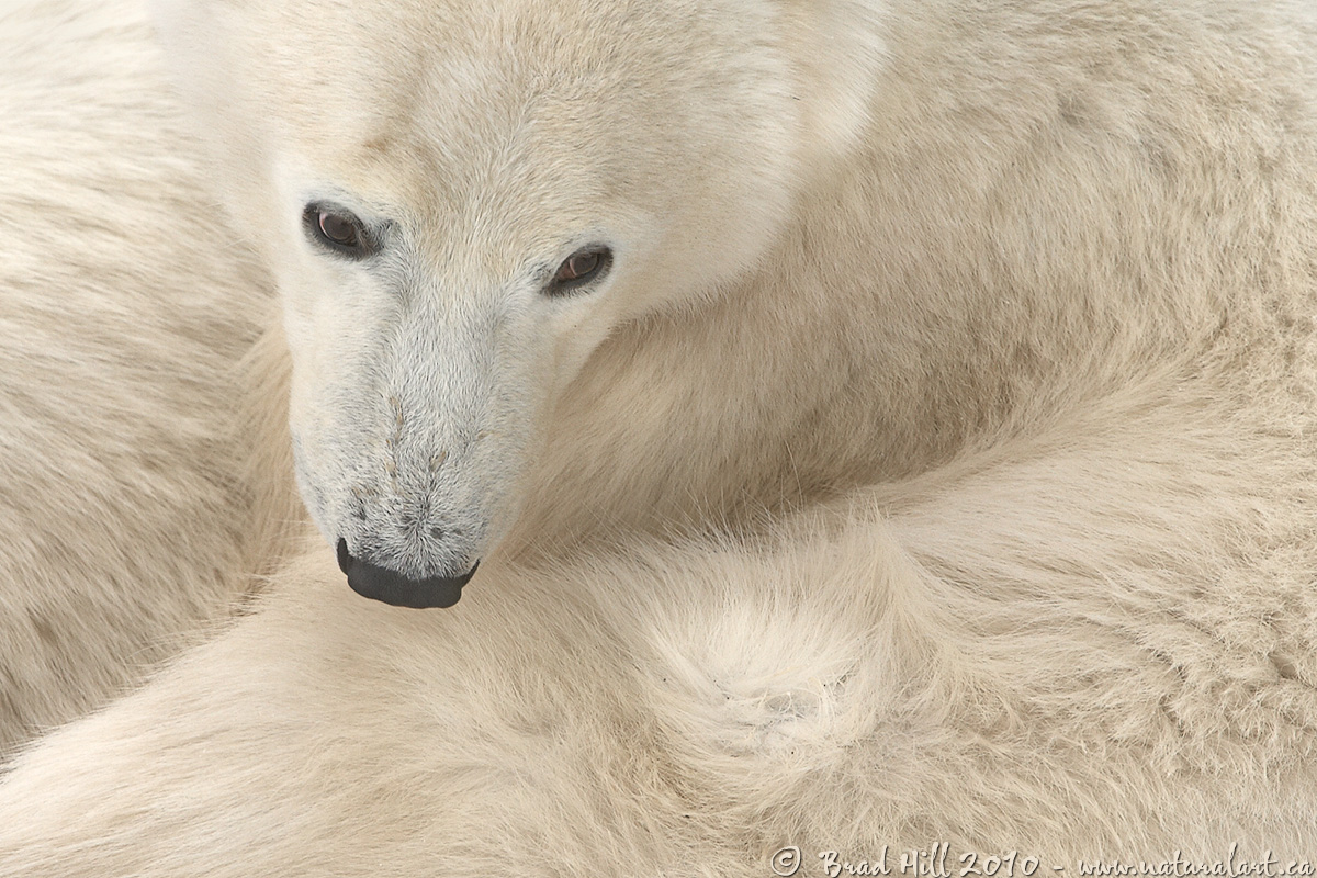
Anyway, this is a shot of yearling polar bear cub cleaning its fur while nestled up against its mother (the mother is the band of fur along the upper portion of the left edge of the frame). We encountered the free-ranging bears out on the tundra (exactly in the middle of nowhere!) and they allowed close approach with no outward sign of alarm or stress. This cub seemed particularly concerned with removing a few specks of dirt in the lighter undercoat of its fur (just visible in the lighter portion of fur near the bottom of the frame). After firing off the obligatory first few "record the event" shots, I sat back and waited until the very gentle cub gave me a composition where its very dark eyes and nose were clearly visible and stood out in contrast from the muted and soft tones of its luxuriant coat.
Subject: Polar bear (
Ursus maritimus) cub cleaning its fur
Location: Cape Churchill, MB, Canada
Camera: Nikon D2H
Lens: Nikon 200-400 mm f/4G ED-IF AF-S VR lens (@ 4000mm - EFL of 600 mm) - handheld. VR on and set to "Normal" mode.
Exposure: 1/80s at f8. ISO 200. +0.67 stop compensation from matrix metered exposure.
Crop: Very minimal - this is about 95% of original image
All the gory details behind this image (field notes, all camera settings and processing details, conservation, etc.) can be found at:
http://www.naturalart.ca/galleries/mammals/bears/detail_61.html.
All comments welcome - I'd be particularly interested whether you prefer the B&W or the colour version of this image (I'm really on the fence myself). As always, probably best to have a peek at the larger version before commenting...
Brad

Comments
21 commentshttp://www.naturalart.ca/galleries/mammals/bears/detail_62.html
Cheers...
Brad
Ken Archer
Other than that, I'd suggest adding a bit more contrast. Your shadows are very far away from black, and I think a polar bear's nose is quite close to black in reality (so, it's not like you'd boost contrast to unrealistic levels). No further nits from me.
-Cam
I much prefer the color version for those subtle pastels - the bw version looks too grey to me.
Thanks for the feedback. I was leaning towards the colour version myself and your comments confirm it.
Some specific responses/feedback:
1. Sally - you asked: Do you ever feel unsafe getting this close to a polar bear?
I was safely up on a an outdoor viewing platform on the backend of a tundra buggy. One of the "tricks" of capturing this shot was to wait until the cub assumed a position where it was angled such that it was mostly perpendicular to ME (as I was shooting down on it). Because when I shot this the cub was leaning against its mother it was at the correct angle for me to capture it without it looking like I was looking down on it. Waiting for it to do this was what required the most patience (and made me unpopular with my tundra-buggy mates who didn't have my level of pickiness).
2. RE: the contrast. I intentionally backed off the contrast on the image (and consciously lightened the nose) to make the image appear "soft" (and gentle). Nonetheless, I may have gone a little too far in reducing the contrast (who says I don't listen to others?!) - I have slightly (as in very slightly) bumped the mid-tone contrast on my master and brought back some of the darker tones on the nose (but I won't touch those eyes!). I've posted the tweaked version on my website here:
http://www.naturalart.ca/galleries/mammals/bears/detail_61.html
Thanks again...
Brad
Not much time for participation these days, but I knew that either you or Stan over at WC would get me off of the viewng sideline and into comment. Turns out you both did.
I prefer the color because it gives a greater sense of depth to me, shallow as it is.
The B&W lacks your normal "POP" IMHO.
Best to you in 2010!
Back to work,Thanks for the break.
Neil