Nature Photographers Network
This is the preserved archive of the original Nature Photographers Network. The community continues at naturephotographers.network.
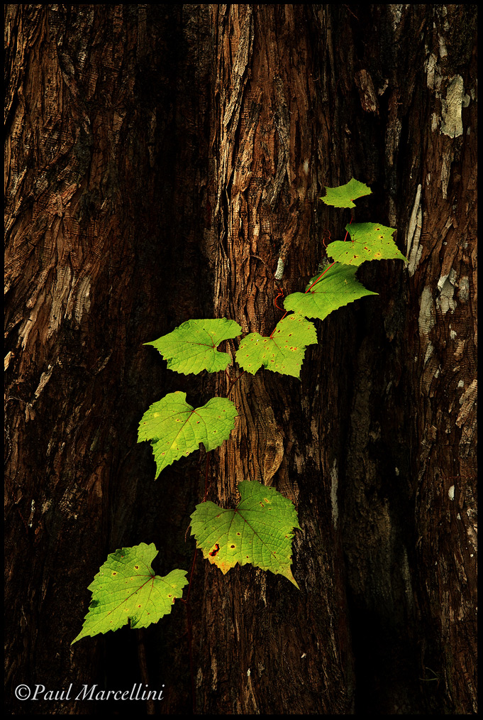
A Scene from the Swamp
‹ PreviousLandscape GalleryNext ›

A Scene from the Swamp

by Paul Marcellini

Gallery: LandscapePosted January 5, 2010438 views24 comments
Rick Gomez and I went for a nice little 7 mile hike to a reportedly nice cypress dome the other day. I have hiked some elevation and I wonder which is worse, this was all mid-calf to mid thigh water and the constant water resistance really took a tole on my knee.

Anyways, we ended up loosing our cloud cover and with the harsh light I made due with smaller scenes. I actually have had a series planned called "Scenes form the Swamp" so I was happy to add to it.

Thanks for the comments on the last,
Paul

5d2, Tamron 28-75

Comments

24 comments
Comment posted by Paul Marcellini on January 5, 2010 at 8:41 PM
here's a bw too
Registered on November 27, 2007, 250 Posts, 2468 Comments
Comment posted by Eva McDermott on January 5, 2010 at 9:11 PM
Beautiful light Paul. I love B&W, but in this case, I prefer the color. This image is very striking with regards to the color and light.
Registered on January 4, 2009, 1015 Posts, 13229 Comments
Comment posted by Rudy Ruberti on January 5, 2010 at 9:16 PM
I really like the way the green leaves stand out against the dark trunks. B&W is nice too, but I prefer color here. I might suggest a slight crop off the top. Well done, Paul.
Registered on October 28, 2008, 179 Posts, 1875 Comments
Comment posted by Rodney Dugmore on January 5, 2010 at 9:22 PM
Great shot Paul.
I like the colour version I think the green makes it as it has a luminous quality against the dark
trunk.
Registered on January 3, 2004, 76 Posts, 1028 Comments
Comment posted by Younes Bounhar on January 5, 2010 at 9:51 PM
I really like the soft light here. Very nice intimate scene. I much prefer the colour to the BW version.
Registered on November 25, 2007, 81 Posts, 1234 Comments
Comment posted by Doug Roane on January 5, 2010 at 10:04 PM
wow, Paul, those leaves just pop off the screen. I like the comp. BW works too, but I prefer the color
Registered on December 12, 2008, 213 Posts, 2226 Comments
Comment posted by Greg Cope on January 5, 2010 at 10:05 PM
I gotta go with color on this one. Either way, I really like the composition with the vertical shadow lines dividing the frame by thirds.
Registered on January 22, 2007, 212 Posts, 2737 Comments
Comment posted by Daniel Ewert on January 5, 2010 at 10:20 PM
I like how the darker background really makes those illuminated leaves stand out. Beautiful image.
Registered on June 2, 2009, 103 Posts, 1500 Comments
Comment posted by Tom Nevesely on January 5, 2010 at 10:47 PM
I also prefer the colour version. I really like how the vibrant green leaves stand out against the brown of the tree trunk.
Registered on June 14, 2005, 147 Posts, 1550 Comments
Comment posted by Stan Rose on January 5, 2010 at 11:31 PM
Sweeet! Love the green on 'black' here. Thats the highlite, and its lost in the monochrome :wink:
Registered on September 15, 2005, 836 Posts, 17099 Comments
Comment posted by Sarah Marino on January 5, 2010 at 11:44 PM
Hi Paul - I really like both but prefer the monochrome. I think the contrast between the leaves and the tree is more dramatic in the monochrome version, which adds more visual interest to me.

I would choose elevation gain over being soggy any day.
Registered on November 10, 2008, 23 Posts, 393 Comments
Comment posted by Vance Gese on January 6, 2010 at 12:37 AM
Exquisite image Paul. The way those green leaves glow against the shadows and the bark is superb. I much prefer the color over the b/w as those greens really sing. Excellent work.
Registered on November 13, 2008, 298 Posts, 6629 Comments
Comment posted by Dietrich Gloger on January 6, 2010 at 5:13 AM
Very strong image Paul. The few leaves are effectivel arranged and well placed within the composition. Light and processing are well handled and compliment the scene perfectly. Very good work!
Registered on January 26, 2007, 360 Posts, 9876 Comments
Comment posted by Matt Anderson on January 6, 2010 at 8:36 AM
Paul, this is a beautiful intimate presentation.
Well done.
(Color is head and shoulders better)
Registered on September 6, 2007, 346 Posts, 2696 Comments
Comment posted by Lajos Horvath on January 6, 2010 at 10:46 AM
Very nice, deep colours. I like a lot them.
Nice work!
Registered on January 3, 2010, 30 Posts, 92 Comments
Comment posted by Phil Pogledich on January 6, 2010 at 12:07 PM
I prefer the color, which is very nice. Like Rudy, I'm also thinking a small crop off the top would be good to consider.
Registered on August 24, 2009, 123 Posts, 3099 Comments
Comment posted by Paul Marcellini on January 6, 2010 at 12:51 PM
Thanks guys, I am with you on the color. Had some requests lately for bw from customers so I was trying here and there. I like the crop idea too.

Thanks again for the comments/critiques!
Registered on November 27, 2007, 250 Posts, 2468 Comments
Comment posted by Derrald Farnsworth on January 6, 2010 at 12:52 PM
Paul, both versions of this image are well done. I am partial to the color version, the green really sticks out on that one. Sorry to hear about your knee.

I am going through the same thing right now - only because of snow resistance!
Registered on August 27, 2007, 56 Posts, 548 Comments
Comment posted by Justin Reznick on January 6, 2010 at 1:00 PM
I definitely prefer the color version Paul. The green contrasting with the browns is striking. I would crop a little off the top. In a perfect world would love to see healthier leaves to give even more contrast to the decaying bark. Would that even be possible if you were there earlier in the season? Great intimate scene!
Registered on November 24, 2009, 79 Posts, 515 Comments
Comment posted by Steve Sieren on January 6, 2010 at 1:24 PM
Love the warmth in the color version but the BW is pretty stark. Like the BW better.

SS
Registered on January 2, 2008, 360 Posts, 5321 Comments
Comment posted by Paul Wegemann on January 6, 2010 at 3:34 PM
Really nice, Paul. I love the color contrasts in the color version, but being a sucker for B&W, I find that one appealing too. They both convey a different feeling. I do think a crop from the top strengthens this image a bit.
Registered on December 14, 2006, 58 Posts, 1888 Comments
Comment posted by Steve Neff on January 6, 2010 at 8:34 PM
I don't know Paul; I don't think I would have pulled a Clyde Butcher and trudged through the swamp to get that phenominal shot. They've got kayaks to get you there you know? The gator factor would be a serious issue, causing me to hand the camera to my wife to get the shot [LOL! just kidding].

That's a gallery shot dude, well done.
Registered on December 11, 2003, 10 Posts, 35 Comments
Comment posted by Rui Vieira on January 7, 2010 at 9:32 AM
Great intimate shot :toast: I prefer the color version, the contrast of the greens against the darker background is awesome :wink:
Registered on September 11, 2008, 39 Posts, 246 Comments
Comment posted by Jimmy Gekas on January 7, 2010 at 1:21 PM
Simple and sweet. This is a great departure from your magnificent grand view images. I really like the soft light that falls on the leaves and some of the bark. Color version works a bit better for me :toast:
Registered on July 26, 2007, 244 Posts, 2807 Comments