Gallery: LandscapePosted January 7, 2010187 views13 comments
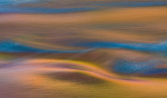
I'm pulled toward abstractions lately, but don't know if they work outside my own strange mind. What do you folks think?
Comments
13 comments
Comment posted by Rui Vieira on January 7, 2010 at 9:20 AM
This one works for me very well I love the mix of colors. Well done.
Registered on September 11, 2008, 39 Posts, 246 Comments
Comment posted by Robert Dayton on January 7, 2010 at 10:10 AM
This works for me. I like the blue and gold combination.
Registered on November 11, 2008, 281 Posts, 3958 Comments
Comment posted by Andreas Resch on January 7, 2010 at 12:30 PM
Abstracts aren't as easy as some might think. You pulled off a very good one here. I like it.
Registered on November 14, 2007, 322 Posts, 6101 Comments
Comment posted by Dean Sauskojus on January 7, 2010 at 1:58 PM
Beautiful! I like it.
Registered on September 29, 2009, 137 Posts, 2659 Comments
Comment posted by John Kerr on January 7, 2010 at 5:20 PM
Nice blend of colors and design.
Registered on October 28, 2009, 111 Posts, 1070 Comments
Comment posted by Harley Goldman on January 7, 2010 at 6:55 PM
Really nice abstract. Works for me. Well done.
Registered on November 19, 2003, 586 Posts, 11271 Comments
Comment posted by Stan Rose on January 7, 2010 at 7:05 PM
'Abstracts' work best for me in the realm of 'nature photography' (as opposed to 'digital art') when i can relate them to nature. So, while i find this to be pretty art, it puzzles me a bit too much as a nature photograph, because im left wondering what is causing the hypersaturated water colors--they arent anything i can relate to in nature. Floris' recent image is a good example of going to the edge of that dividing line, where its surreal, yet you can relate to it; in that case it's the bubbles and ice lines that are very realistic. Here, not only are the colors pumped up, but the exposure is relatively long so its even further removed from 'reality'. All that being said, its an interesting image, and i think if you can tone down the blue a bit it will be pretty cool.
Registered on September 15, 2005, 836 Posts, 17099 Comments
Comment posted by Dan Baumbach on January 7, 2010 at 8:55 PM
Nice blend of shapes and colors.
- Dan
Registered on November 1, 2003, 473 Posts, 7980 Comments
Comment posted by Tony Kuyper on January 7, 2010 at 10:08 PM
I love it when our images cross over into new realms of possibility. It doesn't always work, but I sure love what's going on here.
Registered on November 1, 2003, 364 Posts, 22328 Comments
Comment posted by Wayne Willison on January 8, 2010 at 4:33 PM
Looks like something very interesting in your vision. Undulating colors here really make it for me.
Registered on April 10, 2009, 292 Posts, 3967 Comments
Comment posted by Lon Overacker on January 8, 2010 at 5:28 PM
Scott,
An excellent and bold abstract. I really like that you can see through the blue part of the water - or at least I think I'm seeing through it, or it's a reflection. In either case, it's quite a cool element. I also love the color combo of the oranges and warm tones contrasting with the clear blue areas.
Very nice work!
Lon
Registered on November 24, 2006, 521 Posts, 19147 Comments
Comment posted by Kent Mearig on January 9, 2010 at 7:47 PM
The colors ranging from pastel to electric are very engaging. The long straight bands at the top hang up the movement in the image, so I would prefer a squarer format (losing all/most from the left).
Registered on September 4, 2006, 237 Posts, 4748 Comments
Comment posted by István Molnár on January 15, 2010 at 1:16 PM
Wonderful!
Registered on January 7, 2010, 114 Posts, 704 Comments

Comments
13 comments- Dan
An excellent and bold abstract. I really like that you can see through the blue part of the water - or at least I think I'm seeing through it, or it's a reflection. In either case, it's quite a cool element. I also love the color combo of the oranges and warm tones contrasting with the clear blue areas.
Very nice work!
Lon