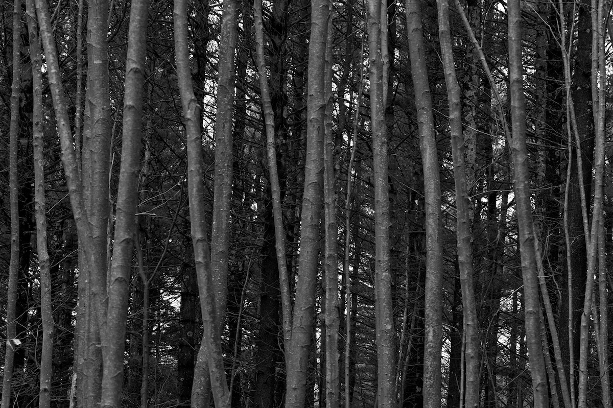
Beech, hemlock, pine
by Chris White
Back to my more chaotic norm ... although I think the silvery beech trunks give this layered, dense image enough structure to make it ... approachable? Thanks for viewing or commenting. This image from New Hamphshire; back to the subtropics soon.
24X36, 100mm f/2 at f/16, 1/100s, ISO1600, handheld, polarizer.
Large image included.

Comments
4 commentsPerhaps a little chaotic, but the repeating trunks and the layers between the beech and background pine give this quite a bit of structure. I'm kinda wishing there weren't "holes" in the forest letting the background sky show through, but the good news is that they're spread out pretty evenly and aren't really all that distracting.
My only nit is that I'm wishing the front trees, the beech trees I'm assuming?, had a brighter tone, letting them separate themselves from the background forest even more. This is of course a b&w, but the trunks are pretty much a mid tone gray. If you could bring up the brightness of the trunks I think that would make a big difference. But that's just one person's opinion.... I do like how you filled the frame and I like the arrangement of all the trunks.
Lon
Seriously, this is a tough subject but i like how youve handled it, theres some good balance here. My only suggestion is along the lines Lon mentions--id like to see better tonal separation--theres a preponderence of dark/heavy here. Keep em coming!
Thanks for the comments. I do need to improve my skills at (1) metering high contrast scenes (I'm trying to refresh my knowledge of zones and translate it to spot metering with a DSLR), and (2) handling contrast in post-processing (in fact, I need to devote more time and energy, and develop more enthusiasm for, post-processing). Also need to use the tripod more, but it's tough when traveling with non-photog friends.
I did work some with contrast, but need to work the luminosity masks more carefully to get anything I'm happy with.
Stan, my next post may be in (gasp) color!
Harley, it doesn't seem soft to me. But my still naive and developing tastes tend to lower saturation and less sharpening than many better photographers prefer. Sharpening, in particular, is an art I still don't understand.
Thanks again for looking, and especially for commenting.
Regards,
Chris