Nature Photographers Network
This is the preserved archive of the original Nature Photographers Network. The community continues at naturephotographers.network.
Frosty Larches
‹ PreviousLandscape GalleryNext ›

Frosty Larches

by Timothy Epp

Gallery: LandscapePosted January 14, 2010143 views9 comments
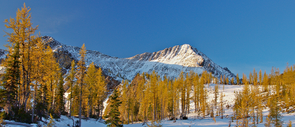
I posted an image earlier this year from this October trip to Mt. Frosty in Manning Provincial Park about 3 hrs east of Vancouver and this is one from that same morning. I did this one as a pano crop which I like, but to me there seems to be a bit much in the way of plain blue sky, however I didn't want to crop the larger Larch to the left, so I'd appreciate your thoughts on that.
It was around -15 celcius on this particular morning so I'm glad I brought extra batteries along.

Specs:
Sony A700/ Tamron 17-50mm F2.8
2 seperate images merged in Dynamic Photo HDR software

Comments

9 comments
Comment posted by Daniel Ewert on January 14, 2010 at 10:08 PM
Nice color in those trees. A fine winter landscape image. I do wish there was just a bit more interest in the sky since there is a lot of it in the frame.
Registered on June 2, 2009, 103 Posts, 1500 Comments
Comment posted by Anthony Vincent on January 14, 2010 at 10:23 PM
Very clean and crisp. Love the colors
Registered on February 5, 2009, 199 Posts, 2775 Comments
Comment posted by Vance Gese on January 14, 2010 at 11:12 PM
Beautiful, crisp winter image Timothy. Understand your desire for more interest in the sky and I would not crop that larch either. You could try a crop on the right hand side, maybe to a line just to the left of where that far ridge bisects the tree line. Might end up with a 2:1 pano, but that would focus the viewers attention more on the line of larches and the mountains dominating the left 3/4 of the image. Just a thought of course. Nice shot.
Registered on November 13, 2008, 298 Posts, 6629 Comments
Comment posted by Chris Chamberlain on January 15, 2010 at 12:40 AM
Very nice colors in this scene. I have never scene a larch tree that I'm aware of. If you were not set on the pano crop, you could take some from the right side. I think I like it just fine the way it is though.

Chris
Registered on March 13, 2007, 500 Posts, 8365 Comments
Comment posted by John Williams on January 15, 2010 at 12:55 AM
I like it Timothy, and think the pano works well. I'm not bothered by the blue sky that much, but think that the larch need to be fired up to help contrast it. With the side light on the larch, I would increase both contrast and saturation in the yellows and let them really glow to balance the sky.
Registered on September 6, 2007, 221 Posts, 5985 Comments
Comment posted by Stan Rose on January 15, 2010 at 3:23 AM
I personally dont feel the tree on the lhs is all that necessary--its the only tree up front and its all the way on the side, which tends to pull your attention over there when really the heart of the comp is the lit mountain. I really like this, the contrasts are great, i just think the balance is slightly off--would like to see more fg snow and less sky up top. :smile:
Registered on September 15, 2005, 836 Posts, 17099 Comments
Comment posted by Lon Overacker on January 15, 2010 at 3:58 AM
Timothy,

I don't mind the sky at all, the color is great and the contrast between the blue and gold is a big part of what makes this scene so beautiful. I'm closer to where Stan is going with this - I like this the way it is, but if anything I would like to see more at the bottom - not necessarily less of the sky. But if you had to twist my arm... I would be happy with this just as presented; the colors are wonderful.

Lon
Registered on November 24, 2006, 521 Posts, 19147 Comments
Comment posted by Kevin Trinkner on January 15, 2010 at 9:03 AM
Love the mix of contrasting colors here, some clouds in the sky would have been nice, but the blues and yellows work well together.
Registered on June 30, 2008, 203 Posts, 2641 Comments
Comment posted by Kevin Trinkner on January 15, 2010 at 9:03 AM
Love the mix of contrasting colors here, some clouds in the sky would have been nice, but the blues and yellows work well together.
Registered on June 30, 2008, 203 Posts, 2641 Comments