Nature Photographers Network
This is the preserved archive of the original Nature Photographers Network. The community continues at naturephotographers.network.
The Mushrooms
‹ PreviousLandscape GalleryNext ›

The Mushrooms

by Catherine Reilly

Gallery: LandscapePosted January 16, 2010276 views14 comments
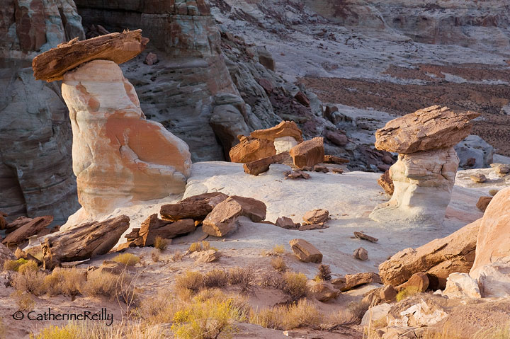
West of Page/Lake Powell at sunset. Cloned out tips of vegetation along the bottom edge and made adjustment to better separate the foreground from the background.

D700, 24-70 @ 70, tripod; f 20, 1/20, ISO 800, -1.00 EV.

Would very much like your opinion on comp and processing. Thanks.

Comments

14 comments
Comment posted by Bob&Charly Nelson on January 16, 2010 at 10:14 AM
I like the comp Catherine, very well composed and presented :toast:
Bob :wavey:
Registered on October 27, 2005, 289 Posts, 4202 Comments
Comment posted by Julie Hatvany on January 16, 2010 at 12:41 PM
I like the comp as well. I also like the touch of yellow provided in the foreground.
Registered on February 10, 2009, 6 Posts, 16 Comments
Comment posted by Eva McDermott on January 16, 2010 at 1:02 PM
The processing looks great Catherine. I also like the comp which is well balanced and you found some nice light.
Registered on January 4, 2009, 1015 Posts, 13229 Comments
Comment posted by John&Patty Benway on January 16, 2010 at 2:32 PM
Very nice indeed Catherine, color, comp and processing is dead on in my opinion. Beautiful work.
John
Registered on May 12, 2006, 626 Posts, 8700 Comments
Comment posted by Reno DiTullio on January 16, 2010 at 2:37 PM
Very nice, Catherine, the low contrast shadowed area in BG really makes the FG pop, well done :toast:
Registered on November 14, 2003, 130 Posts, 1644 Comments
Comment posted by Kent Mearig on January 16, 2010 at 3:56 PM
I've seen other photos of this spot (that I loved) where the post processing was more deliberate in its effort to maximize the attractive aspects of these formations. I find this photo to be very pleasing because of its very natural look and effective composition. I wouldn't mind less room at the bottom though (slightly panoramic).
Registered on September 4, 2006, 237 Posts, 4748 Comments
Comment posted by Albert Darmo on January 16, 2010 at 4:34 PM
Hi Catherine :wavey: A splendid composition. the color tones and detail are so pleasing . :cool: :smile:
Albert Darmo Canada
Registered on November 25, 2008, 1386 Posts, 11978 Comments
Comment posted by Vance Gese on January 16, 2010 at 5:05 PM
Perfectly balanced composition Catherine. Your light-landed processing has resulted in a very natural appearing image with wonderful detail and light. Beautiful work.
Registered on November 13, 2008, 298 Posts, 6629 Comments
Comment posted by Tony Kuyper on January 16, 2010 at 6:38 PM
Know the place very well. You got a lot in here, Catherine. I like the light. Not too harsh, but enough to separate the foreground from the shadows.
Registered on November 1, 2003, 364 Posts, 22328 Comments
Comment posted by Bruce Palla on January 16, 2010 at 11:26 PM
Both look great to me. I like the light and shadow curve.
Registered on December 19, 2007, 25 Posts, 328 Comments
Comment posted by Dean Sauskojus on January 17, 2010 at 2:13 AM
First of all I like how the foreground is separated from the background through the use of light. The light on the foreground is not to harsh and the yellow bushes provides some nice color. The only thing I'd like to see is a bit of sharpening on the background so my eyes aren't confused when focusing. Real nice, Catherine.
Registered on September 29, 2009, 137 Posts, 2659 Comments
Comment posted by Stan Rose on January 17, 2010 at 3:07 AM
Ive stopped there a couple of times, very cool place! I like your comp here, has some nice balance and depth. Its so nice that im gonna be real picky and suggest one minor adjustment--to bring down that one bright area on the extreme right toadstool just a bit using curves or some other method. Nice shot! :wavey:
Registered on September 15, 2005, 836 Posts, 17099 Comments
Comment posted by Robert Dayton on January 17, 2010 at 10:36 AM
Well composed, Catherine. I never tire of seeing images from this area.
You benefitted from good lighting. It's nice that the largest Hoodoo is off
center and that it is diagonally angled to avoid appearing to be static.
With the two larger Hoodoos you've nicely framed the cluster of smaller
ones in the center.
Registered on November 11, 2008, 281 Posts, 3958 Comments
Comment posted by John Williams on January 17, 2010 at 11:04 AM
I too like the comp and how you've set the hoodoos apart from the background with light. My only suggestion would be to add a slight artificial vignette to the bottom half keep the eyes from being dragged to the bright corners.
Registered on September 6, 2007, 221 Posts, 5985 Comments