Nature Photographers Network
This is the preserved archive of the original Nature Photographers Network. The community continues at naturephotographers.network.
Scripps Pier 1
‹ PreviousMan & Nature GalleryNext ›

Scripps Pier 1

by Daniel Cartamil

Gallery: Man & NaturePosted January 31, 2010342 views17 comments
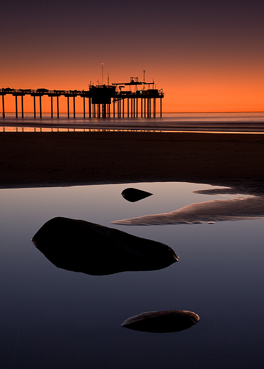
This was actually taken during the past summer, when unusually strong onshore winds were making for extremely clear and colorful sunsets for a three day period (normally southern California sunsets are pretty lackluster in the summer.). Luckily for me, my office is at the base of this pier in La Jolla, so its very convenient to run out when conditions are developing and grab some shots, and be back in my office an hour later. I'm not sure my boss appreciates this as much as I do, but if he doesn't bring it up I won't either!

I thought the rock garden in the center of the foreground pool added somewhat of a zen feel to the scene. There is also a horizontal version below for comparison. I darkened the midground a bit, and cloned out a few footprints.

Canon 40D, f14, ISO 200, 17-85 lens, 4 sec, 3-stop GND (hard)

Comments

17 comments
Comment posted by Daniel Cartamil on January 31, 2010 at 6:47 PM
Horizontal version for comparison
Registered on November 15, 2007, 50 Posts, 601 Comments
Comment posted by Carol Nichols on January 31, 2010 at 7:13 PM
Daniel, I like your vertical version better. The colors in this image are gorgeous!
Registered on November 7, 2007, 161 Posts, 1420 Comments
Comment posted by Kevin McNeal on February 1, 2010 at 12:03 AM
Excellent sharpness - here and the contrast really emphasizes the color through shapes and forms here . Great job.
Registered on May 19, 2006, 209 Posts, 3202 Comments
Comment posted by David Edwards on February 1, 2010 at 4:05 AM
Great shot, Daniel. Pristine color and clarity make this a very sharp and dynamic image. I like the fg (Zen) elements, which are nicely composed into the image. Beautiful sunset color. The verticle is my choice. Nice work.
:smile:
Registered on December 6, 2008, 142 Posts, 2623 Comments
Comment posted by Paolo De Faveri on February 1, 2010 at 5:28 AM
The vertical comp is 100 times stronger and effective than the horizontal, imo. I love everything about this picture, fantastic clarity throughout the frame and wonderful colours.

Paolo
Registered on August 29, 2007, 318 Posts, 1651 Comments
Comment posted by Daniel Cartamil on February 1, 2010 at 2:28 PM
Thanks for the comments! I guess I will shelf the horizontal version, I appreciate the feedback...
Registered on November 15, 2007, 50 Posts, 601 Comments
Comment posted by Jay Nielsen on February 1, 2010 at 4:35 PM
This is really nice! I like how the foreground and background are almost like two separate images stacked on top of each other. I like the vertical version best.
Registered on October 6, 2008, 137 Posts, 720 Comments
Comment posted by Mauro Pasquero on February 1, 2010 at 5:32 PM
Daniel, I do prefer the vertical version too. Amazig light and very strong composition . I do hope that your boss will agree as well ! Did he see it? :toast:
Registered on January 21, 2010, 650 Posts, 2500 Comments
Comment posted by Jim Harris on February 2, 2010 at 10:19 AM
wonderful image here !! I prefer the first image as well,, lovely colors and exposure, I like the freground elements too,, nicely done :toast:
Registered on August 31, 2009, 74 Posts, 368 Comments
Comment posted by Wayne Rhodus on February 3, 2010 at 12:39 AM
I have a vertical eye anyway so the top image really speaks to me. A visual treat from top to bottom Dan ... great capture!
Registered on November 16, 2003, 157 Posts, 3326 Comments
Comment posted by Bob McQuade on February 3, 2010 at 9:47 AM
Absolutely love it, definitely prefer the vertical version. Very dramatic composition and lighting.
Registered on October 8, 2009, 214 Posts, 432 Comments
Comment posted by David Cobb on February 4, 2010 at 10:28 PM
Outstanding Daniel, simple and graphic with a nice play between cool and warm.

David M. Cobb
Registered on December 14, 2007, 312 Posts, 3243 Comments
Comment posted by Youssef Ismail on February 5, 2010 at 3:58 AM
Daniel,

I love the deep silhouette. What happened to stuff like this? Very graphic and powerful attention grabber.
Registered on November 1, 2003, 474 Posts, 5555 Comments
Comment posted by Robert Dayton on February 9, 2010 at 2:52 PM
Congratulations, Daniel. I prefer the vertical.
Registered on November 11, 2008, 281 Posts, 3958 Comments
Comment posted by SandyRichardsBrown on February 9, 2010 at 4:13 PM
Daniel - beaituful image - congrats on the nice EP!!
Sandy r
Registered on November 24, 2003, 3937 Posts, 12909 Comments
Comment posted by Angela Classen on February 10, 2010 at 10:49 AM
Gorgeous colors. I also prefer the vertical version. Congrats on the EP!
Registered on June 13, 2007, 434 Posts, 2742 Comments
Comment posted by Lara Ellis on February 13, 2010 at 10:00 AM
Awesome shot! I love the way your eye leads you in and it looks like you got two shots on one! Nice!
Registered on April 12, 2008, 48 Posts, 30 Comments