Nature Photographers Network
This is the preserved archive of the original Nature Photographers Network. The community continues at naturephotographers.network.
Calling AMOY +REPOST
‹ PreviousAvian GalleryNext ›

Calling AMOY +REPOST

by Brian Gatlin

Gallery: AvianPosted March 5, 2010140 views18 comments
Canon 7D, 500mm f/4 + 1.4x TC. Handheld, kneeling and braced on knee.

1/800, f/9, ISO 400. Full Frame.

Taken at Puerto Penasco, Mexico.

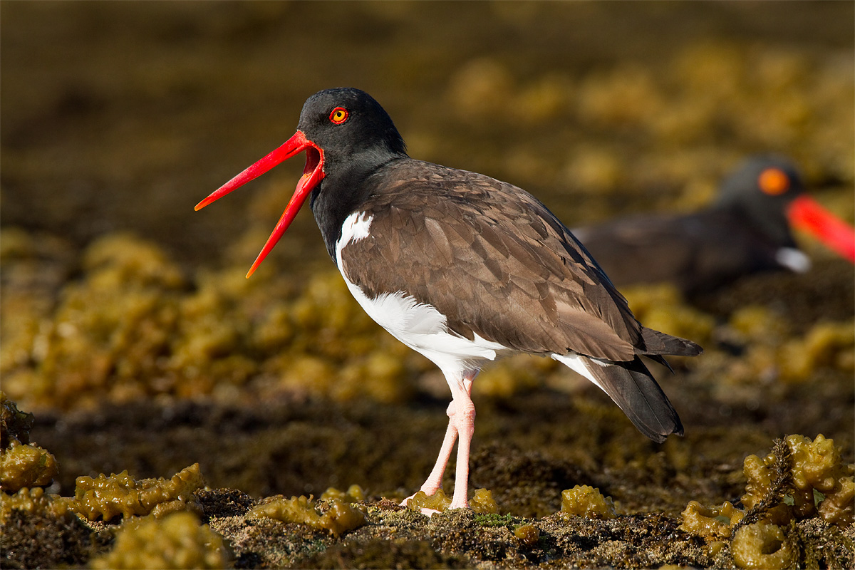
Oystercatchers are among my favorites and I took many frames of them while I was in Mexico. The calling pose makes the shot for me--I can almost hear that high sharp call looking at the photo--otherwise, it has some issues. The reds in the bill are blocked up, the legs are pretty bright, and the vivid greens of the background seem to clash with the colors of the bird. I think the detail in the bird and the good pose make it a worthwhile shot though.

I have a second version where I cropped in tighter (which reduces the amount of vivid greens), but I prefer giving the bird room in the frame and keeping head of the other oystercatcher in the bg. Let me know what you think.

All comments and critiques are appreciated. Please view larger version if possible.

Comments

18 comments
Comment posted by Doug Gilham on March 5, 2010 at 11:03 PM
Nice capture Brian. Besides the nits you've already noted, the OOF bird in the background is a bit distracting, it wouldn't have been so bad had you gotten all of it's bill in the frame IMO. As for the colors, you may try desaturating this a bit, it may help. I looked on my week in SW Florida for these, but was never in the right place at the right time, so great job on this capture.
Registered on September 20, 2009, 77 Posts, 489 Comments
Comment posted by kayes on March 6, 2010 at 12:29 AM
Nice shot, Good focus on the head area. Looks like a hooded Zorro to me :smile:
Registered on February 23, 2010, 51 Posts, 98 Comments
Comment posted by István Molnár on March 6, 2010 at 12:57 AM
Very nice work.
lstván :toast:
Registered on January 7, 2010, 114 Posts, 704 Comments
Comment posted by Jim DeWitt on March 6, 2010 at 3:42 AM
Very nice and interesting light. Nice timing, too.
Registered on August 28, 2006, 1240 Posts, 8506 Comments
Comment posted by Angela McCain on March 6, 2010 at 8:25 AM
Very nice. The reds in the bill don't bother me. I might try saturating the legs a bit to see if you could get the brightness to be less prominent. Not sure that will work though and it's great just as is.
Registered on April 19, 2009, 367 Posts, 3589 Comments
Comment posted by Bob McQuade on March 6, 2010 at 8:44 AM
Background color does not bother me, but OOF bird with bright beak in background really does.
Registered on October 8, 2009, 214 Posts, 432 Comments
Comment posted by Mia McPherson on March 6, 2010 at 8:50 AM
Brian,

I love the great calling pose you have caught here, the setting and the great look at this amoy's eye.

The red bill is a touch too saturated. You might be able to reduce that some though in ACR, by desaturating the red channel some, which I think would be well worth the effort. You could also tone down the background after opening the image in PS.

This is a lovely image and with a few tweaks it could be much stronger.
Registered on June 25, 2007, 491 Posts, 12566 Comments
Comment posted by Brian Gatlin on March 6, 2010 at 9:58 AM
Thanks to all for the constructive comments. This site is fantastic. I feel like I've learned and improved so much in the 6 months I've been active here. This is thanks to the great talent, expertise and knowledge here, as well as the incredible generosity.

For this repost, I have cropped out the oof bird at right, desaturated the red channel (-11 in ACR), reduced the brightness on the legs (-42 in PS), and desaturated the bg (-11 in PS). (Did I overdo the desaturation on the reds?)
Registered on March 21, 2009, 202 Posts, 4187 Comments
Comment posted by Sally King on March 6, 2010 at 10:51 AM
I love the colors (don't know if they are realistic or not). I love the open bill. The OOF guy in the background works for me but I wish the bill hadn't gotten cut off.
Registered on December 2, 2008, 416 Posts, 4450 Comments
Comment posted by Monica Siri on March 6, 2010 at 11:46 AM
Brian,
I like the less saturated red in the repost, I did not mind the bird out of focus if he had not had his beak cut off. Great detail, light and pose. Really nice image! :toast:
Registered on September 20, 2009, 132 Posts, 3764 Comments
Comment posted by David Sparks on March 6, 2010 at 12:59 PM
Brian:
I really like what you did for the repost. The key factors for me were the desaturation of the reds and the reduction of brightness on the legs. I was ambivalent about the OOF bird, but now that I see the repost, I like the image better without it. The DOF is terrific. I really enjoy seeing the detail in the "perch". The calling pose is a strong positive too.
Registered on May 26, 2007, 290 Posts, 4270 Comments
Comment posted by Satie Sharma on March 6, 2010 at 1:08 PM
Sweet shot, Brian. I like the calling pose, detail and setting. I think the repost is better. :toast:
Registered on November 11, 2003, 189 Posts, 5335 Comments
Comment posted by Mia McPherson on March 6, 2010 at 3:46 PM
Brian

I like the colors of the repost much better, I also think that not having the red bill in the background of the OOF bird put more emphasis on the oystercatcher too.
Registered on June 25, 2007, 491 Posts, 12566 Comments
Comment posted by Richard Ditch on March 6, 2010 at 5:09 PM
Good job on the rework - it looks more natural with the reds toned down.
Registered on November 1, 2003, 1031 Posts, 12705 Comments
Comment posted by Steve Balke on March 6, 2010 at 9:01 PM
The repost gets my vote too, Brian. I like it very much as posted. Colors, detail and wide open beak look great. :toast:
Registered on June 18, 2009, 229 Posts, 2915 Comments
Comment posted by Jagdeep Rajput on March 7, 2010 at 12:22 AM
Beautiful frame ! The repost looks so much better !
Jagdeep Rajput
Registered on April 29, 2008, 686 Posts, 2857 Comments
Comment posted by Kurt Bowman on March 7, 2010 at 12:37 AM
I like the repost on this one Brian! Terrific angle and like the less saturated colors in the second post.
Registered on June 19, 2008, 1005 Posts, 8028 Comments
Comment posted by Nick Saunders on March 8, 2010 at 7:23 AM
Well done Brian. The repost is a big improvement. I zoned right in on the main subject. :toast:
Registered on February 6, 2008, 321 Posts, 3035 Comments