Nature Photographers Network
This is the preserved archive of the original Nature Photographers Network. The community continues at naturephotographers.network.
A Cool Tremont Morning(+ edit)
‹ PreviousLandscape GalleryNext ›

A Cool Tremont Morning(+ edit)

by Paul Marcellini

Gallery: LandscapePosted May 5, 2010583 views32 comments
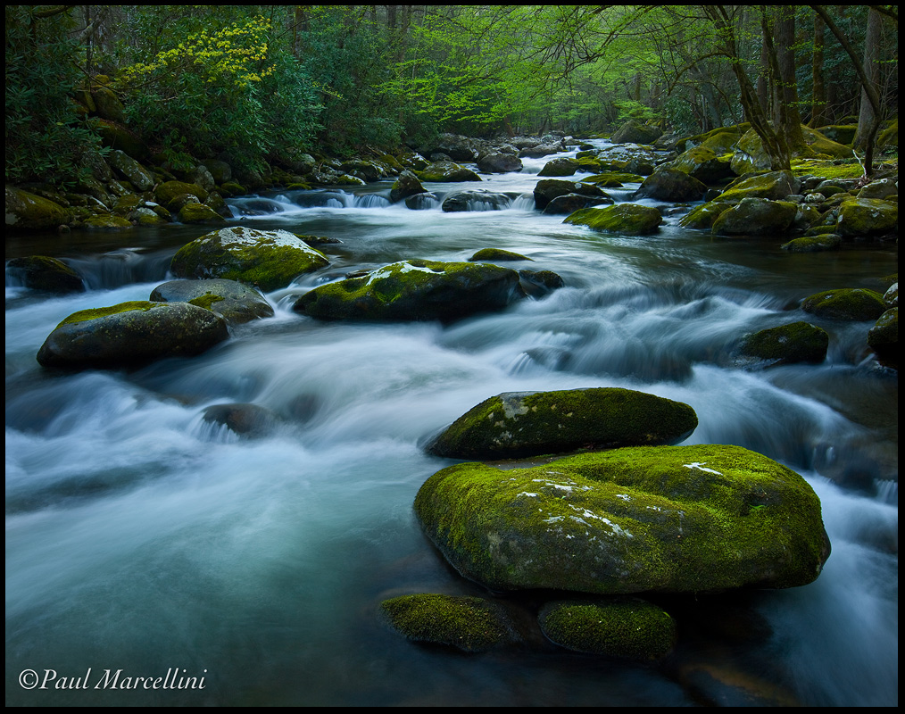
Here's the next image taken up around Tremont. I was hoping to find some moss covered rocks since Roaring Fork was closed. Again, processed cooler but I just couldn't bring myself to warm it up. This was early morning and was pretty cold for this Miami boy. =) I also wanted to highlight the water, and how it turned out, so i left it a bit darker, I do have some nice bright exposures to bring in shadows if needed.

Thanks for the comments on the last, always much appreciated.
Paul

Canon 5d2, 16-35@27
ISO: 100
Aperture: 16
Shutter: 1.6

Comments

32 comments
Comment posted by Chris Chamberlain on May 5, 2010 at 10:10 AM
I think the exposure looks great, and don't think it needs to be warmed up any. It's a beautiful place, that you have presented very well. i'm amazed at the lack of debri/clutter in the scene. it;s so pristine looking. It seems there are always too many branches/fallen trees cluttering up the edges of the creeks/rivers around here. I might reduce the cyan in the white water only, just a bit.

Chris
Registered on March 13, 2007, 500 Posts, 8365 Comments
Comment posted by Guy Tal on May 5, 2010 at 10:15 AM
This feels calm and quiet to me. A place I would love to just sit and listen to the flowing water and wind in the trees.

Guy
Registered on November 1, 2003, 566 Posts, 15507 Comments
Comment posted by John Williams on May 5, 2010 at 10:49 AM
This is very rich! I think I'd leave as is Paul. This is a wonderful, peaceful feeling, stream shot, and I really like the way that lrc anchors the shot.
Registered on September 6, 2007, 221 Posts, 5985 Comments
Comment posted by Anthony Vincent on May 5, 2010 at 11:02 AM
Very nice Paul and like your choice of leaving this one cool. So many spots in the park that have that calming presence. Nice work at capturing it
Registered on February 5, 2009, 199 Posts, 2775 Comments
Comment posted by Stuart Williams on May 5, 2010 at 11:07 AM
comp is spot on. i like everything about this, paul. i only wonder about the contrasts (maybe a touch of detail in those shadows would help!?) and the odd orange colour in the bottom right??
Registered on December 7, 2007, 247 Posts, 4792 Comments
Comment posted by Bill Chambers on May 5, 2010 at 11:55 AM
A beautiful catch Paul, and I like the lower perspective too.
Registered on April 10, 2005, 753 Posts, 21216 Comments
Comment posted by Matt Anderson on May 5, 2010 at 12:20 PM
Paul, nice work.
Intoxicating environment.
I sorta want it just a slight bit warmer.
But that is easily a choice made by a viewers mood.
Registered on September 6, 2007, 346 Posts, 2696 Comments
Comment posted by Rodney Ninow on May 5, 2010 at 12:23 PM
Beautiful image. Great composition and good choice of shutter speed. Overall, the image feels a little dark to me, not much, maybe 1/3 a stop.
Registered on January 11, 2009, 7 Posts, 123 Comments
Comment posted by Verena & Georg Pop on May 5, 2010 at 1:28 PM
wonderful dof and mood! I can breath the wet air. very calming image.
georg
Registered on July 5, 2006, 272 Posts, 2823 Comments
Comment posted by Daniel Rappaport on May 5, 2010 at 1:30 PM
Well composed. Nice cool green tones.
Registered on September 9, 2009, 294 Posts, 2006 Comments
Comment posted by Luis Argerich on May 5, 2010 at 1:34 PM
It looks like a night shot, with nice blues on the water. The green is bright and eye-catching, really wonderful picture.
Registered on December 22, 2009, 91 Posts, 1349 Comments
Comment posted by Balakumar Kaushik on May 5, 2010 at 1:56 PM
Very beautifully composed Paul. Don't mind the cooler processing.
:toast:
Registered on January 4, 2008, 98 Posts, 1403 Comments
Comment posted by Daniel Cartamil on May 5, 2010 at 2:03 PM
Nice - this is all about the comp, it feels perfectly framed.
Registered on November 15, 2007, 50 Posts, 601 Comments
Comment posted by Jim Goldstein on May 5, 2010 at 3:07 PM
The color of the water and moss in combination with the good deal of contrast make for a dark mood that I like a lot. The darker and cooler tone of the image works for me Paul.
Registered on March 18, 2006, 119 Posts, 878 Comments
Comment posted by Scott Anderson on May 5, 2010 at 3:30 PM
Great shot, Paul! I especially like the yellowish-green treen on the top left--it's a nice place for my eyes to rest.
Registered on July 1, 2009, 30 Posts, 181 Comments
Comment posted by Walt Sterneman on May 5, 2010 at 3:50 PM
Very pretty Paul. I like it as is. I'm with Guy, I could just sit down here and enjoy!
Registered on March 24, 2010, 73 Posts, 1268 Comments
Comment posted by Dietrich Gloger on May 5, 2010 at 4:21 PM
Excellent comp and great mood. All works very well here.
Registered on January 26, 2007, 360 Posts, 9876 Comments
Comment posted by Robert Dayton on May 5, 2010 at 4:24 PM
I like the tonality. Beautiful combination of blues and greens. Well done, Paul.
Registered on November 11, 2008, 281 Posts, 3958 Comments
Comment posted by Paul Marcellini on May 5, 2010 at 5:11 PM
Thanks everyone! Here's a touch brighter/warmer version, and the orange spot on the bottom is an underwater rock. Something I will desat on the master file.

Registered on November 27, 2007, 250 Posts, 2468 Comments
Comment posted by Art Escobado on May 5, 2010 at 8:06 PM
The processing looks very believable to me-nice image!
Registered on January 7, 2007, 0 Posts, 775 Comments
Comment posted by Dan Baumbach on May 5, 2010 at 9:05 PM
The warmer version is very nice.

- Dan.
Registered on November 1, 2003, 473 Posts, 7980 Comments
Comment posted by Dean Sauskojus on May 5, 2010 at 9:07 PM
I'll take either one, but I'm slightly in favor of the second. It has a little more life to it. Everything looks good Paul.
Registered on September 29, 2009, 137 Posts, 2659 Comments
Comment posted by Richard Siggins on May 5, 2010 at 9:18 PM
I really like the greens and blues in the photo. I wouldn't change the color temp at all. Well done.

Is this the week for Florida Boys to come to the mountains?
Registered on October 11, 2007, 115 Posts, 223 Comments
Comment posted by Tony Kuyper on May 5, 2010 at 10:11 PM
This is really good, Paul. From comp to light I love every pixel.
Registered on November 1, 2003, 364 Posts, 22328 Comments
Comment posted by Morris McClung on May 5, 2010 at 10:30 PM
Beautiful scene. Great greens and I like it darker here. It feels more intimate.
Registered on May 7, 2007, 670 Posts, 19650 Comments
Comment posted by Bruce King on May 5, 2010 at 10:50 PM
Great work Paul. I like both versions. I suppose the brighter will get the most nods but the darker has an aire of mystery about it and I like that. I second Chris's comment about the lack of clutter. I often spend time grooming a scene like this when practical but they never look this clean. Two thumbs up, nice going.
Registered on January 14, 2010, 276 Posts, 2212 Comments
Comment posted by Erik Iverson on May 5, 2010 at 10:51 PM
Perfect. Calm. Peaceful. Love it.
Registered on March 8, 2010, 1 Posts, 26 Comments
Comment posted by Adrian Klein on May 6, 2010 at 12:18 AM
Wonderful scene here Paul and captured with your fine touch as usual. I agree with the others, I like the edit slightly more. I could easily hang out in a place like this for quite a while.
Registered on June 10, 2007, 112 Posts, 1506 Comments
Comment posted by Yan Zhang on May 6, 2010 at 4:58 AM
Paul, this is a really nice shot. I like the DOF and the milk feeling of the water. The FG rock pushes this picture even higher.
Registered on April 10, 2010, 28 Posts, 292 Comments
Comment posted by Bruce Painter on May 6, 2010 at 10:20 AM
Both versions are good and I understand your reasoning for the cooler processing on the first but I like #2 a little better. I seems a little more natural to me. Great work.

Bruce
Registered on May 11, 2006, 50 Posts, 207 Comments
Comment posted by Stan Rose on May 6, 2010 at 11:37 AM
Very nice, great depth. The other one was better, but this is still terrific.
Registered on September 15, 2005, 836 Posts, 17099 Comments
Comment posted by Rick Gomez on December 10, 2010 at 6:45 PM
Its amazing that of all the foreground rocks in all of the Smokys even though we've never shot together out there, we pick the same damn rocks as a foreground. That's just too cool. It's not like this is one of those obvious, off the side of the main road shots either. I gotta show you mine.
This looks great BTW.
Registered on March 3, 2007, 206 Posts, 1853 Comments