Nature Photographers Network
This is the preserved archive of the original Nature Photographers Network. The community continues at naturephotographers.network.
Out on a Limb
‹ PreviousLandscape GalleryNext ›

Out on a Limb

by Lon Overacker

Gallery: LandscapePosted June 5, 2010425 views37 comments
First of all, thank you so much for the comments on my previous image.

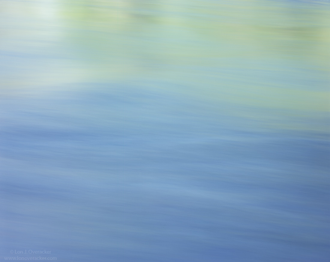
I'm very interested to get a reaction to this. I say quite often that "simple is almost always good." Well, how simple is simple before it becomes nothing? How close is this to just posting a colored square? Am I too far out on the limb with this?

I captured 4 images along the side of the Merced river during our recent trip. I was hoping for some nice standing waves in the river combined with some beautiful reflected light. didn't find the standing waves I was looking for and ended up trying four different exposures; 1/4s, 1s, 4s, and 8s. This is the 8s result.

Anyway, out of all of them, I keep coming back to this one. But I just don't know if there's anything here to keep one's interest for more than a passing look.

Would appreciate some honest and straight forward comments on this one.

4x5, Nikkor 300mm, V100, f/4 @ 8s.

Thanks!

Lon

Comments

37 comments
Comment posted by Eric Good on June 5, 2010 at 5:17 PM
While I enjoy the minimalist nature of this image, I'm a little ambivalent about the white area in the ULC. I kind of wish the green tones ran all the way across the image. For me, one lone twig or rock would well placed in the image would be a nice addition. Probably would work well in a medical office or such due to its calming qualities.
Registered on March 17, 2007, 116 Posts, 4764 Comments
Comment posted by Julian Barkway on June 5, 2010 at 5:31 PM
The colours are delightful and the overall effect is very Mark Rothko but, despite that, I do feel there should be just one more element to bring things together and provide somewhere for the eye to settle.

That said, it's still very much a Lon Overacker.
Registered on January 18, 2007, 344 Posts, 1961 Comments
Comment posted by Dietrich Gloger on June 5, 2010 at 6:07 PM
First of all, a beautiful and appealing image Lon. The soft structure and the pastels are really sweet. The 1/3 - 2/3 division into two different colours is effective.
For me this image is rather an abstract image, and therefore I think some more added (highlight) contrast to bring out the structure of the water can help to make it more powerful - but only if this is the intention. Now almost in contradicion to what I just said - I think there is too much structure for it to work as image of "nothing". Also the scale is recognizable which might work against that "ethereal" effect - if you were after it.

All this is just me trying to intellectualize my reaction to this image. Hope it makes sense and helps. Maybe this helps the least -I like this one! :biggrin:
Registered on January 26, 2007, 360 Posts, 9876 Comments
Comment posted by Chris White on June 5, 2010 at 6:31 PM
Thought provoking, for me, quivering right on the edge of enough ... I like the hues, a bit more 'upbeat' than Rothko, I think.
Registered on February 27, 2007, 61 Posts, 945 Comments
Comment posted by Luis Argerich on June 5, 2010 at 6:56 PM
It's a beautiful pastel palette Lon and I think that it's very difficult to see how it works here. I'm betting it really looks fantastic in a large print.

:toast:
Registered on December 22, 2009, 91 Posts, 1349 Comments
Comment posted by Marc Adamus on June 5, 2010 at 7:41 PM
You used a sheet of 4x5 on this?! :biggrin: :wink: I'd see if you could enhance select textures just slightly but that's pretty nit-picky. I do like it. Reminds me of the gentle simplicity of some of Mark M's seascapes. There's a lot more to capturing these so nicely than one might think.
Registered on September 17, 2005, 780 Posts, 8091 Comments
Comment posted by Bill Chambers on June 5, 2010 at 7:52 PM
I enjoy this A LOT. This is a long way from becoming "nothing". Gorgeous color combination and it still has a nice flow to it.
Registered on April 10, 2005, 753 Posts, 21216 Comments
Comment posted by Harley Goldman on June 5, 2010 at 8:47 PM
I think it is excellent! It is a beautiful abstract and the soft colors and patterns are plenty to hold my attention. I don't think it is "an NPN image", but I it is my favorite of your recent Yosemite posts and perhaps your posts for a while. I second Bill, I like it a lot.
Registered on November 19, 2003, 586 Posts, 11271 Comments
Comment posted by Kah Kit Yoong on June 5, 2010 at 9:14 PM
I wouldn't say it's one of your top tier of work but it does look pretty and have considerable appeal as a minimalist fine art landscape. The subtle differences in colour work well and I suspect a shutter speed of 30-60 seconds might have given it an even more ethereal abstract look.
Registered on September 27, 2006, 636 Posts, 10682 Comments
Comment posted by Ben Horne on June 5, 2010 at 9:26 PM
Very calm colors, and the hint of flowing water texture with a diagonal flow. This is the type of image that the web does not do justice to. If this was printed at a reasonable size (30x37 or larger) and presented with a nice mat and contemporary frame, the overall impact would be nice.
Registered on August 27, 2009, 51 Posts, 959 Comments
Comment posted by Eva McDermott on June 5, 2010 at 9:48 PM
At first I was on the fence about this one Lon thinking there should be something else there. I have come back to it several times today and the more I see it, the more I like it. Tranquil and beautiful colors with a slight hint of detail. My only nit or wish is that the upper greens had a more continuous tone.
Registered on January 4, 2009, 1015 Posts, 13229 Comments
Comment posted by Daniel Ewert on June 5, 2010 at 10:32 PM
Beautiful abstract image, Lon. The colors here are great.
Registered on June 2, 2009, 103 Posts, 1500 Comments
Comment posted by Chris Chamberlain on June 5, 2010 at 10:35 PM
Well, I don't know if you could get any more simplistic if you tried! I think there is a sort of no-man's land with these. You can go too simple, or not simple enough, if that makes sense. But this goes beyond too simple IMO, and it works because of that. I have to say the blues, and the rest of the colors are really nice. There is enough texture in the water to look at, and even a little rolling going on with the water. I think I would tone down the brightest spot in the upper left.

Chris
Registered on March 13, 2007, 500 Posts, 8365 Comments
Comment posted by Ned Fenimore on June 6, 2010 at 12:43 AM
Simple, subtle beauty.. one of your best I feel...
Registered on November 1, 2003, 467 Posts, 2803 Comments
Comment posted by Stuart Williams on June 6, 2010 at 1:14 AM
i like it - there's sufficient texture and flow to be interesting. the transition from cold to warm colours adds tension. but ... i do suspect that some element would have sent it through the roof. and ... I also suspect that, in your future experiments, that this sort of image requires excuriatingly careful composition and vision of the final rendition of the colours to be extraordinarily successful.
Registered on December 7, 2007, 247 Posts, 4792 Comments
Comment posted by Andreas Resch on June 6, 2010 at 2:45 AM
Looks simple to capture but all who have tried such a shot before know, that it isn't. I love the soft hue change from top to bottom and the slight hint of waves. Great capture, Lon.
Registered on November 14, 2007, 322 Posts, 6101 Comments
Comment posted by Stan Rose on June 6, 2010 at 3:04 AM
Usually i dont look at any comments before i comment--dont want any external influence--but this time i read all the comments first (kind of an experiment :wink: ) before checking out the post. Interesting split of views here. I still havent seen the shot. Drum roll please.... :biggrin:
Ok, well...I really like it. There's more than enough here to keep it out of the boring minimalist category. the nice curved lines and especially the sweet reflections at top make it a pleasure to view. I think i would like it even more with some additional twist thrown in to the bottom 2/3, which would disrupt the nice flow of course, but im partial to scenes with a bit of tension thrown in. :wavey:
Registered on September 15, 2005, 836 Posts, 17099 Comments
Comment posted by R.Bill Moser on June 6, 2010 at 3:08 AM
this works for me. This is an excellent abstract image.I like the soft structure and the pastell colors. It looks very appealing to me.
Registered on January 29, 2010, 285 Posts, 4281 Comments
Comment posted by Danny Laureys on June 6, 2010 at 5:31 AM
I like this a lot Lon, simple but beautiful, almost like a painting very well done, maybe the bright spot in upper left could be toned down, but really minor to me. :toast: :toast:
Registered on January 5, 2008, 590 Posts, 1261 Comments
Comment posted by Patricia Brundage on June 6, 2010 at 6:06 AM
Although there is a variation in color tones from bottom to top, there still isn't enough to hold my interest. A few strong waves would certainly have helped. :biggrin:
Registered on March 23, 2006, 1111 Posts, 6531 Comments
Comment posted by INGOMA on June 6, 2010 at 10:48 AM
I am glad you went out on a limb, Lon. This is lovely and I think the more subtle details here, rather than strong textures, make this so special. For my tastes, I might have gone with less of the green area and rather have it as a top border for the lower blues. Lovely image.
Registered on July 2, 2004, 231 Posts, 3110 Comments
Comment posted by Paul Breitkreuz on June 6, 2010 at 12:06 PM
Lon, this works for me. Obviously about as simplistic as it gets for elements, but also a far cry from the chaotic scenes we see too. I'm not sure if the inclusion of Monet fits, but to me it has that painterly appeal and for that reason alone it is very nicely captured. The white area mentioned could be addressed with some minor color painting/blending there, but that is no nit at all IMO. :cool:
Registered on February 25, 2006, 525 Posts, 8448 Comments
Comment posted by Guy Tal on June 6, 2010 at 12:29 PM
I love it, Lon! I'm generally a fan of abstract images that give the viewer just enough to begin guessing and exploring, which is exactly what you've done here. The color palette is very pleasant too.

Guy
Registered on November 1, 2003, 566 Posts, 15507 Comments
Comment posted by Mark Windom on June 6, 2010 at 1:02 PM
Love the soft pastels and painterly quality of this. The very upper left corner is just a little too bright, IMO. Nice stuff!
Registered on November 1, 2003, 176 Posts, 2302 Comments
Comment posted by Steve Sieren on June 6, 2010 at 1:48 PM
Lon, this is definitely the most simple photo on the page today. You've got the thirds things down. I see consumers hanging this stuff all the time and it's just too simple for words.
Registered on January 2, 2008, 360 Posts, 5321 Comments
Comment posted by Tony Kuyper on June 6, 2010 at 4:36 PM
I love it, Lon. A whole series of these would make an awesome art show in some big corporate space. Very arty compared to the more "natural" nature photography we're used to seeing.
Registered on November 1, 2003, 364 Posts, 22328 Comments
Comment posted by Anthony Vincent on June 6, 2010 at 6:10 PM
Sometimes the things that catch our eye reflect what's going on in our lives. Feeling calm and peaceful Lon?
Great job with this one and the watercolor like palette of colors is just enough to evoke emotion.
Well done
Registered on February 5, 2009, 199 Posts, 2775 Comments
Comment posted by Paul Marcellini on June 6, 2010 at 6:24 PM
I love these types Lon. I just love complicated scenes more. I do occasionally shoot something nice and simple though. This is a great example of that. The tones are wonderful and complimentary.
Registered on November 27, 2007, 250 Posts, 2468 Comments
Comment posted by Raymond Marlow on June 6, 2010 at 11:57 PM
Lon I have to chime in to the point where I am longing for some more texture or something in the water. A bit surprised that for an 8s shot there isn't more to see but I do agree with many that this image does have a place in certain places where placid, calm settings are the must. looking at it more closely I almost feel like I'm looking through a window and its not a picture. It does have me looking and that's a key point in an image.
Registered on October 15, 2008, 158 Posts, 531 Comments
Comment posted by Rick Lundh on June 7, 2010 at 3:33 AM
Lon,

Although I love the idea here...this, for me... is too simplistic. It's not even an abstract at this texture and light level. Being completely honest (because that's what I do)... move on from this one. It's not up to par with the rest of your work. I do like the idea though...but this type of shot takes a lot of trial and error as you know already...
Registered on April 28, 2004, 774 Posts, 4351 Comments
Comment posted by Yan Zhang on June 7, 2010 at 5:48 AM
Lon, I like this image a lot. Simplicity is one of my main photography rules, but I found it was so difficult to achieve without reducing another important goal "Beauty". This photo is as simple as it is and is so nice. Besides the colors, the structure of water is quite special.
Registered on April 10, 2010, 28 Posts, 292 Comments
Comment posted by Dan Baumbach on June 7, 2010 at 9:10 AM
I don't know, Lon. It certainly is pretty. But as a print on my wall, would I enjoy looking at it every day, I don't know.

- Dan.
Registered on November 1, 2003, 473 Posts, 7980 Comments
Comment posted by Verena & Georg Pop on June 7, 2010 at 12:11 PM
I think the urc is a bit out of focus and the comp could be improved by cropping from the..... :biggrin: :biggrin: :biggrin:
nah! its good as is, not exactly an eye-popper and you won't win many poto contest with it ( which means it might really be a good image...) but its a great image to just stare at. what more could you ask for.
georg
Registered on July 5, 2006, 272 Posts, 2823 Comments
Comment posted by Jimmy Gekas on June 7, 2010 at 1:20 PM
Simple and soothing. I like this. :toast:
Registered on July 26, 2007, 244 Posts, 2807 Comments
Comment posted by Anil Rao on June 7, 2010 at 9:37 PM
Hi Lon,

In my opinion images such as this one challenge the mind. Folks who appreciate such a challenge will find enjoyment in this photograph, while others might not. You already know which camp I fall in. I am very glad to see that you are pushing not only your own boundaries, but also that of the viewer. It is definitely needed and goes a long way to show what photography is all about.
Registered on November 15, 2003, 234 Posts, 4923 Comments
Comment posted by Kent Mearig on June 7, 2010 at 10:37 PM
35 people already commented on...nothing...let's make it 36. If it had been my own "vision", I can imagine growing very attached to this photo. As your thought/response/presentation, I just don't feel like you're showing me much. Count me among those who have needed some kind of anchor (maybe more of a hook) that is missing here. Keep climbing out on those limbs. It's worth it.
Registered on September 4, 2006, 237 Posts, 4748 Comments
Comment posted by Pramod Viswanath on June 8, 2010 at 3:16 AM
To simply put it - I love it. Am sure a big print would have a stunning image and the abstractness in the image is amazing!
Registered on December 4, 2008, 60 Posts, 697 Comments