Gallery: LandscapePosted June 7, 2010191 views22 comments
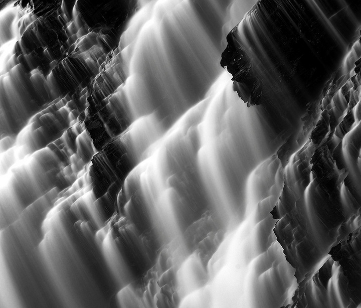
During a workshop in a beautiful vale with numerous waterfall everywhere. I felt inspired by this mixture of rocks and water.
"cascade de trainant . Samoens . France (74)"
Comments
22 comments
Comment posted by Karsten Wrobel on June 7, 2010 at 3:42 PM
beautiful patterns and contrasts + gorgeous detail Alexandre... I find myself holding my head at an angle and wonder whether I enjoyed the image more if the water was flowing downwards... but that may just be me...
Registered on November 1, 2008, 117 Posts, 851 Comments
Comment posted by Steve Sieren on June 7, 2010 at 4:06 PM
I like the way you tilted the angle to change the dynamic of the image Alexandre. Good stark contrast for the black and white conversion. The amount of single cascades looks like it could reach infinity.
Registered on January 2, 2008, 360 Posts, 5321 Comments
Comment posted by Ron Richins on June 7, 2010 at 4:12 PM
I like how you've tilted this, and I think it works well. Nice shot.
Registered on March 6, 2008, 113 Posts, 1009 Comments
Comment posted by Eric Good on June 7, 2010 at 4:32 PM
The tilt gives this a wind-swept feel which I like. Nicely seen, captured and processed!
Registered on March 17, 2007, 116 Posts, 4764 Comments
Comment posted by Stuart Williams on June 7, 2010 at 5:06 PM
great cascades suited to the strong contrast. you might test us by posted a not-tilted image and seeing which we prefer!?
Registered on December 7, 2007, 247 Posts, 4792 Comments
Comment posted by Scott Fricke on June 7, 2010 at 6:53 PM
Very nice image, but in the end the tilt doesn't feel right to me, I think it works on it's own with the correct orientation.
Registered on January 19, 2007, 133 Posts, 1448 Comments
Comment posted by Morris McClung on June 7, 2010 at 7:10 PM
Looks tilted. Probably a bit too avant-garde for this group.
Registered on May 7, 2007, 670 Posts, 19650 Comments
Comment posted by INGOMA on June 7, 2010 at 7:46 PM
Gorgeous textures and shapes and the black- white contrast is amazing. Do you have a version which is not tilted? I would actually love to see this straight.
Registered on July 2, 2004, 231 Posts, 3110 Comments
Comment posted by Floris van Breugel on June 7, 2010 at 7:54 PM
Stunning graphical abstract, Alexandre. The tilt feels a little awkward to me, but I've always hated intentional tilts like that
Registered on December 19, 2008, 306 Posts, 4840 Comments
Comment posted by Chris Chamberlain on June 7, 2010 at 9:25 PM
This is beautiful, graphic, and interesting enough! It doesn't need the added gimic of the intentional tilt, IMO.
Chris
Registered on March 13, 2007, 500 Posts, 8365 Comments
Comment posted by Michael Hackett on June 7, 2010 at 9:41 PM
this has great detail and contrast, although I think I would like it better if it wasn't tilted.
Registered on January 12, 2008, 71 Posts, 192 Comments
Comment posted by Tony Kuyper on June 7, 2010 at 9:47 PM
The tilt certainly adds a new dynamic to the image that I sort of like. Now if everyone here starts doing this, it might get trite rather quickly. Water seems a bit grainy. Intentional or sharpening artifact
Registered on November 1, 2003, 364 Posts, 22328 Comments
Comment posted by Eva McDermott on June 7, 2010 at 11:27 PM
Fantastic work Alexandre!
Registered on January 4, 2009, 1015 Posts, 13229 Comments
Comment posted by Lon Overacker on June 7, 2010 at 11:34 PM
Alexandre,
Certainly bold and I think worthy. The strength of this attempt of stepping out of the box for me is the strong diagonal lines created by the tilt. Interestingly enough, this doesn't cause me to tilt my head wishing it was straight, but lets my mind imagine the water flowing diagonally off to the left as if that's where it should go naturally because of the diagonal.
Although part of me wishes for more detail in the darker area, URC, the other part thinks that corner anchors the diagonals well.
Congrats for if anything, an intriguing look and thought provoker.
Lon
Registered on November 24, 2006, 521 Posts, 19147 Comments
Comment posted by Daniel Ewert on June 8, 2010 at 12:16 AM
Makes me dizzy! Nice abstract, Alexandre.
Daniel
Registered on June 2, 2009, 103 Posts, 1500 Comments
Comment posted by Anil Rao on June 8, 2010 at 12:33 AM
I love this photograph not only for its technical brilliance (awesome tones throughout) but also for the striking composition. Really nice job, Alexandre.
Registered on November 15, 2003, 234 Posts, 4923 Comments
Comment posted by Dietrich Gloger on June 8, 2010 at 1:08 AM
Very strong bw image with a strong abstract feel. First time I have a nit - in the upper right corner - this darker protrusion is a bit dominating, but it is not a big deal.
Registered on January 26, 2007, 360 Posts, 9876 Comments
Comment posted by Pramod Viswanath on June 8, 2010 at 1:25 AM
Very powerful image and super composition Alexandre !
Registered on December 4, 2008, 60 Posts, 697 Comments
Comment posted by Alexandre Deschaum on June 8, 2010 at 1:40 AM
My odd tilt seem to be a bit controversial here ! I understand , I felt it quite natural on the moment to create a diagonal view as the overall scene is quite abstract .
It goes on this 'way' like the square crop, but .. maybe you're right and it's a bit "too much". Maybe I'll put another view of this waterfall next days :)
thank you very much for your opinion
Registered on May 10, 2010, 29 Posts, 101 Comments
Comment posted by Kah Kit Yoong on June 8, 2010 at 2:22 AM
I like the tilt. Fabulous capture of these cascades.
Registered on September 27, 2006, 636 Posts, 10682 Comments
Comment posted by Richard Hartmann on June 8, 2010 at 12:39 PM
Don’t you guys know anything,….. In this part of the world the water flows in this strange direction due to the high iron content and the shifting of the earth’s magnetic core. JK
I really like the how the highlights contrast with the dark.
Registered on January 15, 2009, 13 Posts, 772 Comments
Comment posted by John Lehmkuhl on June 9, 2010 at 3:43 AM
Awesome but the tilt doesn't work for me..... beautiful processing for the b&w look.
Registered on May 22, 2005, 165 Posts, 2008 Comments


Comments
22 commentsChris
Certainly bold and I think worthy. The strength of this attempt of stepping out of the box for me is the strong diagonal lines created by the tilt. Interestingly enough, this doesn't cause me to tilt my head wishing it was straight, but lets my mind imagine the water flowing diagonally off to the left as if that's where it should go naturally because of the diagonal.
Although part of me wishes for more detail in the darker area, URC, the other part thinks that corner anchors the diagonals well.
Congrats for if anything, an intriguing look and thought provoker.
Lon
Daniel
It goes on this 'way' like the square crop, but .. maybe you're right and it's a bit "too much". Maybe I'll put another view of this waterfall next days :)
thank you very much for your opinion
I really like the how the highlights contrast with the dark.