Gallery: LandscapePosted June 27, 2010404 views9 comments
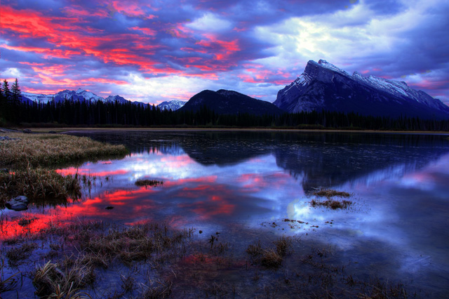
A typical Sunrise at the Vermillion Lakes in Banff Alberta, this place gets the best sunrise light I have seen...but a very popular and touristy place.
Comments
9 comments
Comment posted by Dorin Bofan on June 27, 2010 at 4:41 PM
Might be typical to you, but for me this is an outstanding light show. I'd be tempted to crop a bit from the bottom.
Registered on April 30, 2007, 122 Posts, 3086 Comments
Comment posted by Winnie Ho on June 27, 2010 at 5:16 PM
Cool lightshow. This is instantly recognisable, I like what you have done here. The very slightest thing is the floating vegetation touching the reflected peak of the mountain- I wish that were separated a little. I like the balance of sky and water.
Registered on January 6, 2008, 93 Posts, 1788 Comments
Comment posted by Anthony Vincent on June 27, 2010 at 5:43 PM
Im having a hard time understanding the light in the sky here Simon. The colors are intense but not quite sure about the whitest parts combined with the bright colors. Seems to me that the sky would be rather subdued with colors of that magnitude. I could be wrong and Im fine with that if indeed that is the case. The comp is great all around with nice majestic peaks. Care to inform (be nice Im not from the mountains )
Registered on February 5, 2009, 199 Posts, 2775 Comments
Comment posted by Lon Overacker on June 27, 2010 at 6:36 PM
Simon,
Great followup to your first image. What a grand "reflectionscape." The sky is certainly full of drama and this is a great sunrise from this popular location. And the somewhat dark presentation works very well to.
I would agree with a slight pano crop. Not only would that emphasize the symmetry, but also take care of the small, brighter plants in the LLC (lower left corner.) Just an alternative suggestion. The only other issue for me is that this just seems a bit over the top in terms of saturation. No doubt this was an incredible sky, just for my taste the reds and purples are a little on the strong side. Gets back to personal taste though of course.
Lon
Registered on November 24, 2006, 521 Posts, 19147 Comments
Comment posted by Chris Gin on June 27, 2010 at 7:08 PM
The reflections and colours are nice, but the saturation looks a bit overdone. The clouds in particular have that HDR tonemapped look.
Registered on October 13, 2008, 6 Posts, 43 Comments
Comment posted by Robert Dayton on June 27, 2010 at 7:34 PM
Spectacular light, Simon! As some others have commented,perhaps
toning down the saturation would work, plus I agree with some sugesstions
about considering a bottom crop. Nevertheless, this is breathtaking.
Thanks for sharing.
Registered on November 11, 2008, 281 Posts, 3958 Comments
Comment posted by Marc Adamus on June 27, 2010 at 8:12 PM
Yeah, some real nice moody blues here. The use of reflections at this spot is a bit unconventional but compliments the sky perfectly. The reds, in the sky especially, should probably be toned down because some pretty heavy clipping of the channel is evident in web presentation at least.
Registered on September 17, 2005, 780 Posts, 8091 Comments
Comment posted by SimonRumford on June 27, 2010 at 11:42 PM
Thanks guys for the comments, the saturation is a bit vibrant, the colours in the sky were really that shade of pink, this area gets the most intense colours for a sunrise I have ever seen....however I small amount of de-saturation could do a bit of good...I am not a fan of cropping it landscape view but I can definatly see how it could add a good effect to the overall picture...
:)
Registered on June 25, 2010, 28 Posts, 80 Comments
Comment posted by Chris Chamberlain on June 30, 2010 at 12:43 AM
Beautiful shot of a place I'd love to see someday. Colors are spectacular, although I think you would have just as much impact toning down the reds a bit.
Chris
Registered on March 13, 2007, 500 Posts, 8365 Comments

Comments
9 commentsGreat followup to your first image. What a grand "reflectionscape." The sky is certainly full of drama and this is a great sunrise from this popular location. And the somewhat dark presentation works very well to.
I would agree with a slight pano crop. Not only would that emphasize the symmetry, but also take care of the small, brighter plants in the LLC (lower left corner.) Just an alternative suggestion. The only other issue for me is that this just seems a bit over the top in terms of saturation. No doubt this was an incredible sky, just for my taste the reds and purples are a little on the strong side. Gets back to personal taste though of course.
Lon
toning down the saturation would work, plus I agree with some sugesstions
about considering a bottom crop. Nevertheless, this is breathtaking.
Thanks for sharing.
:)
Chris