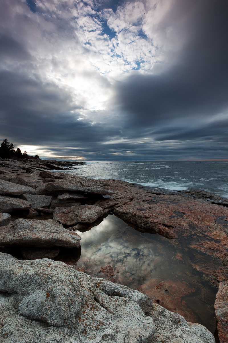
I took this image over a year ago (April 2009) Ocean Point, Boothbay, Maine on a particularly cloudy morning...... but I keep coming back to this set of images. I don't think I have posted it here before, so interested in your thoughts especially because of the hot spot in the sky. I am also on the fence with the vertical format. I usually don't like verticals unless 4X5 or 6X7. In this case, I could not get in all in without the orginal 5DM2 format.
Canon 5D MarkII
Canon16-35mm f/2.8L at 16mm (Distortion corrected in LR3)
ISO100 0.3sec f/22
SR Color Combo +3-Stop SS ND Gradient
TK Layer Masks, Glow, and sharprning in CS5 (Though I am finding a bit over sharpening in CS5 compared to CS4. Also when saving for Web, CS5 posts a GIF version but it does provide a web preview. Just an anoyance or stupidity on my part? Anyone finding these issues? ......or is just my computer ineptness? (BTW - I am also using LR3 for pre-processing).
I have a slightly different image on my website (as well as this).
Old Version. Which do ya perfer?
Thanks for looking and for any comments, critique, or technical input which is always greatly appreciated.

Comments
14 comments- Dan.
Paul
Ed
Tough call between the two images. I prefer the sky in your web version, but like the rocks and reflection pool better with this one. The other version seems a tad heavy on the contrast. I like this one for it's rusty look and feel of the rocks and pool; and the contrast seems just right.
Now the only issue I have with the tall vertical format (and I say this in general, not just your image here) is that we tend to either a: want to include too much and/or b: end up with a split comp - what's more important, the sky? or the foreground? In your case here, I can't see cropping out the blue of the sky and definitely can't crop the rocks, so I'll settle for just what you've captured!
Lon
p.s. As far as the oversharpening, if you're using TK's actions what I settled on was setting the opacity of those two layers (if using "less halos") to about 75%. I would agree that by default at 100% opacity it's too much for most images. Don't tell Tony, but I even went as far as editing the action so that it defaults to 75% opacity just to save me from having to set it myself... call me lazy.
I like every thing about the new version except the brightness of the fg rock which, for me, is a huge distraction. I suppose it may have been naturally much brighter than all the rest. However, if you could make it, and maybe the next rock up on the left, as dark as the brown ones, somehow, I think it would make this image extremely moody and compelling - I think it would be worth it.
As usual, the composition works well. The reflection really is the strongest part of the image. Really nice. Best Regards.
Gary.