Nature Photographers Network
This is the preserved archive of the original Nature Photographers Network. The community continues at naturephotographers.network.
Fall Colors--with edit
‹ PreviousLandscape GalleryNext ›

Fall Colors--with edit

by Chad Merrell

Gallery: LandscapePosted July 15, 2010116 views9 comments
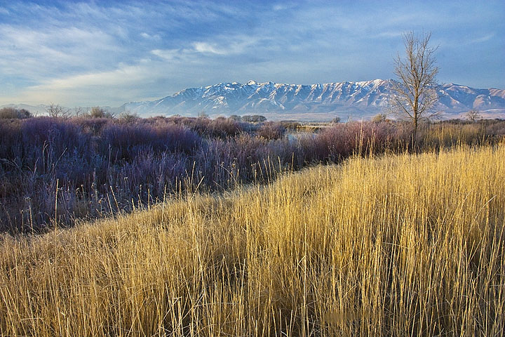
This was a grab on the way back to the truck. I looked over my shoulder and the colors and opposing angles caught my eye. I kind of like it the way it is but I have to ask--too heavy handed with the saturation slider? I am guessing tha tif I am asking it probably is.
Canon 450D
Canon 15-85 EFS @16mm
ISO 400
1/15 s
f22

Comments

9 comments
Comment posted by Bruce King on July 15, 2010 at 9:25 AM
Nice image Chad. I think the sat. looks fine Some might say the yellow grass is a touch too yellow but it looks good to me. nice job.
Registered on January 14, 2010, 276 Posts, 2212 Comments
Comment posted by Ed Lowe on July 15, 2010 at 10:05 AM
The sat looks fine to me, Chad. I also like your use of warm and cool colors in the scene. Did you happen to shoot any comps without the tree on the right? This is just a personal preference, but I like the scene better without it.

Ed
Registered on February 7, 2004, 414 Posts, 7115 Comments
Comment posted by Lon Overacker on July 15, 2010 at 7:57 PM
Chad,

Another very nice image, but I must say not as compelling as your first two. I really like the sweet, golden light hitting these grasses up front, but compositionally I think they dominate a little bit too much. but that's just me. The other observation is that the willows look pretty purple in the shadows there. Otherwise, this is still an excellent landscape. I even think the tree works very well with the comp.

To your question, I really like the color/sat of the grasses; the sky/clouds look good too. Just those purples in the shadows.

Lon
Registered on November 24, 2006, 521 Posts, 19147 Comments
Comment posted by Lon Sharp on July 15, 2010 at 9:11 PM
I would consider a crop of the yellow grasses near where they meet the willows on the left. They would then would be same (but inverted) approximate mass and shape as the willows, and the diagonal line between them would lead to the lower left corner. That said, I think this is worth it! I like the colors and the scene is compelling without feeling overdone.
Registered on December 9, 2007, 258 Posts, 9892 Comments
Comment posted by Youssef Ismail on July 15, 2010 at 9:48 PM
Chad,

I think the colors look very natural in this iage. Again I really like the purple tones in the scrub in the shade.
Registered on November 1, 2003, 474 Posts, 5555 Comments
Comment posted by Tony Kuyper on July 15, 2010 at 10:00 PM
Excellent grab-shot. The purple in the middle ground seems a bit heavy but the other color contrast here are very nice and the comp is superb.
Registered on November 1, 2003, 364 Posts, 22328 Comments
Comment posted by Doug Roane on July 15, 2010 at 10:17 PM
Hey Chad,
What Lon said pretty much sums it up for me also.
Registered on December 12, 2008, 213 Posts, 2226 Comments
Comment posted by Nicolaus Wegner on July 16, 2010 at 1:31 PM
Yup, very cool angles Chad. The tree almost gets in the way on this one though. Wish it were off to the right, allowing more of a view of the mountains. Looks cool, but perhaps a more centered approach on the mountains would have worked, maybe even a crop on the left?
Registered on February 21, 2010, 133 Posts, 1509 Comments
Comment posted by Chad Merrell on July 16, 2010 at 8:17 PM
I sure appreciate you guys looking but even more apperciate crtiques and suggestions. Here it is with the suggested changes. I went into the willows and lightened them a little and turned down the saturation and cropped some from the bottoma nd from the left. Thanks again.
Registered on July 8, 2010, 91 Posts, 304 Comments