Nature Photographers Network
This is the preserved archive of the original Nature Photographers Network. The community continues at naturephotographers.network.
Rwkd Goldfinch & repost
‹ PreviousAvian GalleryNext ›

Rwkd Goldfinch & repost

by Dennis Plank

Gallery: AvianPosted August 9, 2010182 views13 comments
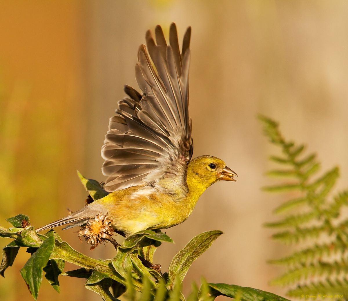
This is the same image I posted a week ago. The bg washed that one out. On looking at it, I decided the white balance was probably off-it was rather blue for the time of day it was taken. I upped the color temperature in ACR (probably beyond reality) and added some extra sharpening to the bird to help contrast it to the bg. I also changed the crop to make the bird larger in the frame.

I'd be interested in your reactions.

7D, 500mm f4 + 1.4TC, Black Widow on Gitzo legs, f5.6, 1/2500s, iso 400, Av mode with -1/3 compensation, subject distance 10.1m. Taken at 7:06 pm on July 30th.

Comments

13 comments
Comment posted by Richard Ditch on August 9, 2010 at 11:40 AM
Good refinement of a solid base image. Getting the white balance corrected to start is essential; with difficult lighting situations I sometimes try the white-point eyedropper to take out any subtle color cast I've missed and then do minor tweaks from that new base point.
Registered on November 1, 2003, 1031 Posts, 12705 Comments
Comment posted by Ron Dudley on August 9, 2010 at 12:20 PM
It's quite interesting comparing the two versions Dennis. I like the better detail on this one due to the closer crop and also find this background more appealing. To my very amateur "birding eye" the colors on the bird look a bit more natural on your original post but that's simply an observation that may or may not be accurate.
Registered on March 30, 2007, 437 Posts, 10915 Comments
Comment posted by Vincent Grafhorst on August 9, 2010 at 12:24 PM
I did not go bakc to your previous post dennis, but this sure looks great. Awesome feather detail, spectacular pose, good light, natural looking WB and perfect amount of contrast. I am not too fond of square crops in general, but in this case it seems to work. :toast:
Registered on February 24, 2006, 504 Posts, 7203 Comments
Comment posted by Ken Archer on August 9, 2010 at 2:15 PM
Hi Dennis,

This version appeals to me more, both are excellent photos though. Excellent Action!

Ken Archer
Registered on October 28, 2004, 222 Posts, 6683 Comments
Comment posted by SandyRichardsBrown on August 9, 2010 at 2:59 PM
Love this!
Great colors and exceptional pose.
The ferns and general BG is perfect.
Sandy r
Registered on November 24, 2003, 3937 Posts, 12909 Comments
Comment posted by Brian Gatlin on August 9, 2010 at 10:57 PM
Dennis, I think this is an excellent reworking. This one really focuses my attention on the bird and the fantastic pose you captured. Everything you've done here works for me, and the colors look good to my eye.
Registered on March 21, 2009, 202 Posts, 4187 Comments
Comment posted by Charles Gangas on August 9, 2010 at 11:06 PM
I like the re-work Dennis. I think the increased temp adjustment works well with the BG and the bird and I love the wing position. The only nit I have is the color in the perch- I think I'd be temped to cool it off a tad...or not. Nice job!
Registered on August 12, 2009, 544 Posts, 2414 Comments
Comment posted by Mia McPherson on August 9, 2010 at 11:23 PM
Dennis

I've flipped back and forth on this image and the previous post, I like the background on this one more but like the colors of the bird in the original image. So, I guess I am saying I might try for some thing in the middle?
Registered on June 25, 2007, 491 Posts, 12566 Comments
Comment posted by Angela McCain on August 9, 2010 at 11:33 PM
I missed your post of the last one. But I like the modifications you've chosen to make. The bird color itself appears to be just right. Well done.
Registered on April 19, 2009, 367 Posts, 3589 Comments
Comment posted by KC Choo on August 10, 2010 at 9:46 AM
Flipping the two images back & forth has me giving the vote to #1.
Registered on November 15, 2004, 519 Posts, 8278 Comments
Comment posted by Dennis Plank on August 10, 2010 at 10:26 AM
I should have thought of this. Just for comparison, here's the original lighting with the new crop. I'm thinking I agree with Mia that something between the old and new color temperature would work best.
:wavey:
Registered on January 28, 2008, 1767 Posts, 23192 Comments
Comment posted by May Haga on August 10, 2010 at 1:01 PM
Love it Dennis. Excellent post-production work.
May
Registered on February 22, 2007, 714 Posts, 8470 Comments
Comment posted by Geoffrey Baker on September 1, 2010 at 1:49 PM
You've captured a lovely pose here :smile:
Well done.

Geoff.
Registered on August 20, 2010, 192 Posts, 980 Comments