Nature Photographers Network
This is the preserved archive of the original Nature Photographers Network. The community continues at naturephotographers.network.
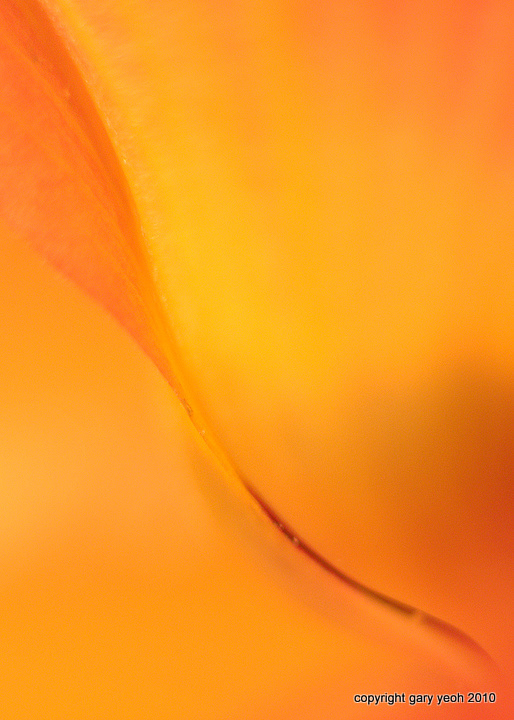
Untitled abstract
‹ PreviousFlora GalleryNext ›

Untitled abstract

by Gary Yeoh

Gallery: FloraPosted August 11, 2010125 views14 comments
Don't really know what this flower is, hence untitled. Grow on short tree along the beach with yellow or orange petal. These flowers fell on the beach in large numbers but were still relatively fresh and intact. Collected a few to experiment with.

D90 50mm1.8+36mm ET, 1/20 F1.8 beanbag dining table incandescent light. Still experimenting so comments and suggestions appreciated.

Comments

14 comments
Comment posted by Ramamohan Pai on August 11, 2010 at 9:49 PM
Gary, Tough to pull it off with just one dominant color - so full marks right there :cool: . Love that sinusoidal curve moving in the frame diagonally also.

I wish the edge was a bit sharper but its compensated a bit by letting the eye latch on to the contrast provided by the darker color.

I think you are on the right path and I can see abstracts in your future (its tough to get out after that).
Registered on November 1, 2003, 550 Posts, 9037 Comments
Comment posted by Mark Windom on August 11, 2010 at 10:16 PM
I like the abstract quality of this. I would like to see the leading edge of the petal a little sharper. However, in order to make the entire edge sharper you would have to increase the DOF considerably which would take away some of the images' abstract nature. You might try focusing just on the darker portion of the petal's edge and sharpen that a bit.

I'm done rambling.... :wavey:
Registered on November 1, 2003, 176 Posts, 2302 Comments
Comment posted by Pat Sampson on August 11, 2010 at 11:02 PM
Luke,

I think the advice from Ram and Mark is good and can't add anything to that. I like the diagonal composition here.

Pat
Registered on May 19, 2007, 953 Posts, 15989 Comments
Comment posted by Bruce King on August 11, 2010 at 11:15 PM
I like the composition but I agree with the previous comment s regarding shrpness. Beautiful color and light.
Registered on January 14, 2010, 276 Posts, 2212 Comments
Comment posted by Carol Hyman on August 11, 2010 at 11:45 PM
Neat experiment, Gary. Perhaps playing with the light source might create some interesting shadows. No other ideas ...

Cheers,

Carol
Registered on January 18, 2007, 597 Posts, 8062 Comments
Comment posted by Brigitte Lorenz on August 12, 2010 at 2:17 AM
Hi Gary, very nice lines and color....agree with Ram and Mark here to sharpen a bit more.

Brigitte
Registered on January 10, 2009, 187 Posts, 1507 Comments
Comment posted by John&Patty Benway on August 12, 2010 at 6:46 AM
I definitely find this interesting Gary, I like the color and comp, along with the softness, it works for me. Nicely done.
John
Registered on May 12, 2006, 626 Posts, 8700 Comments
Comment posted by Ken Smith on August 12, 2010 at 11:18 AM
Calm, peaceful S-curve fills the frame. Nicely done. I'd be tempted to flip vertical just to see the fan shape at bottom. Cool transition oranges.
Registered on September 5, 2008, 449 Posts, 2444 Comments
Comment posted by Bob&Charly Nelson on August 12, 2010 at 9:59 PM
Really neat abstract Gary. This has a liquid lava look to me. :toast:
Bob :wavey:
Registered on October 27, 2005, 289 Posts, 4202 Comments
Comment posted by Catherine Reilly on August 13, 2010 at 3:35 AM
Gary this is beautiful in comp, color, and concept. I think, at least as it appears to me, it looks quite soft, though. I hope you'll keep working on these kind of images though because it looks like you've got the eye for it. With extension tubes, it's frustrating because not even a blink of your eyelids will cause a blur or take the image out of focus. Will be eagerly waiting to see more.
Registered on August 16, 2006, 603 Posts, 9192 Comments
Comment posted by Nathan Buck on August 13, 2010 at 1:01 PM
I love the 'on edge' shot Gary. Nicely done.

Nathan
Registered on November 1, 2003, 1101 Posts, 13589 Comments
Comment posted by Morris McClung on August 13, 2010 at 6:18 PM
I really like the lines and color in this one. Perhaps, as suggested, the pof on the darker part of the line, but still this is a gorgeous abstract.
Registered on May 7, 2007, 670 Posts, 19650 Comments
Comment posted by Albert Darmo on August 13, 2010 at 10:52 PM
Hi Gary. Enjoy your fine abstract, love the splendid color tones. Yes it would even be better with a sharper leading line :biggrin: :rolleyes:
Albert Darmo. Canada
Registered on November 25, 2008, 1386 Posts, 11978 Comments
Comment posted by Bill Fach on August 13, 2010 at 11:14 PM
Gary: When I first saw the thumbnail I though it was one of Ram's. I hope you will take that as a high compliment. I'm not as concerned so much about the sharpness of the edge but the color of it. I think if it was subdued some this would work better for me. Keep up the fabulous work. >=))>
Registered on November 1, 2003, 1805 Posts, 26981 Comments