Gallery: LandscapePosted September 3, 2010114 views9 comments
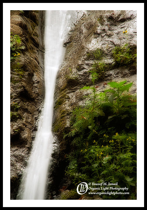
A close up of Pfieffer Falls in Bug Sur State Park. From the workshop.
Comments and Critiques appreciated.
Comments
9 comments
Comment posted by Steve Sieren on September 3, 2010 at 4:18 AM
Looks organic to me. This must be where the falls head over the cliff?
Registered on January 2, 2008, 360 Posts, 5321 Comments
Comment posted by Greg Maklae on September 3, 2010 at 5:58 AM
I don't know if it due to the compression, but the cliff looks overly sharpened. Also there is no detail in the falls.
Registered on November 18, 2008, 170 Posts, 759 Comments
Comment posted by Lucy VanSwearingen on September 3, 2010 at 10:34 AM
I think you should give the BG more depth with shadows and contrast. Especially in the rocks surrounding the falls and even in the falls themselves. They need depth to make the falls look real. The overall effect now IMO looks like a white streak of falls against a flat background. JMO I am a geologist, so I see scenes like this quite a bit.
I think you will like the final result
Registered on May 23, 2009, 800 Posts, 2042 Comments
Comment posted by Youssef Ismail on September 3, 2010 at 11:47 AM
Strange, on my monitor the falls are bright but full detailed. I can see streaks all the way down and I can even see through the upper portion to see the rock face behind it. It might be slightly over-sharpened, but the bright rock wall top right was reflecting a lot of light.
It might be that my monitor is starting to show its incapability of being calibrated, I can't get it to the proper brightness level, hence what I see as normal with regards to brightness on my overly dark monitor might be appearing as to bright on a normally bright monitor.
Does anyone else see the falls as too bright and without detail?
Registered on November 1, 2003, 474 Posts, 5555 Comments
Comment posted by Phil Pogledich on September 3, 2010 at 11:59 AM
Youssef, the exposure of the falls looks just fine to me. I can see all the same details as you. I like the semi-hourglass shape of the falls and the foliage on the RHS balances out the composition nicely. It looks like a difficult waterfall to photograph and I think you did quite nicely here.
Registered on August 24, 2009, 123 Posts, 3099 Comments
Comment posted by Lon Overacker on September 3, 2010 at 3:28 PM
Youssef,
While not overwhelming, this is actually pretty unique and nicely crafted. I like the simple design of the comp and the narrow hour-glass type figure of the falls.
As far as brightness and detail? The falls certainly have detail in the sense of streaking and a sense of motion. Mostly the streaking is at the bottom and the top is more transparent as you mentioned. The only area where detail is lost is less would be right in the center, but I still see some differentiation. Personally, I usually associate "loss of detail" in an overexposed/clipped situation - and this is certainly not that.
I think the overall contrast and brightness look good on my monitor. If anything, the foliage looks like it has a little bit of a glow to it, but you didn't mention any special processing.
Anyway, I think this is well seen and captured. I like it.
Lon
Registered on November 24, 2006, 521 Posts, 19147 Comments
Comment posted by Stan Rose on September 3, 2010 at 6:27 PM
This is definitely one of those shots that is monitor dependent--im looking at a dual monitor right now, and the right one looks good while the left one looks too bright--i know the right monitor is better calibrated so ill go with that one I like this comp, but the white patchy stuff on the rocks on the rhs kind of bother me--they look kind of 'pasty' and unaesthetic. I dont know if its fixable.
Registered on September 15, 2005, 836 Posts, 17099 Comments
Comment posted by Tony Kuyper on September 3, 2010 at 11:48 PM
I like it. The off-center falls makes for a very dynamic image.
Registered on November 1, 2003, 364 Posts, 22328 Comments
Comment posted by Stuart Williams on September 4, 2010 at 1:41 AM
there's a little detail in the falls but i do find them too bright. i'd have like to see the plants a little crisper as well.
Registered on December 7, 2007, 247 Posts, 4792 Comments

Comments
9 commentsI think you will like the final result
It might be that my monitor is starting to show its incapability of being calibrated, I can't get it to the proper brightness level, hence what I see as normal with regards to brightness on my overly dark monitor might be appearing as to bright on a normally bright monitor.
Does anyone else see the falls as too bright and without detail?
While not overwhelming, this is actually pretty unique and nicely crafted. I like the simple design of the comp and the narrow hour-glass type figure of the falls.
As far as brightness and detail? The falls certainly have detail in the sense of streaking and a sense of motion. Mostly the streaking is at the bottom and the top is more transparent as you mentioned. The only area where detail is lost is less would be right in the center, but I still see some differentiation. Personally, I usually associate "loss of detail" in an overexposed/clipped situation - and this is certainly not that.
I think the overall contrast and brightness look good on my monitor. If anything, the foliage looks like it has a little bit of a glow to it, but you didn't mention any special processing.
Anyway, I think this is well seen and captured. I like it.
Lon