Nature Photographers Network
This is the preserved archive of the original Nature Photographers Network. The community continues at naturephotographers.network.
Ponta da Piedade
‹ PreviousLandscape GalleryNext ›

Ponta da Piedade

by Helio Cristovao

Gallery: LandscapePosted September 7, 2010339 views20 comments
Algarve, Portugal
August 2010

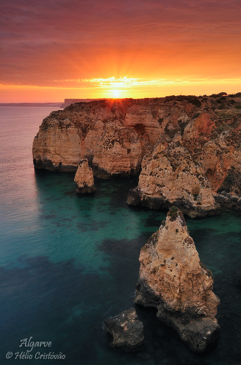
I´m posting two shots taken from my latest series from Algarve seascapes, hope to hear some thoughts about choosing one?

The first image was taken after, as the sun was setting, the warmer light and intense orange tones took over the sky.

About the second, a different framing on earlier light, though maybe the sky is more interesting on this one. It´s cropped to 5x7 format.

Thanks for the input.

Comments

20 comments
Comment posted by Helio Cristovao on September 7, 2010 at 4:35 PM
Registered on September 15, 2009, 83 Posts, 434 Comments
Comment posted by Jim Lou on September 7, 2010 at 4:36 PM
Excellent composition and colors. I particularly like the foreground rock to lead my eyes into the frame. I like the first one with sun, which adds drama to the photo.

Jim
Registered on August 3, 2010, 86 Posts, 273 Comments
Comment posted by Bill Chambers on September 7, 2010 at 4:42 PM
Love the contrast of warm and cool colors here - very pretty shot.
Registered on April 10, 2005, 753 Posts, 21216 Comments
Comment posted by Dean Sauskojus on September 7, 2010 at 4:43 PM
Both are great images Helio. I like the drama of the first. I think the black frame helps that as well. Beautiful work!
Registered on September 29, 2009, 137 Posts, 2659 Comments
Comment posted by Daniel & Loana on September 7, 2010 at 4:59 PM
Wonderful shots. I personally prefer the first (presented), with orange tones in the sky.

COngrats

D&L
Registered on October 7, 2008, 166 Posts, 3044 Comments
Comment posted by Nick Bristol on September 7, 2010 at 5:18 PM
Really nice. I really like the warm colors and look of the first one the best. Beautiful image!

Nick Bristol
Lone Rock, WI
Registered on February 1, 2004, 752 Posts, 14140 Comments
Comment posted by Joshua Hardin on September 7, 2010 at 5:56 PM
Both are really nice but I also like the first one slightly better for the deeper colors, tighter comp and the sun rays that are visible. You definitely nailed this shot, twice!
Registered on July 29, 2006, 40 Posts, 414 Comments
Comment posted by Gary McGhee on September 7, 2010 at 6:25 PM
I think I prefer the first one also, although both are very good. It looks to be a beautiful coastine and sea looks very inviting.

Gary.
Registered on April 15, 2010, 142 Posts, 2416 Comments
Comment posted by Eva McDermott on September 7, 2010 at 6:59 PM
I like the drama of the first image Helio but I think both are beautiful. I really like the contrast between the orange sky and turquoise water, the rays, and warm light on the cliffs. Beautiful work.
Registered on January 4, 2009, 1015 Posts, 13229 Comments
Comment posted by Daniel Ewert on September 7, 2010 at 8:33 PM
I love how I can see through the teal water to the ocean floor. Beautiful!

--I think I might like the second one just a bit better.
Registered on June 2, 2009, 103 Posts, 1500 Comments
Comment posted by Wade Hardy on September 7, 2010 at 11:40 PM
Tough choice. The first one definitely has more immediate impact, but I also like the more subtle 2nd version as well. I guess my choice would be for the 1st version though. Great shots!
Registered on May 2, 2006, 121 Posts, 1824 Comments
Comment posted by Tony Kuyper on September 8, 2010 at 12:06 AM
Both are fine images. The bottom of the scene seems a bit bright in the second one, but the colors are very attractive in both.
Registered on November 1, 2003, 364 Posts, 22328 Comments
Comment posted by dean hebert on September 8, 2010 at 12:16 AM
Beautiful photos. I like the first one but I feel that the sky is just a bit hot. I love the colour of the water and the isolation of the FG rock. :toast:
Registered on August 4, 2010, 70 Posts, 1132 Comments
Comment posted by Anil Rao on September 8, 2010 at 12:39 AM
A fascinating location and you have done a great job in showcasing it via these two photographs. I am having a hard time choosing between the two. Although diferent some ways, they are equally beautiful.
Registered on November 15, 2003, 234 Posts, 4923 Comments
Comment posted by John Lehmkuhl on September 8, 2010 at 3:10 AM
Awesome shots !! I think I prefer the 2nd one - the sky is more interesting and not so blown out, even if it is a bit more dynamic. Both are very nice.
Registered on May 22, 2005, 165 Posts, 2008 Comments
Comment posted by Chris Chamberlain on September 8, 2010 at 10:44 PM
Why not choose both. They are both fine shots. If I had to choose, I like the first warmer version better.

Chris
Registered on March 13, 2007, 500 Posts, 8365 Comments
Comment posted by Shaun Mazurek on September 9, 2010 at 1:10 AM
Hello Helio,
Each image is superb. I prefer the subtlety of the second image and the second composition slightly more. I think the addition of the extra rock wall in the lower right hand corner helps keep my eye in the composition a bit longer. Your images of Portugal are amazing and defiantly inspire a great deal of wanderlust. I cant wait to see more. :)
Registered on June 12, 2010, 21 Posts, 162 Comments
Comment posted by Kah Kit Yoong on September 9, 2010 at 2:56 AM
I prefer the first one. Absolutely gorgeous work!
Registered on September 27, 2006, 636 Posts, 10682 Comments
Comment posted by Helio Cristovao on September 9, 2010 at 5:59 AM
Thanks for the feedback. I had to choose one to a local nature photography contest. Guess what, I sticked with the 2nd one, though my initial processing and choice was all about the 1st photo... Well, let´s just wait and see. It was a tough decision, though. May seem strange, but in the second shot the FG rocks make some difference, really like that ...
Registered on September 15, 2009, 83 Posts, 434 Comments
Comment posted by Mark Metternich on September 9, 2010 at 2:06 PM
Very nice shot here, no nits. :toast:
Registered on June 19, 2009, 276 Posts, 6240 Comments