Comment posted by Pat Sampson on September 8, 2010 at 8:31 PM
Richard,
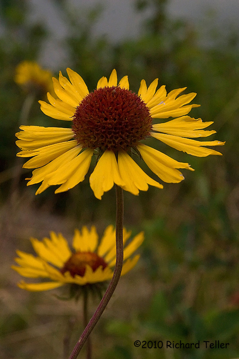
My immediate reaction is that this seems a little flat - almost dark. I like your dof decision but for me Ideally the stem wouldn't cross the bg flower. I might play with levels a little on this, if it were mine.
Pat
Registered on May 19, 2007, 953 Posts, 15989 Comments
Comment posted by Bill Fach on September 8, 2010 at 9:35 PM
Richard: I agree with Pat regarding the color being a little flat. I don't mind the stem crossing the BG flower but I think I would crop away most of the blue on the top. Good DOF/POF choice. >=))>
Registered on November 1, 2003, 1805 Posts, 26981 Comments
Comment posted by Ramamohan Pai on September 8, 2010 at 11:12 PM
I don't know much about the Flora in Canada but the flower looks more like a variety of Gaillardia to me than a Cone Flower .
Take care of the flatness and you have a winner here
Registered on November 1, 2003, 550 Posts, 9037 Comments
Comment posted by Carol Hyman on September 9, 2010 at 2:18 PM
Lovely separation between the BG and the subject flower, Richard.
Carol
Registered on January 18, 2007, 597 Posts, 8062 Comments
Comment posted by Morris McClung on September 11, 2010 at 11:14 AM
I like your comp and I agree about a touch of brightening and a small crop off of the top. Excellent dof and pov.Nice work.
Registered on May 7, 2007, 670 Posts, 19650 Comments

Comments
5 commentsMy immediate reaction is that this seems a little flat - almost dark. I like your dof decision but for me Ideally the stem wouldn't cross the bg flower. I might play with levels a little on this, if it were mine.
Pat
Take care of the flatness and you have a winner here
Carol