Gallery: FloraPosted September 8, 201055 views11 comments
Nikon D300, Sigma 150. F/7.1, 1/320, ISO 200.
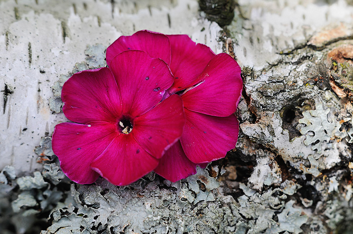
The deep red tones and soft detail of the phlox are contrasted against the light colors and heavy detail of the birch bark and lichen. Comments appreciated.
Comments
11 comments
Comment posted by Pat Sampson on September 8, 2010 at 8:26 PM
Beautiful colors and interesting textures Albert. I like the diagonal bias in the comp also and the placement of the blooms in the frame. I might be tempted to clone out the spots on the petals but that's certainly a subjective call. Good looking image for my tastes.
Pat
Registered on May 19, 2007, 953 Posts, 15989 Comments
Comment posted by Bill Fach on September 8, 2010 at 9:33 PM
Albert: Well this is easy; ditto what Pat said. I do think cleaning up the petals is a worthy project. >=))>
Registered on November 1, 2003, 1805 Posts, 26981 Comments
Comment posted by Craig Strand on September 8, 2010 at 10:28 PM
Wonderful contrasting image. Outstanding phlox and color.
Registered on March 30, 2008, 416 Posts, 2885 Comments
Comment posted by Ramamohan Pai on September 8, 2010 at 11:14 PM
The deep reddish pinks are set off really nicely by the muted tones of the Lichen. I like the texture provided by the Lichen.
Lovely Photo
Registered on November 1, 2003, 550 Posts, 9037 Comments
Comment posted by Gary Yeoh on September 9, 2010 at 6:20 AM
Albert:
Nice contrast of colors and texture. Good placement of the flowers too.
Registered on September 1, 2009, 588 Posts, 8184 Comments
Comment posted by Andrew Finlayson on September 9, 2010 at 6:26 AM
An interesting idea well executed. As much as the colour contrast is beautiful its the texture contrast that really works for me. Nice shot.
Registered on July 29, 2010, 26 Posts, 404 Comments
Comment posted by Bob Duff on September 9, 2010 at 6:39 AM
Albert, very nice comp. The colour contrast isgood. I might be tempted to try and extract some more colour sat, texture, and contrast from the lichen if possible.
Registered on April 21, 2010, 160 Posts, 1675 Comments
Comment posted by Debashis Bandyopad on September 9, 2010 at 11:37 AM
Nice juxtaposition Albert.. Good colors and comp but here's another vote for cleaning up the blooms..
Registered on June 24, 2007, 130 Posts, 1309 Comments
Comment posted by Carol Hyman on September 9, 2010 at 2:17 PM
Hi Albert, Really like the diagonal placement of the Phlox. I'll ditto comments on carefully cleaning up the black spots on the flowers. I think they're a distracting element. And I'll make yet another suggestion. Mask the flower and use a B/W filter on the BG. That would eliminate the orange on the bark which is also a distraction, but then again, if the purpose is documentation, leave everything alone.
Nice details.
Carol
Registered on January 18, 2007, 597 Posts, 8062 Comments
Comment posted by Morris McClung on September 11, 2010 at 11:17 AM
The contrasts really work well here, Albert. Nice work.
Registered on May 7, 2007, 670 Posts, 19650 Comments
Comment posted by Ian Wolfenden on September 12, 2010 at 12:32 PM
Lovely image, Albert - one which reminds me of the way Gigi sometimes sets flowers against textured backgrounds. Inspired choice of layout, with the split in the bark falling along the diagonal setting of the petals.
Registered on May 18, 2007, 1108 Posts, 7647 Comments

Comments
11 commentsPat
Lovely Photo
Nice contrast of colors and texture. Good placement of the flowers too.
Nice details.
Carol