Comment posted by Patricia Brundage on September 16, 2010 at 9:26 AM
The whole series has been a pleasure to view. This is my favorite so far. Guess my camera club background, where everything should be sharp focus, still wins out when comparing an abstract to a sharp presentation. Each image had its own personality and the vision of a great photographer.
Registered on March 23, 2006, 1111 Posts, 6531 Comments
Comment posted by Wayne Rhodus on September 16, 2010 at 9:36 AM
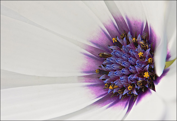
A very strong comp Ian with lovely rich color. I understand what you are saying about the errant petal introducing a sense of chaos, which is nice, but it's close proximity to the "green arrow" leading out of frame at right center only emphasizes that element (which I find distracting). I'd make the green arrow go away then print this beauty. Just my $0.02 worth.
Registered on November 16, 2003, 157 Posts, 3326 Comments
Comment posted by Phil Pogledich on September 16, 2010 at 11:20 AM
Killer shot, Ian. The color and composition really give this some impact. I'll agree with Wayne about that little green spot . . . it detracts ever so slightly.
Registered on August 24, 2009, 123 Posts, 3099 Comments
Comment posted by Carol Hyman on September 16, 2010 at 11:54 AM
I like that errant petal, Ian even though it and the triangle of space under the petal do call out to the eye.
One solution would be painting the triangle of space purple; I think the errant petal would then be less noticeable. Another solution is cropping (less desirable). ARGH. These decisions.
Ian, I hope you paint the triangle of space, keep the errant petal, and I'm off for some badly needed coffee
Cheers,
Carol
Registered on January 18, 2007, 597 Posts, 8062 Comments
Comment posted by Nathan Buck on September 16, 2010 at 1:39 PM
I like it a lot Ian. The green triangle does bug me just a bit.
Nathan
Registered on November 1, 2003, 1101 Posts, 13589 Comments
Comment posted by Andrew Finlayson on September 16, 2010 at 3:47 PM
Composition wise this is great and it may be just me, but this seems to lack the punch of your other shots colour wise and feels a bit over sharpened.
Registered on July 29, 2010, 26 Posts, 404 Comments
Comment posted by Bob Duff on September 16, 2010 at 6:40 PM
Well done Ian. I like the luminosity of the image and the sharpness achieved form the stack. Of this series I tink I slightly prefer Trio but it's close.
Registered on April 21, 2010, 160 Posts, 1675 Comments
Comment posted by Gary Yeoh on September 16, 2010 at 8:00 PM
Ian:
Nice details here and lovely luminosity! I like the break in the symmetry.
Registered on September 1, 2009, 588 Posts, 8184 Comments
Comment posted by Morris McClung on September 16, 2010 at 8:49 PM
Museum quality.
Registered on May 7, 2007, 670 Posts, 19650 Comments
Comment posted by Pat Sampson on September 16, 2010 at 8:56 PM
Ian,
I can't think of anything that would have emphasized the symmetry in the flower more than the one swirled errant petal. You're just killin me with this image. Gorgeous colors, perfectly exposed whites and a perfect stack. I could see cloning out the space and might consider it but I also like the tear drop shape of it with the tip flowing away from the center. I know it's there because that petal is out of place and that again adds interest for me and involves me in the image. For my tastes this is an exceptional image exactly as posted.
Pat
Registered on May 19, 2007, 953 Posts, 15989 Comments
Comment posted by Ramamohan Pai on September 16, 2010 at 9:11 PM
Best in the series (so far) for me, Ian. I love the center of the O'spermum flower because of the yellow-purple combination and the geometry. This view shows it off very well.
Registered on November 1, 2003, 550 Posts, 9037 Comments
Comment posted by Albert Darmo on September 16, 2010 at 10:31 PM
Hi Ian Another fantastic version of form and color of the osteospermum I liked the whole series, each had its superb qualities ...... agree with nathan about the triangle
Albert Darmo Canada
Registered on November 25, 2008, 1386 Posts, 11978 Comments
Comment posted by Ken Smith on September 17, 2010 at 12:18 AM
This is exquisite! I can see this as a 4 X 6 foot print hanging on a wall over a large couch. Cool shot! There is a grit to this that is spellbinding.
Registered on September 5, 2008, 449 Posts, 2444 Comments
Comment posted by Muhammad Zaid Wani on September 17, 2010 at 2:56 AM
Beautiful image, Ian.
Registered on August 18, 2005, 23 Posts, 1406 Comments
Comment posted by Miro Susta on September 17, 2010 at 9:32 PM
Perfect composition. All details are just superb. Very well done Ian.
Registered on August 18, 2006, 719 Posts, 3736 Comments
Comment posted by Larry Lynch on September 21, 2010 at 11:48 AM
Beautifully crafted. Wonderful sharpness and subtle lines in the petals. Love the grainy look and colors.
Registered on September 16, 2006, 773 Posts, 9940 Comments
Comment posted by Carol Hyman on September 21, 2010 at 3:43 PM
Congratulations on the EP, Ian.
Good job.
Carol
Registered on January 18, 2007, 597 Posts, 8062 Comments
Comment posted by Ramamohan Pai on September 21, 2010 at 4:17 PM
Congrats on a well deserved EP, Ian
Registered on November 1, 2003, 550 Posts, 9037 Comments
Comment posted by Buck Ward on September 21, 2010 at 9:00 PM
A fabulous photograph. Congratulations.
The errant petal and green arrow that raise so much comment did even catch my eye. It is the relationship between the purple center and the detail in the white petals to the left that I initially saw. It's as if the flower center is a flood light, illuminating the petals. Excellent.
Registered on December 8, 2003, 96 Posts, 1917 Comments
Comment posted by Ian Wolfenden on September 22, 2010 at 2:26 AM
Thanks, everyone, for your views and kind comments - all of them much appreciated.
Registered on May 18, 2007, 1108 Posts, 7647 Comments
Comment posted by SandyRichardsBrown on September 22, 2010 at 3:09 AM
Congrats on the EP!
Sandy r
Registered on November 24, 2003, 3937 Posts, 12909 Comments
Comment posted by Catherine Reilly on September 22, 2010 at 3:57 AM
Exquisite comp and detail here, Ian. Love the colors and the masterful exposure for the white. Just beautiful. Congrats on the EP.
Registered on August 16, 2006, 603 Posts, 9192 Comments
Comment posted by Giuseppe Guadagno on September 22, 2010 at 10:42 AM
Beautiful Ian! I am glad that you have chosen as model my favourite flower. An ispired photo.
Summer is ended and my life is back to normality. I'll come back soon in NPN.
Take care.
Registered on February 3, 2007, 827 Posts, 5052 Comments
Comment posted by Debashis Bandyopad on September 22, 2010 at 11:33 AM
Masterly in every way... Congrats on your EP
Registered on June 24, 2007, 130 Posts, 1309 Comments
Comment posted by Bill Fach on September 22, 2010 at 1:47 PM
Ian: I was really AWOL last week but when Pat recommended this I concurred enthusiastically. I like the color impact and the radiance of the shot especially. Superior image.>=))>
Registered on November 1, 2003, 1805 Posts, 26981 Comments
Comment posted by May Haga on September 23, 2010 at 10:54 AM
Good choice for EP Ian. I have been slow in posting my comments but did see it earlier and really liked it.
May
Registered on February 22, 2007, 714 Posts, 8470 Comments
Comment posted by Morris McClung on September 23, 2010 at 11:09 AM
Congrats on the EP!
Registered on May 7, 2007, 670 Posts, 19650 Comments
Comment posted by Patricia Brundage on September 24, 2010 at 1:50 PM
Congratulations Ian! Beautiful work, as is your standard.
Registered on March 23, 2006, 1111 Posts, 6531 Comments
Comment posted by Kurt Bowman on September 24, 2010 at 6:01 PM
A real beauty Ian!!! Just lovely and congrats on the EP!
Registered on June 19, 2008, 1005 Posts, 8028 Comments

Comments
29 commentsOne solution would be painting the triangle of space purple; I think the errant petal would then be less noticeable. Another solution is cropping (less desirable). ARGH. These decisions.
Ian, I hope you paint the triangle of space, keep the errant petal, and I'm off for some badly needed coffee
Cheers,
Carol
Nathan
Nice details here and lovely luminosity! I like the break in the symmetry.
I can't think of anything that would have emphasized the symmetry in the flower more than the one swirled errant petal. You're just killin me with this image. Gorgeous colors, perfectly exposed whites and a perfect stack. I could see cloning out the space and might consider it but I also like the tear drop shape of it with the tip flowing away from the center. I know it's there because that petal is out of place and that again adds interest for me and involves me in the image. For my tastes this is an exceptional image exactly as posted.
Pat
Albert Darmo Canada
Good job.
Carol
The errant petal and green arrow that raise so much comment did even catch my eye. It is the relationship between the purple center and the detail in the white petals to the left that I initially saw. It's as if the flower center is a flood light, illuminating the petals. Excellent.
Sandy r
Summer is ended and my life is back to normality. I'll come back soon in NPN.
Take care.
May