Nature Photographers Network
This is the preserved archive of the original Nature Photographers Network. The community continues at naturephotographers.network.
TheTrees Bow - Too Much?
‹ PreviousLandscape GalleryNext ›

TheTrees Bow - Too Much?

by Wayne Jones

Gallery: LandscapePosted September 21, 2010215 views15 comments
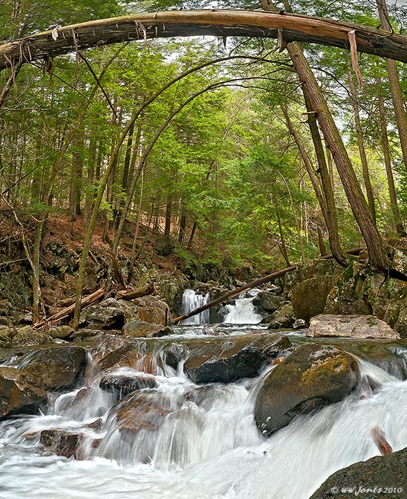
I have not been out shooting for a long time, so I revisited a couple of old images. This is a vertical panorama (3 horizontal frames) of a scene I shot three years ago. The top was cropped off the version I posted then (see my comment below). I wonder if the more subtle older version -- with the large leaning tree cropped off the top -- looks better. What do you think?

Canon 20D
Sigma 18-200mm.
1/13 sec. @ f/20
Three horizontal exposures stitched in PhotoShop CS5

Comments

15 comments
Comment posted by Wayne Jones on September 21, 2010 at 9:11 AM
Here's the older version with the top cropped off. Is this more subtle version (that doesn't hit the viewer in the head with a log) better?
Registered on April 18, 2007, 953 Posts, 6435 Comments
Comment posted by Stan Rose on September 21, 2010 at 9:15 AM
I prefer it with the arch! It mimics the arch of the trees behind--gives it a 'tunnel' effect. Its more weird too--and i like weird. :razz: Cool shot! Hope all is well with you :wavey:
Registered on September 15, 2005, 836 Posts, 17099 Comments
Comment posted by Paul Duval on September 21, 2010 at 9:27 AM
Wayne,

Both images have merit. The second gateway log cropped out is pretty straightforward, but the other with the gateway arch is like a doorway inviting you into the image. A little more unusual and definitely more interesting take.

Paul
Registered on June 30, 2009, 508 Posts, 1907 Comments
Comment posted by Jorne de Bruin on September 21, 2010 at 9:29 AM
NIce lush scene Wayne, I prefer the first version! :wavey:
Registered on June 26, 2008, 178 Posts, 2136 Comments
Comment posted by Bill Chambers on September 21, 2010 at 9:32 AM
I prefer the arched version - it seems to "frame" the image, but doesn't take away from the focal point. The water action is captured nicely with your chsoen shutter speed. Nice shot Pal. Hope you're hanging in there!
:wavey:
Registered on April 10, 2005, 753 Posts, 21216 Comments
Comment posted by Kent Mearig on September 21, 2010 at 11:18 AM
I like the top tree while in terms of overall processing, I prefer the version without it. The lesser contrast in the water is preferable I think. Is there any more room above the tree at the top? I know with stitched photos, we're sometimes forced to go a little tighter than was originally intended.
Registered on September 4, 2006, 237 Posts, 4748 Comments
Comment posted by Dietrich Gloger on September 21, 2010 at 1:54 PM
The arch is interesting and I think works well very well. Kind of frames the scene nicely. But I have to say that I prefer the older version. It is indeed more subtle because the arch is quite imposing.
Registered on January 26, 2007, 360 Posts, 9876 Comments
Comment posted by David W. Kelly on September 21, 2010 at 2:15 PM
I like them both Wayne but prefer the older version. Beautiful image.
Registered on October 7, 2005, 883 Posts, 6590 Comments
Comment posted by dean hebert on September 21, 2010 at 7:57 PM
I like the arch but I wouldn't mind a bit more headroom up top.
Registered on August 4, 2010, 70 Posts, 1132 Comments
Comment posted by Lon Overacker on September 21, 2010 at 8:11 PM
Hey Wayne,

I like both. The first one works because it's unique and the bowed tree just frames the top of the scene nicely. So it works that way. Yet on the other hand, it's almost a novelty and could be considered a distraction to the lovely forest and stream scene you've captured. In the end if I was to have this hanging in house, I'd prefer the one without the bowed tree.

Also, I'm assuming you processed these differently as well because it seems like the first, uncropped version is richer and as you mentioned the older a bit more subtle. I like the processing, color, contrast etc. of the image posted first in your post.

It's a beautiful scene no matter which way... :-)

Lon
Registered on November 24, 2006, 521 Posts, 19147 Comments
Comment posted by Morris McClung on September 21, 2010 at 8:52 PM
Well, Lon said everything I would say, only better than I could. So, ditto Lon!
Registered on May 7, 2007, 670 Posts, 19650 Comments
Comment posted by Doug Roane on September 21, 2010 at 9:16 PM
I love the arch! This web version just looks a little oversharpened.
Registered on December 12, 2008, 213 Posts, 2226 Comments
Comment posted by Tony Kuyper on September 21, 2010 at 10:01 PM
Really interesting comp. The arch really makes it. Seems a bit too sharp on my screen.
Registered on November 1, 2003, 364 Posts, 22328 Comments
Comment posted by John&Patty Benway on September 23, 2010 at 6:26 AM
Very tough choice, I honestly like them both, I will go with arc, just because it's different. Take care.
John & Patty
Registered on May 12, 2006, 626 Posts, 8700 Comments
Comment posted by Muhammad Zaid Wani on September 23, 2010 at 3:41 PM
Both the images are beautiful, Wayne. Good work.
Registered on August 18, 2005, 23 Posts, 1406 Comments