Gallery: LandscapePosted October 7, 201067 views5 comments
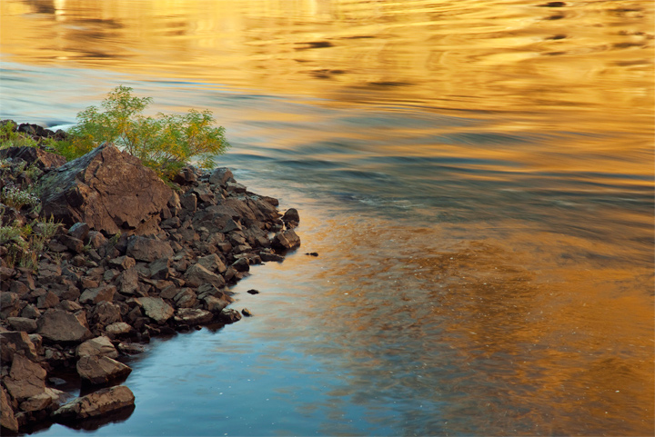
Here is a shot I took a couple weeks back. I haven't been out shooting since but will head out somewhere this weekend and hopefully find a little fall color too. (Hopefully the picture size works out this time.)
Comments
5 comments
Comment posted by Jorne de Bruin on October 7, 2010 at 8:56 AM
Great colour in this one Aaron! Love the golden top of the frame in combination with the cooler water just below. I'm not 100% sold on the rocks though, this scene/colour lends itself very well for a more abstract image I think
Registered on June 26, 2008, 178 Posts, 2136 Comments
Comment posted by Vance Gese on October 7, 2010 at 6:42 PM
Really like the warm golden hues in the water and the water motion. As Jorne wrote, the rocks seem a bit of a distraction though. Wonder if cropping the image, focusing primarily on the right hand side and making this a more abstract image would work. Just a thought. Nice work.
Registered on November 13, 2008, 298 Posts, 6629 Comments
Comment posted by Tony Kuyper on October 7, 2010 at 10:13 PM
Very pleasant scene. A scroll crop of about 1/2 the orange at the top feels like it creates a bit better balance in this image.
Registered on November 1, 2003, 364 Posts, 22328 Comments
Comment posted by Aaron Cowan on October 8, 2010 at 1:53 AM
Thanks for the comments! I find it interesting the different cropping ideas that are proposed. I didn't realize until looking at the photos on my computer that I captured three distinct areas in the water alone. I wanted to add the rocks/shoreline to add another subject as I didn't think the water could stand alone. I guess have another photo within my photo
Registered on September 22, 2010, 8 Posts, 165 Comments
Comment posted by Luis Argerich on October 8, 2010 at 11:03 AM
Hi Aaron,
It's a nice image but the colors are too strong and the left part a little uninteresting and the contrast between both things a little harsh for me.
Registered on December 22, 2009, 91 Posts, 1349 Comments

Comments
5 commentsIt's a nice image but the colors are too strong and the left part a little uninteresting and the contrast between both things a little harsh for me.