Nature Photographers Network
This is the preserved archive of the original Nature Photographers Network. The community continues at naturephotographers.network.
Blue Creeks… TOO  Blue?
‹ PreviousLandscape GalleryNext ›

Blue Creeks… TOO Blue?

by Wayne Jones

Gallery: LandscapePosted October 12, 2010341 views19 comments
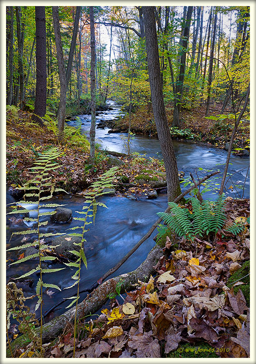
Just a little creek that flows by my house, but there are some pretty views. This section is about 3 miles from home, where a trib joins it. I shot this scene after sunset. The result was deep blues in the stream, just as we get deep blues in many post-sunset shots of the sky. The water in the original RAW images as so blue, it looked unnatural to me, so I reduced the blue saturation and lightened it a bit for this version.

QUESTION: Please compare it to the deep blue original in my comment below, and tell me if I did the right thing by desaturating the water.

Canon 50D
Sigma 17-70mm. f/2.8
1 sec. @ f/16; ISO 100
Tripod; Mirror up via LCD focusing; 2-sec. timer
Double-processed in ACR and hand blended in CS5 to bring down brightness in the top part.

Comments

19 comments
Comment posted by Wayne Jones on October 12, 2010 at 1:57 PM
Here's the "unedited" version with blues so saturated, I thought it looked unnatural.
Did I do the right thing in bringing down the saturation and lightening the water in the other (posted) version? THANKS
Registered on April 18, 2007, 953 Posts, 6435 Comments
Comment posted by Dean Sauskojus on October 12, 2010 at 2:45 PM
Either one is acceptable to my eye Wayne. I do like the unedited because it has more contrast and I like the blues in the edited. Just very small changes. Nice S curve in the creek and lots to look at.
Registered on September 29, 2009, 137 Posts, 2659 Comments
Comment posted by Greg Maklae on October 12, 2010 at 3:23 PM
Wayne, they are both good images, but my eye is drawn slightly more to the bottom one.
Registered on November 18, 2008, 170 Posts, 759 Comments
Comment posted by Barry Vangrov on October 12, 2010 at 4:29 PM
I think you did the right thing by reducing the blue on the water. In addition I might consider a crop off the top to eliminate some of that flat sky. Nice comp and colors.
Registered on September 1, 2009, 148 Posts, 749 Comments
Comment posted by Paolo De Faveri on October 12, 2010 at 4:50 PM
You live in a very nice place, Wayne! I think you did the right choice with the processing, and the composition is flawless.

:toast: :toast:
Paolo
Registered on August 29, 2007, 318 Posts, 1651 Comments
Comment posted by Taylor Reed on October 12, 2010 at 4:55 PM
Looks good to me Wayne, those ferns are really nice set against the meandering stream
Registered on February 18, 2010, 26 Posts, 556 Comments
Comment posted by Luis Argerich on October 12, 2010 at 6:00 PM
Hi Wayne,
I like the undedited version it has very nice colors and it's a pleasant composition. Nice scene!
Registered on December 22, 2009, 91 Posts, 1349 Comments
Comment posted by Stan Rose on October 12, 2010 at 7:06 PM
You did the right thing because you followed your vision and your conscience, and you didnt care what the masses think. :wink:
Fabulous scene, Wayne--great S-curve! :toast:
Registered on September 15, 2005, 836 Posts, 17099 Comments
Comment posted by Mark Pelton on October 12, 2010 at 7:30 PM
yes, I think you did the right thing. Excellent composition and processing.
Registered on November 25, 2003, 380 Posts, 4647 Comments
Comment posted by Michael J Greene, on October 12, 2010 at 8:35 PM
Hi Wayne,

I like them both, but would side on the one with the slightly desaturated water. Beautiful S curve and lovely autumn palette.

Michael
Registered on June 18, 2009, 86 Posts, 2317 Comments
Comment posted by Lon Sharp on October 12, 2010 at 10:26 PM
I prefer your edit. Great composition!
Registered on December 9, 2007, 258 Posts, 9892 Comments
Comment posted by Morris McClung on October 12, 2010 at 10:40 PM
The frist one looks more natural to me, and yet still has plenty of impact from the great comp and color. :toast:
Registered on May 7, 2007, 670 Posts, 19650 Comments
Comment posted by Vance Gese on October 13, 2010 at 12:51 AM
Love this Wayne. The S curve of the creek, the ferns, and fallen leaves make for a superb composition. I do like the first post a bit better. Still has plenty of blue in the water in spite of desat'ing the blues. Outstanding. Nice to have such a beautiful little creek so close to your home.
Registered on November 13, 2008, 298 Posts, 6629 Comments
Comment posted by Nick Bristol on October 13, 2010 at 11:08 AM
This is really pretty, Wayne. Like others I really like the S curve in the creek. It is a very pleasing scene. Quite beautiful. I prefer the 1st version with just a little less blue. Well done.

Nick Bristol
Lone Rock, WI
Registered on February 1, 2004, 752 Posts, 14140 Comments
Comment posted by John Williams on October 13, 2010 at 11:54 AM
Lovely comp and fall color. The curve of the river is perfect.

Interesting comparison Wayne. To my eye, the entire scene would look better with a slight bit of yellow added. I like the darkness of the water in the second.
Registered on September 6, 2007, 221 Posts, 5985 Comments
Comment posted by Lon Overacker on October 13, 2010 at 2:06 PM
Beautiful capture Wayne. You have managed to craft such a cohesive comp with the placement of the stream and arrangement of all the foliage - a wonderful image.

Other than the water color itself, it's hard to tell if there's anything different between the two, but I almost feel like I prefer the overall processing of the second/original image. Yes, the water is a nice deep blue and perhaps too much for some, but honestly it's not too far off. At this point though, it's all just a matter of personal choice and opinion.

Beautiful image no matter how you slice it.

Lon
Registered on November 24, 2006, 521 Posts, 19147 Comments
Comment posted by Eric Good on October 13, 2010 at 4:48 PM
What an awesome comp captured here! Initially I was going to say I like the desaturated first post, but the more I look at this I like the density of the second post and particularly how the fern in the LLC pops more. If you can preserve the density and desaturate the blue a wee bit, I might prefer that. Really wonderful work either way.
Registered on March 17, 2007, 116 Posts, 4764 Comments
Comment posted by Bill Chambers on October 13, 2010 at 6:35 PM
Hey Wayne - sorry for being late but I was originally viewing this on my uncalibrated work monitor. The desaturated version looks slightly better asfar as colors go IMO. Love your comp - very balanced, and the curves of the stream just lead the eye deeper and deeper into the scene. Also like the fall color peeking out of the BG.
Registered on April 10, 2005, 753 Posts, 21216 Comments
Comment posted by Chris Chamberlain on October 14, 2010 at 12:04 AM
Excellent! Both work fine for me, I have no problem with the saturation in the unedited version. But go with you feelings, it worked. This is a lovely location, and so close to your home, how fortunate!

Chris
Registered on March 13, 2007, 500 Posts, 8365 Comments