Folks, I truly need some of you to put on your thinking caps and assist me in making some decisions.
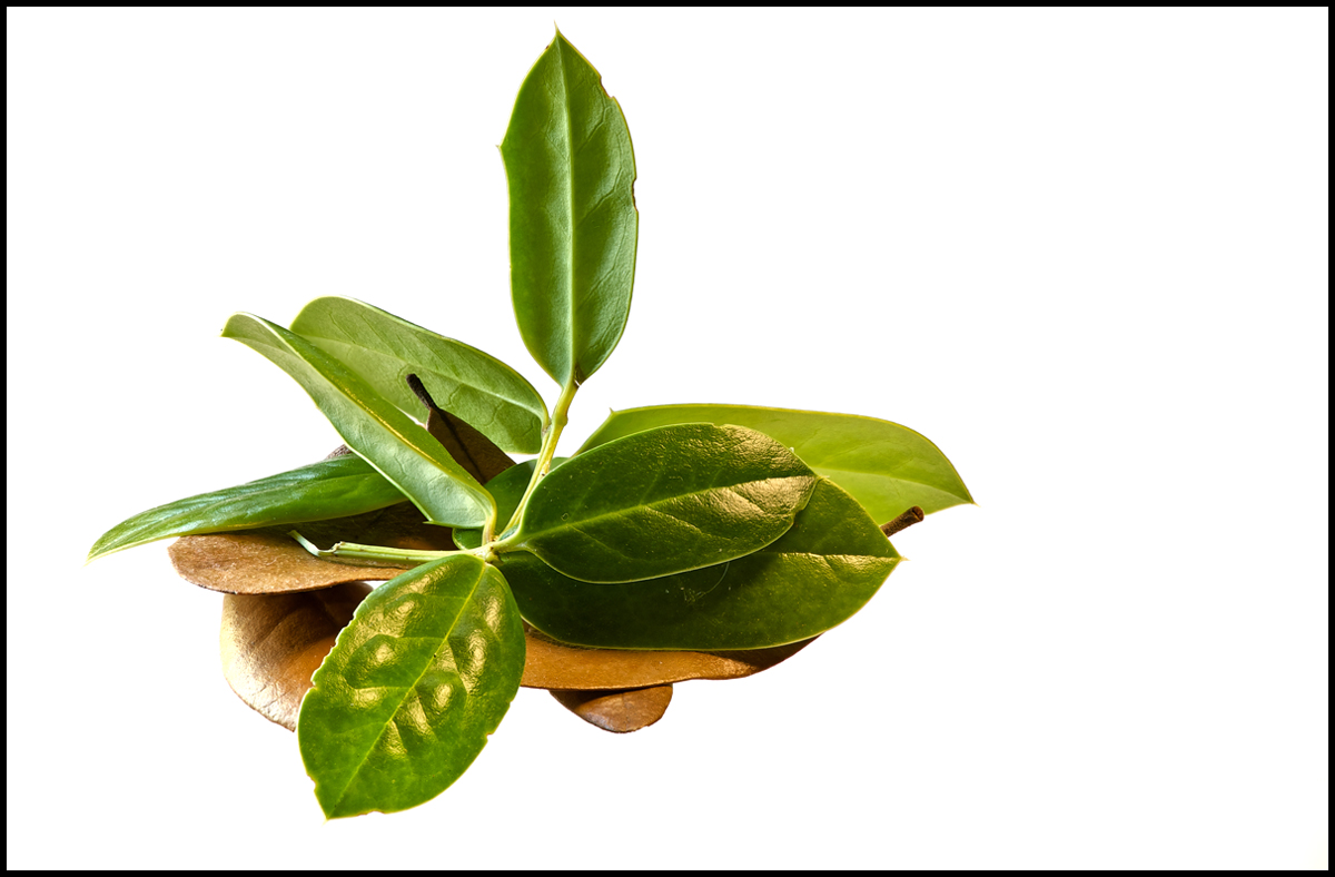
I'm posting two images. The subject matter is identical. A few Live Oak leaves and a couple of sprigs of something that resembles Holly, and who knows. The compositions are slightly different because I was just pushing the leaves around to make sure I had them in the frame.
Here's what I was testing...
1) I picked up a sample piece of plastic that Michael's can use when framing artwork. It's non-glare, very thin, and very expensive. A piece of 12x16 will an alleged 50% discount will cost about thirty-two bucks! I don't see any shadows or glare or texture on either photo. Do you?
2) I'm shoving desks around and moved a computer table so that a north-facing window provides light from the left side. I positioned a florescent art/magnifying lamp on the right and let it shine on the subject through a white umbrella that I acquired somewhere. I think on both photos that was successful with the exception of a touch of shine on one of the brown Live Oak leaves on the left. Not sure how to handle accidental reflections such as that. I know I can fix it in PS, but didn't bother for either image. So suggestions are very welcome.
The final item I was testing was using two different lenses on the D700. Both were shot with a tripod, MLU, cable release, spot meter, -3EV, ISO 100, f/8, and manual exposure, as well as manual focus.
This first image is my preference. It was shot with the 70-200mm lens + 500D diopter at 1/5s and at 130mm. In this case I stacked 15 images. Now this combination is a royal PITA to use. The shooting distance from the front of the lens to the subject must be about 17.5" but I think I captured far more detail and it's far sharper.
The second image was shot with a 60mm f/2.8 D lens. It too was stacked but I wasn't able to get as many images. It contains 7 images shot at 1/8th of a second.
I think the second image is OK but I'm aiming for perfection here

Maybe I'll never reach it, but I'm aiming for it.
So I would really like opinions on the lighting, the glass that sits under the leaves, and which of the two lenses I should keep.
And, I thank you for taking the time to write.

Carol

Comments
17 commentsOh, one other thought, the 60mm shows some signs of CA, most of the time it's not too prevalent and I didn't attempt to correct it.
Again, thanks to all who write.
Carol
The lighting seems just slightly intrusive to me but with the exception of the scanner I never use artificial light, so I don't know anything about it. That said, I don't dislike this light, I just notice it almost as soon as I register the subject. For lack of a better way to describe it, it seems emotionless and antiseptic but still intrusive.
I prefer the contrast and sharpness in the first subject by far.
The glass interests me a lot. I don't see any shadows, glare or textures and I wouldn't have had a clue as to how you set this shot up.
So I think everything works great here except the lighting and I'm not opposed to it, it just seems a little antiseptic to me.
Pat
Tomorrow I'll see what happens with only the light from the window.
Thanks, again,
Carol
The second image seems quite flat and much less eye-catching/interesting.
Hope this helps -
Sandy
1) The glass is invisible in both pictures.
2) I prefer the first image in terms of coloration, sharpness and crispiness. I use the diopter occasionally and I find I like the bokeh that this set up gives.
3) Lighting a bit strong and artificial but I know you are not concerned about that in these images.
Oh! I do like composition and the high key bg.
Yes, in this case, I wanted the glass to be a non-existent element.
Sandy, thank you too for your feedback. I realize that neither of these images are your typical floral image. I think this all started a couple of months ago with I simply dropped some spent Bougainvillea blossoms on a piece of paper and while I like the blossoms, I also ended up with the texture present in the paper. That led to using a piece of non-glass glass I had and in turn to the present piece of glass I'm trying... What a complex adventure. Interesting that you think the first image is natural and Pat thinks it's antiseptic, not that the two ideas are mutually exclusive
I hope others comment too. At least this is helping me making up my mind about buying a decent-size piece of glass. Next I'll think about finding some lens that is as effective as the 70-200 and Canon diopter but easier to use.
Thanks folks,
Carol
I almost wish I had used a grouping of the Mexican Plums. They too would make a great test. And there's always tomorrow and tomorrow.
Carol
I don't see any glare, shadows, or texture on either photo. I prefer the first image for it's greater DOF. The first one also looks a little sharper to me.
There are a couple of things about the lighting that bug me.
First is the inconsistent color temperature. The light from the left is much cooler than the light from the right. It really shows if you compare the quality of the light on the darker leaves on the right with the quality of the light on the vertical leaf.
Second, both light sources seem to be of similar intensity. I find that somewhat confusing. Things that I think should be in shadow aren't and vice versa. I wonder how this would look if you tamed one of the light sources so that you had a main light source and fill light. As it is, I think there are two main light sources.
Keep in mind I don't do studio lighting setups so I don't know much about them. But that doesn't stop me having an opinion.
Your comments about color temperature are interesting and right on. The light from the window is a northern light. I'll have to scrounge around and see if I can find an umbrella with a different color. And as I've mentioned, another possibility is moving the lamp to another location.
I've never done studio lighting either but that sure doesn't stop me from experimenting
Carol
A sunlit version ...
Thanks for all of your input.
Carol
The glass looks really good although I did think the texture provided by the glass in your 3-D image was a real plus element. I do think a polarizer would help although that puts another piece of glass in the equation. I do appreciate your software acumen. I'm a capture guy and so far have not had the patience to put in the computer time required for stacking/stitching/HDR etc. 2 thumbs up for your experiments and for your detailed explanations. >=))>
May
Pat
Albert Darmo. Canada