Nature Photographers Network
This is the preserved archive of the original Nature Photographers Network. The community continues at naturephotographers.network.
My Wetlands
‹ PreviousLandscape GalleryNext ›

My Wetlands

by beth summer

Gallery: LandscapePosted November 8, 2010107 views8 comments
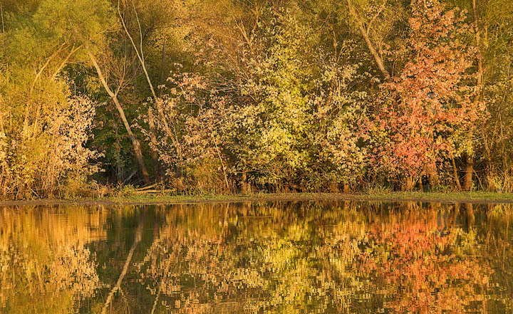
About 1/2 mile from my house are some wetlands. I call them "mine" because I live down there so often shooting images every season. Over the years, I've seen alot of changes and I always look forward to going down there for a new adventure. This image is a tad oversharpened on purpose. I wanted to give the look that I felt when I shot this in the evening. The fg trees were brightly sharp with the bg trees a bit wispy.

d80, f8, usual pse stuff

Comments

8 comments
Comment posted by Jim Greenwood on November 8, 2010 at 5:10 PM
It must be nice to have a place such as you describe. I appreciate what you are attempting to achieve. However, at web resolution, I'm not sure that it is coming through. Perhaps, instead of over sharpening, you might try to slightly blur the background selectively. I know this is an autumn scene, but it seems too warm to my eye. Did you use a warming filter, or apply a warming photo filter layer in Photoshop?
Registered on November 9, 2003, 229 Posts, 1523 Comments
Comment posted by Nick Bristol on November 8, 2010 at 5:11 PM
I really like this Beth. The warm light and colors are very nice. I like how you can even see the sharp foreground trees in the reflection compared to the others. I like these kind of places too. Very nice.

Nick Bristol
Lone Rock, WI.
Registered on February 1, 2004, 752 Posts, 14140 Comments
Comment posted by beth summer on November 8, 2010 at 5:31 PM
Jim, I don't use warming filters. The sun was hitting this area at dusk. The colors are as is pretty much. It really was this warm. I think you're right that what I was attempting to show does not really show up on the monitor at this resolution. When printed, it's pretty much just what I wanted. Thank you for your comments and you too, Nick.
Registered on November 1, 2003, 437 Posts, 5220 Comments
Comment posted by Mark Pelton on November 8, 2010 at 10:44 PM
Very nice, Beth. I might darken just a tad.
Registered on November 25, 2003, 380 Posts, 4647 Comments
Comment posted by Chris Chamberlain on November 8, 2010 at 11:35 PM
Lovely scene! It seems a bit yellow/warm to me. I'd like to see a little more separation between the colors.

Chris
Registered on March 13, 2007, 500 Posts, 8365 Comments
Comment posted by John Williams on November 8, 2010 at 11:38 PM
Very nice Beth. That's a wonderful bank of color, and the reflection sets it up just right. I too like the idea of darkening it a bit, which would also add a bit of saturation.
Registered on September 6, 2007, 221 Posts, 5985 Comments
Comment posted by Stan Rose on November 9, 2010 at 11:18 AM
Oooh--this is real purty!! I love the nice symmetry here. :wavey:
Registered on September 15, 2005, 836 Posts, 17099 Comments
Comment posted by Morris McClung on November 11, 2010 at 9:55 AM
Dynamic diagonal lines and nice light and color. Well done.
Registered on May 7, 2007, 670 Posts, 19650 Comments